ZEIT BROOKLIN APARTMENT
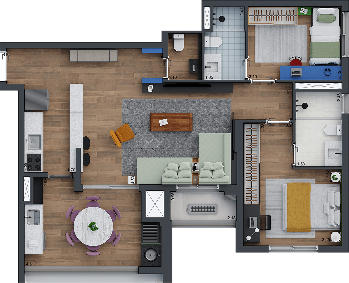
Urban, contemporary and sophisticated: these three adjectives describe perfectly this apartment of 86 m2 that serves as a decorated model for the Zeit Brooklin building, by the real estate developer Setin. The well-distributed layout allows the integration of the kitchen with the social area and the transformation of the balcony into a dining room. There is also a toilet serving the living space. In the private area there are two comfortable en suites, one of them with an internal window that connects the bath and sleeping areas – which brings brightness and a dose of boldness to the bathroom space.
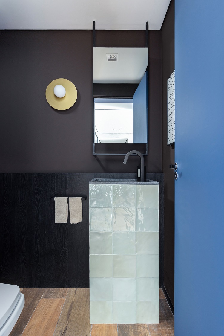
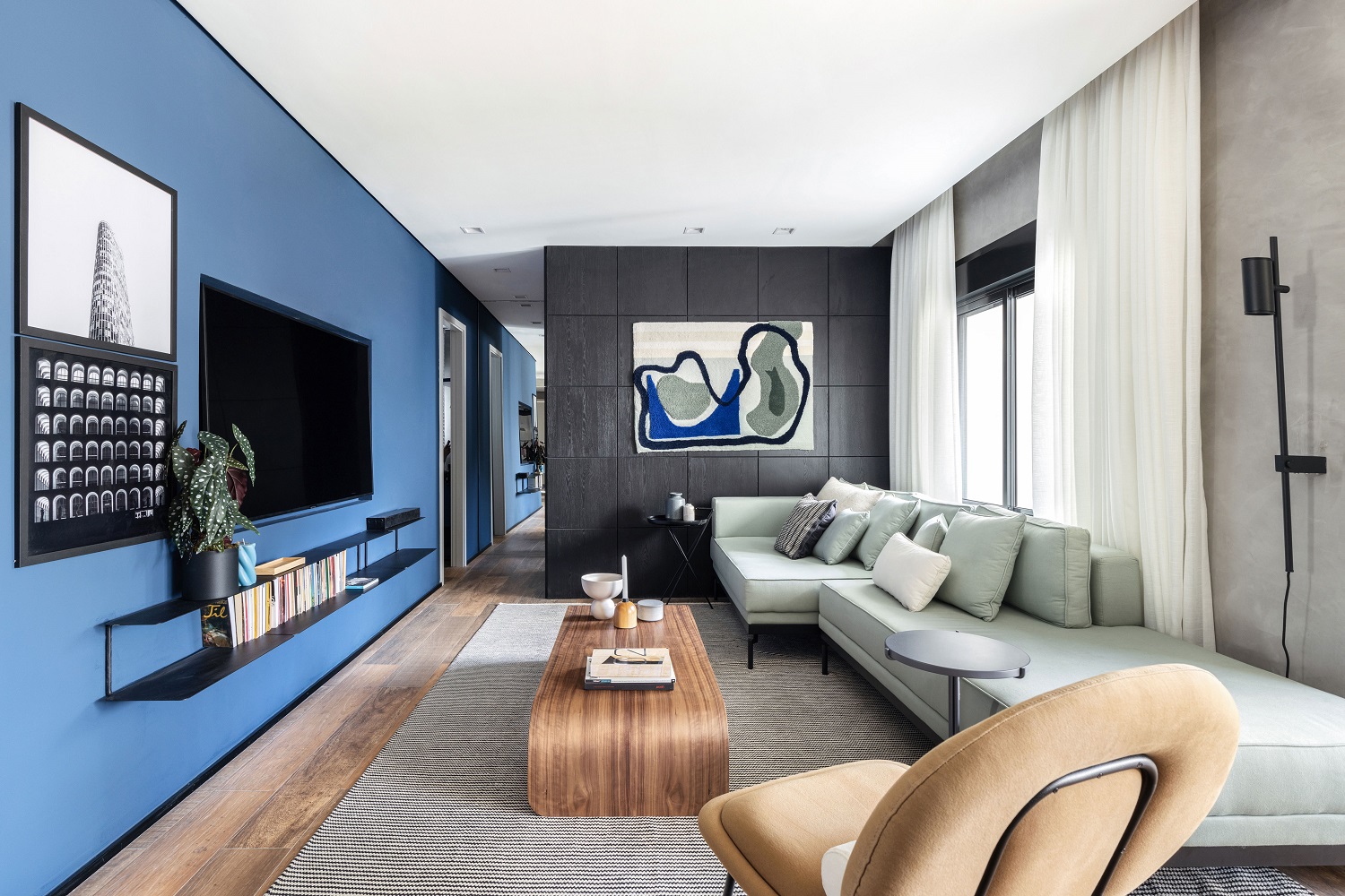
We sectored the spaces using colors. The blue section (color Mistério do Oceano, by Tintas Coral) frames the toilet and the entrance to the kid’s bedroom. The black block, with a square panel – a kind of inverted wainscoting with low relief – gives access to the master bedroom. To make the circulation in the living room easier, we embedded the TV in the masonry and dismissed the traditional TV stand – in its place there is the CE shelf, by Fernando Jaeger Design.
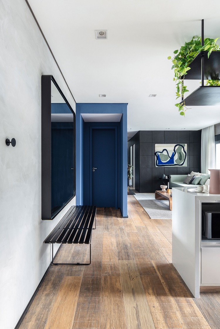
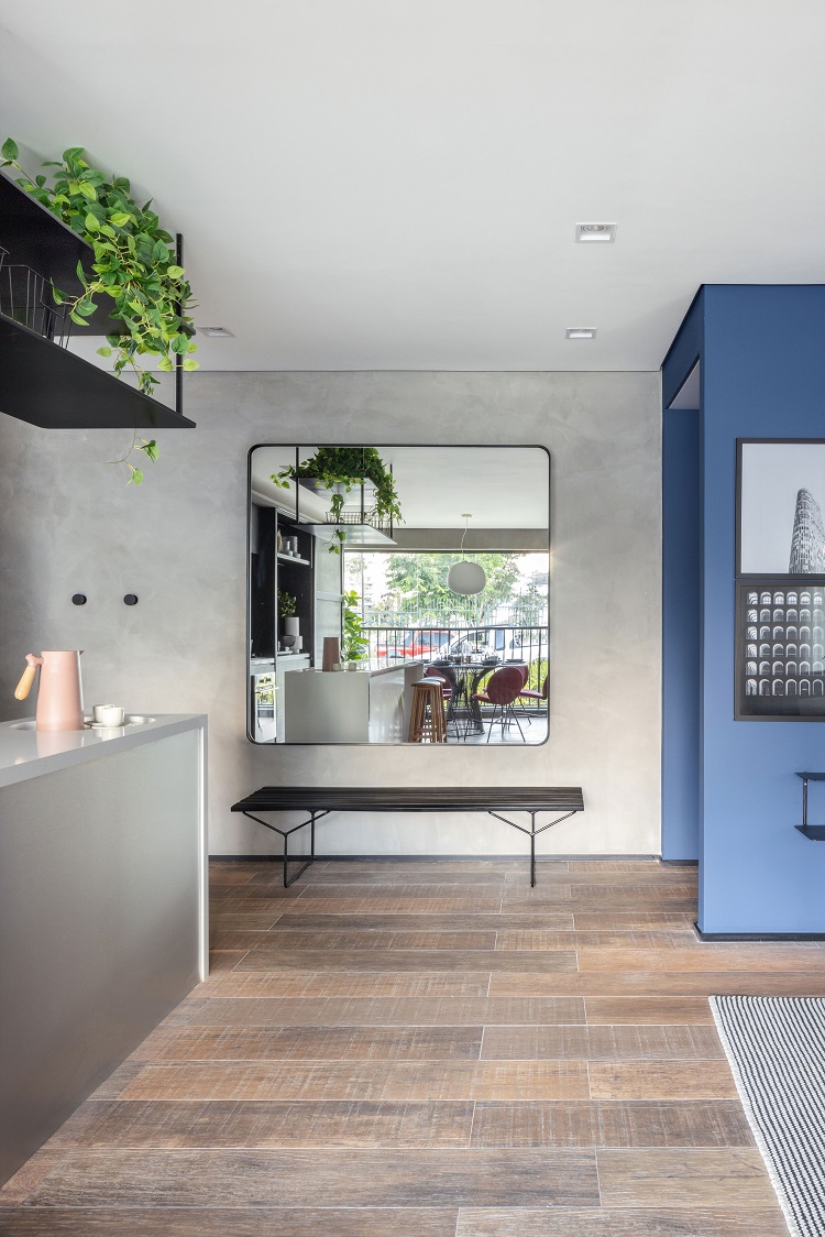
The wide corridor, 1.20 m width, has two discreet supports that transform it into a small hall: to the right, over the island, a recess in the quartz surface serves as an organizing tray to place objects; to the left, there is a slatted bench to support bags and coats. At its end, the blue door closes the toilet. The entire floor of the social area is covered with wood-look porcelain tiles (model Ibirapuera Mix, by Portobello). Hanged on the wall opposite the balcony, the custom-made mirror multiplies the light coming from the outside.
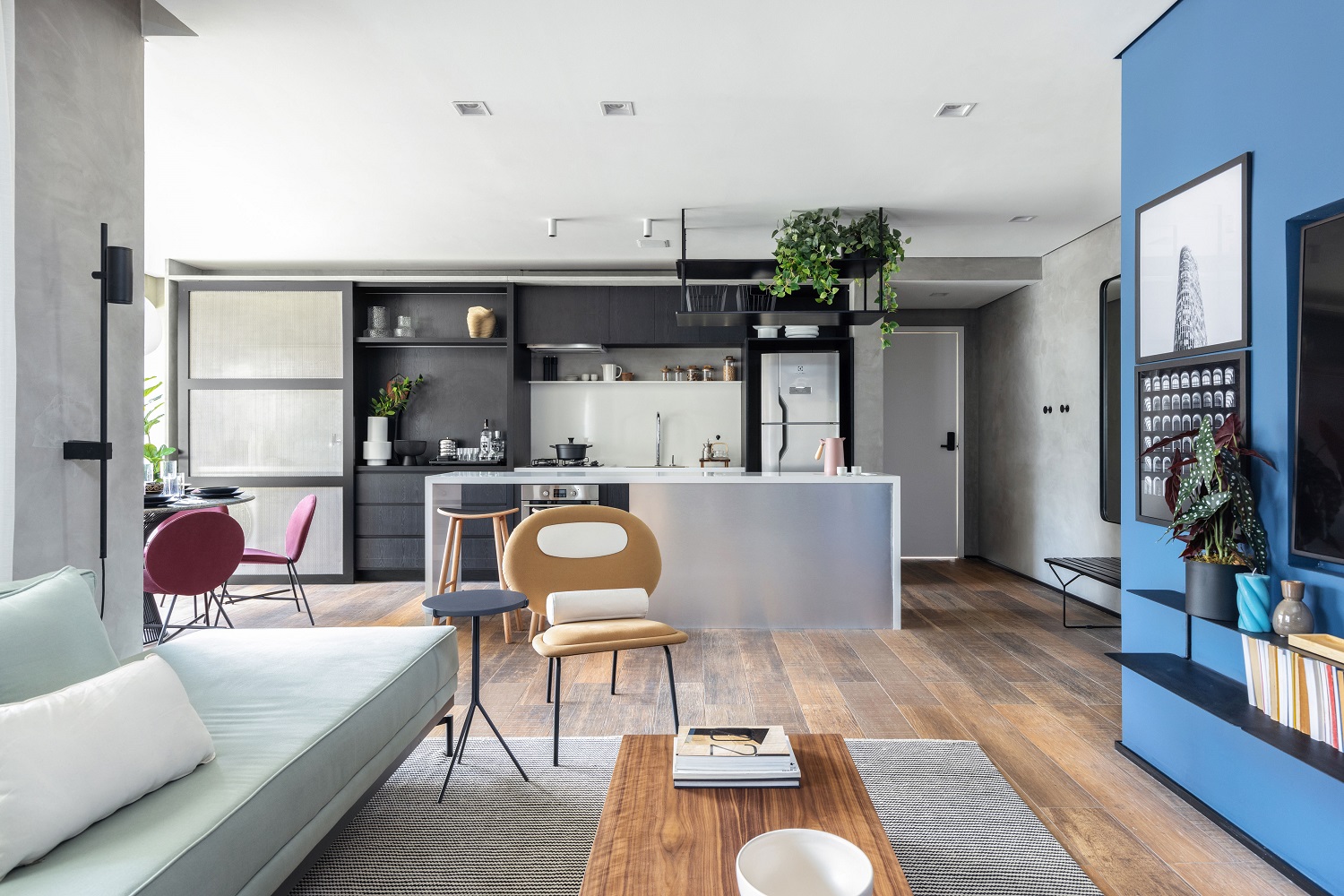
The social area of this apartment is all integrated and full of practicalities. We also chose unconventional materials for the cabinetry, with finishes in ebony and stainless steel patterns, and we punctuated the palette with a strong shade of blue – a good reinforcement for the urban identity of the interior design
– MAURICIO ARRUDA
ASSOCIATED AT TODOS ARQUITETURA
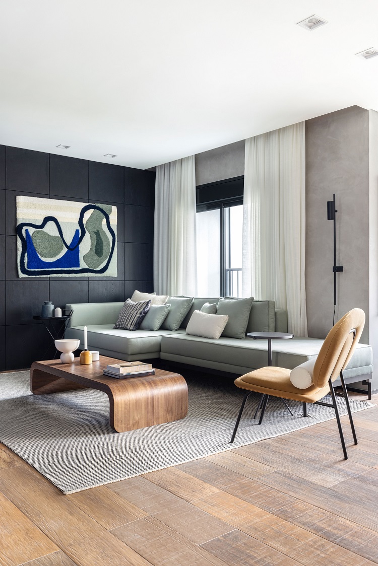
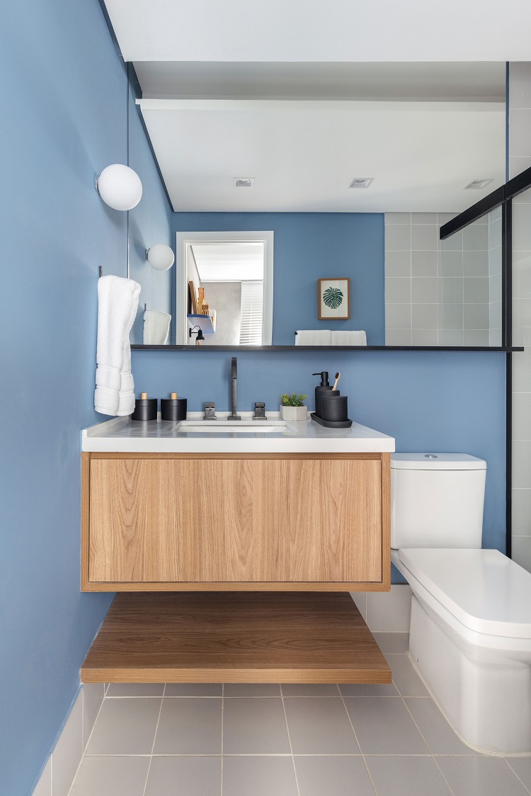
Raphael Dias’ tapestry from Casa Diária follows the interior design palette. The subtle green from the tapestry reappears in the sofa Steel, by Lider Interiores. The coffee table is Zoom, from Ondo. The round black ones came from Boobam, as well as the sconce. The mustard armchair is Ovo, from Studio Massa. At the entrance of the toilet, a tensioned fabric on the ceiling produces the diffused lighting, more welcoming. Inside, the light comes from the golden sconce by Lumilandia. The sink is made of grey levigated granite Andorinha and its base is finished with tiles Verde Gouache (Portobello).
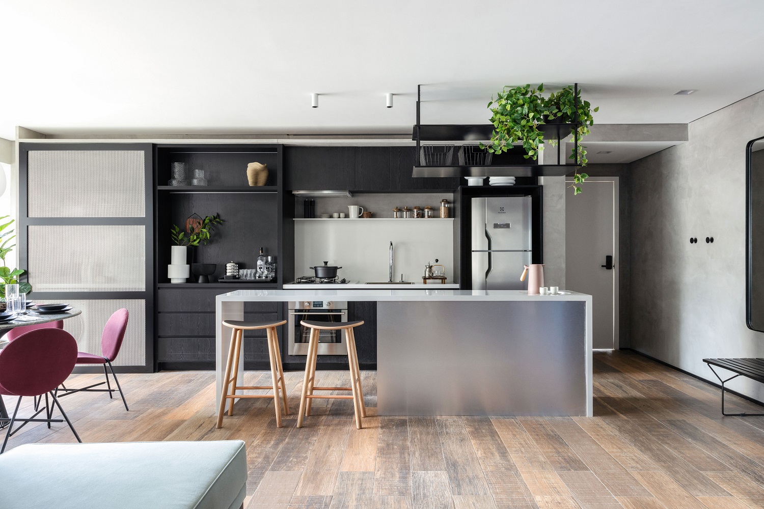
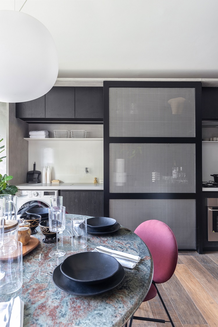
Fully integrated into the living room, the kitchen has light gray quartz agglomerate countertops. Under the island, there is an empty part on one side, and, on the other, cabinets finished with MDF (model stainless steel). In the background, the dark cabinetry with the ebony like effect texture (pattern Absoluto from Linha Design by Duratex) concentrates the stove and hood, sink and refrigerator – in addition to the bar and laundry room.
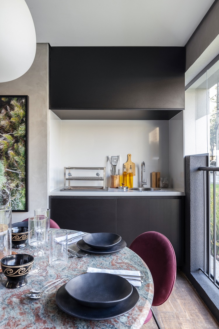
The sliding door frames perforated sheet metal, and it hides either the laundry room or the bar. The round dining table seats six people comfortably in its 1.30 m diameter and joins the palette with the top made of granite Rosa Raíssa. The grill niche follows the language of the kitchen and repeats the same quartz agglomerate on the countertop and the backsplash, and also presents closed cabinetry on top.
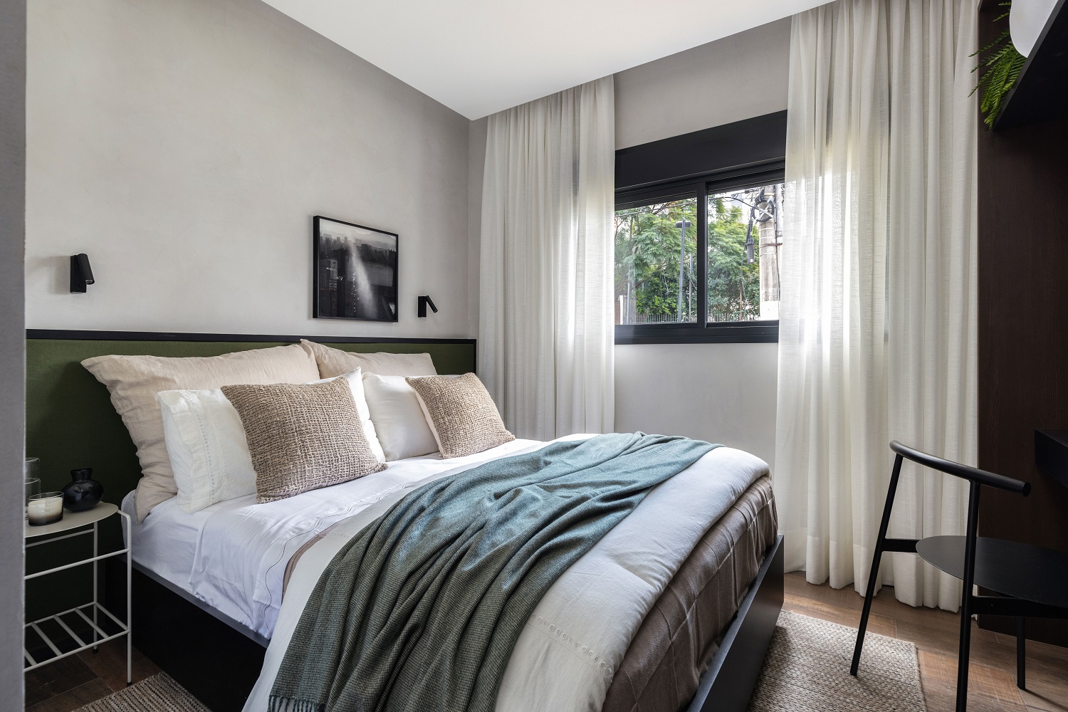
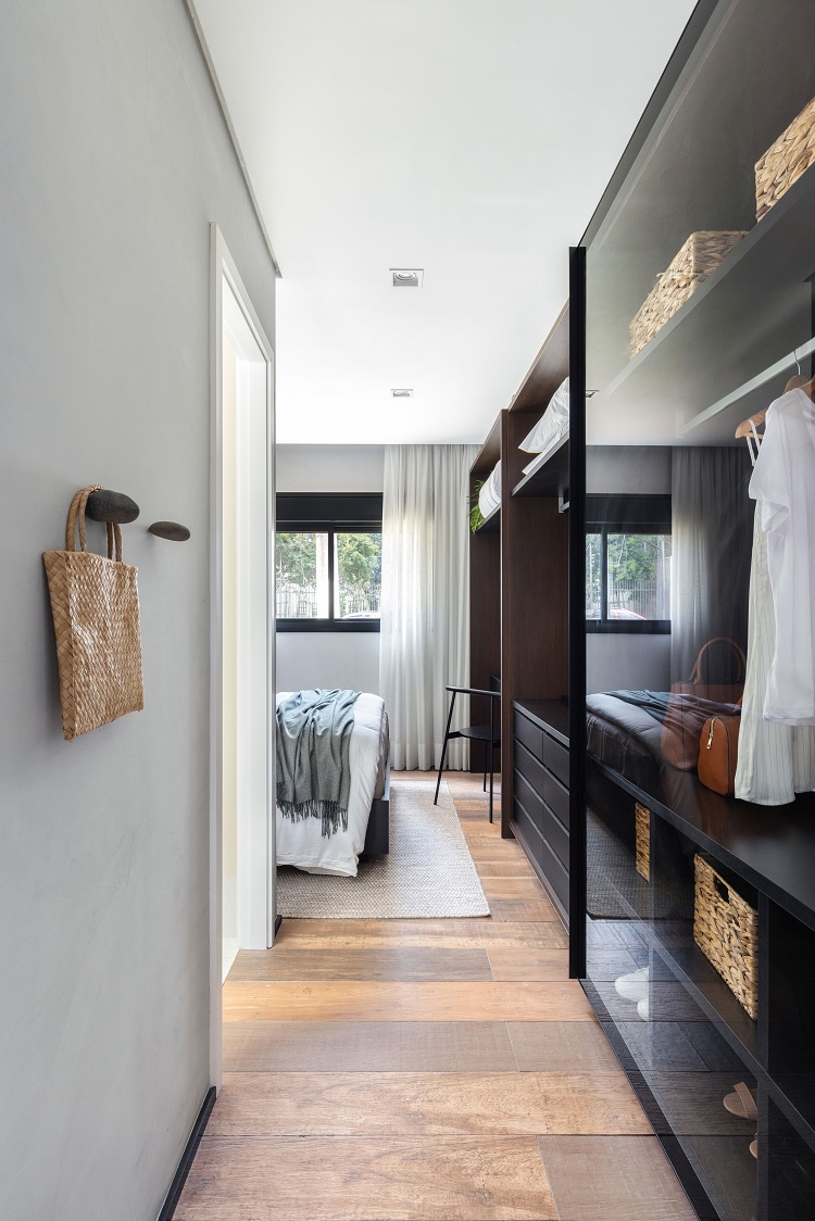
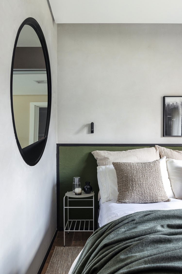
We chose glass doors for the couple’s closet, which also mixes two shades of wood on the inside. We designed a foam headboard with a thin wooden frame, good for leaning back and reading with the light from the articulated sconces (model Led Flat, by Blumenau Iluminação). The bedside tables are model O.U, by Boobam.
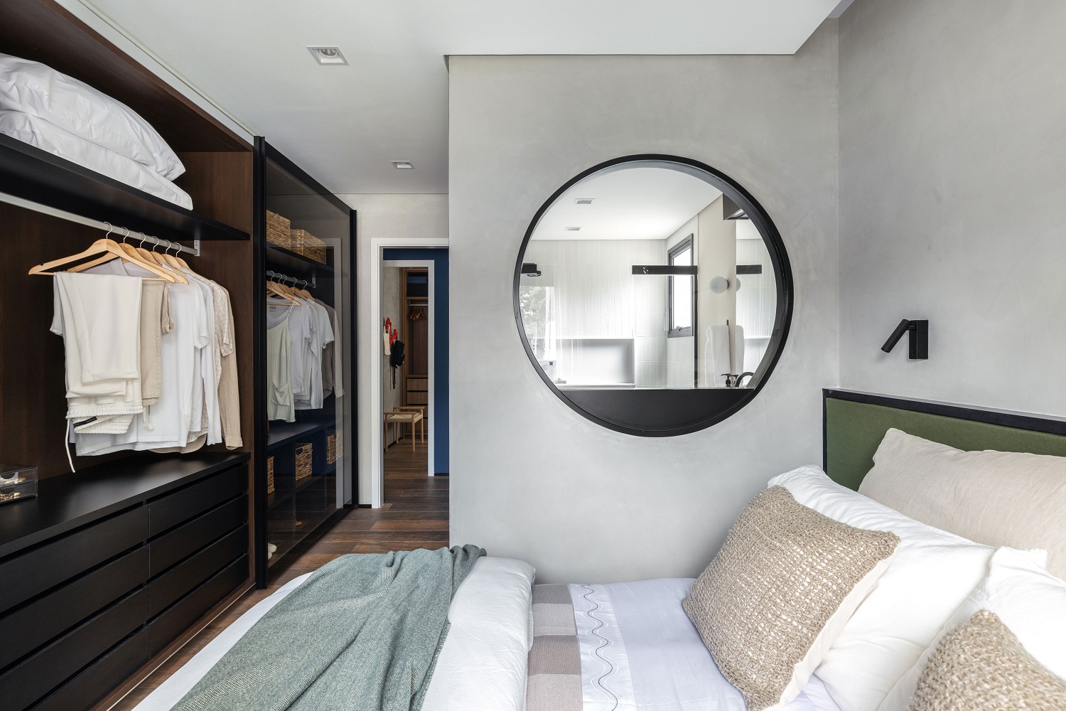
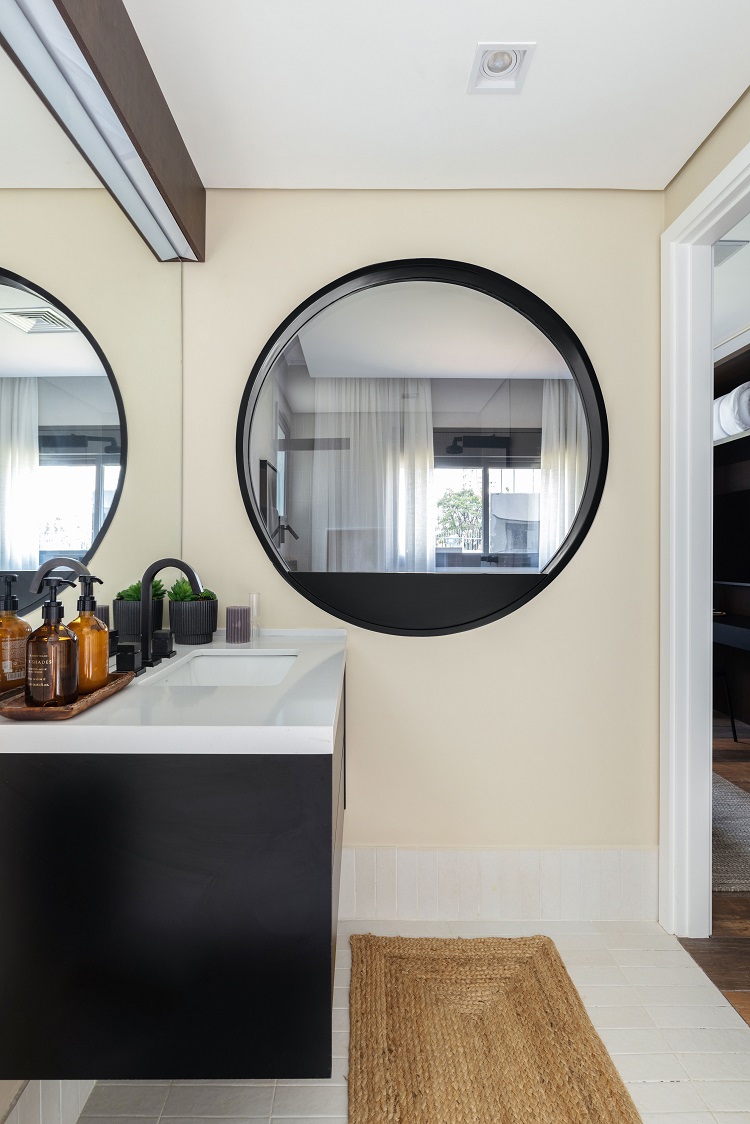
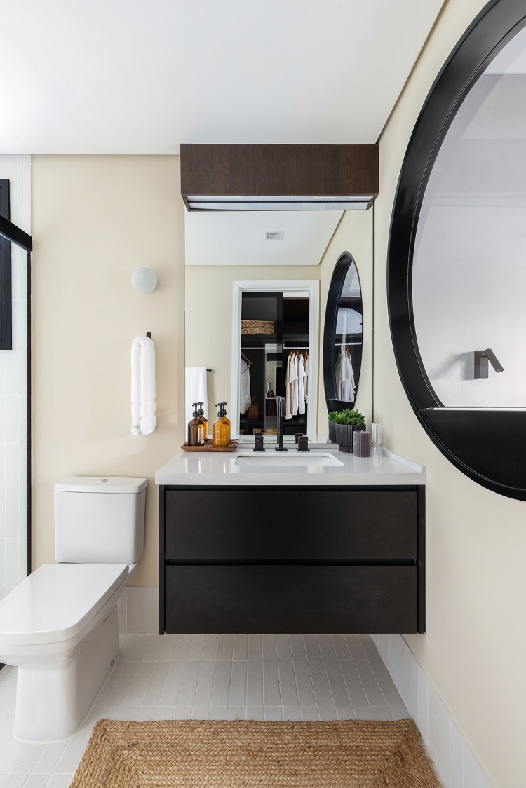
A dose of boldness: we put a round window in the wall between the bedroom and the bathroom. The transparency of the glass multiplies the brightness in the master bedroom.
For the sake of visual unity, we chose the same ceramic tiles (Horizontes Santorini, by Portobello) to cover the floor and the walls of the bathroom. The black hardware and accessories match the cabinetry and the metallic parts of the shower box and the window to the bedroom.
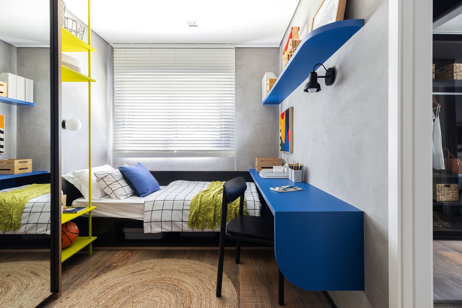
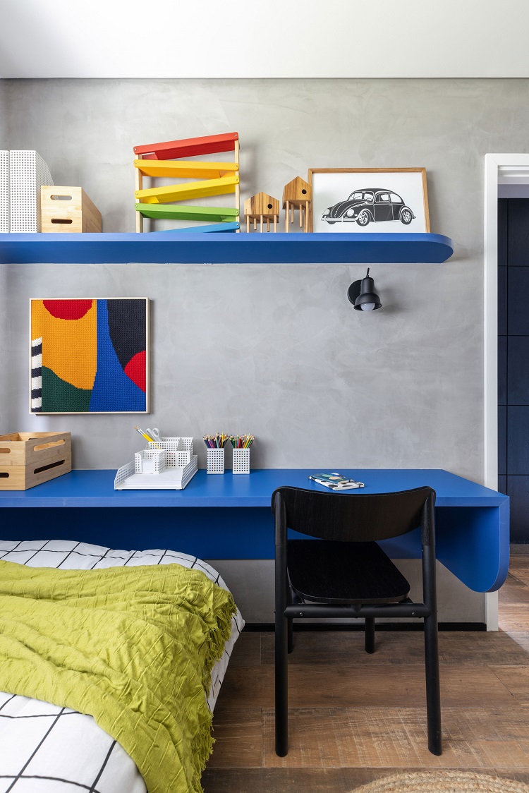
In the kid’s room, we designed a metallic rack painted in a bright shade of lime green, which makes a good contrast with the blue that appears on the shelf and on the study bench – its brackets are hidden by the side extension of the surface. The light for studying comes from the sconce Moderna Ascribu, from Lumilandia.
The blue tone from the living room appears once again on the wall of the kid’s bathroom. Here we also chose the same ceramic tile to cover floor and walls, model 1900 Gris, from Colormix.
FLOOR PLAN
