SUZANO APARTMENT
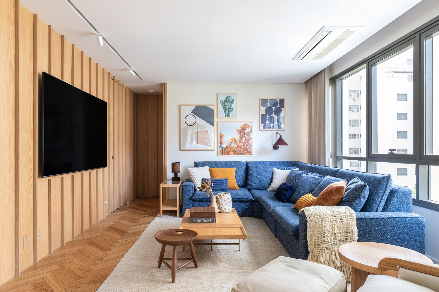
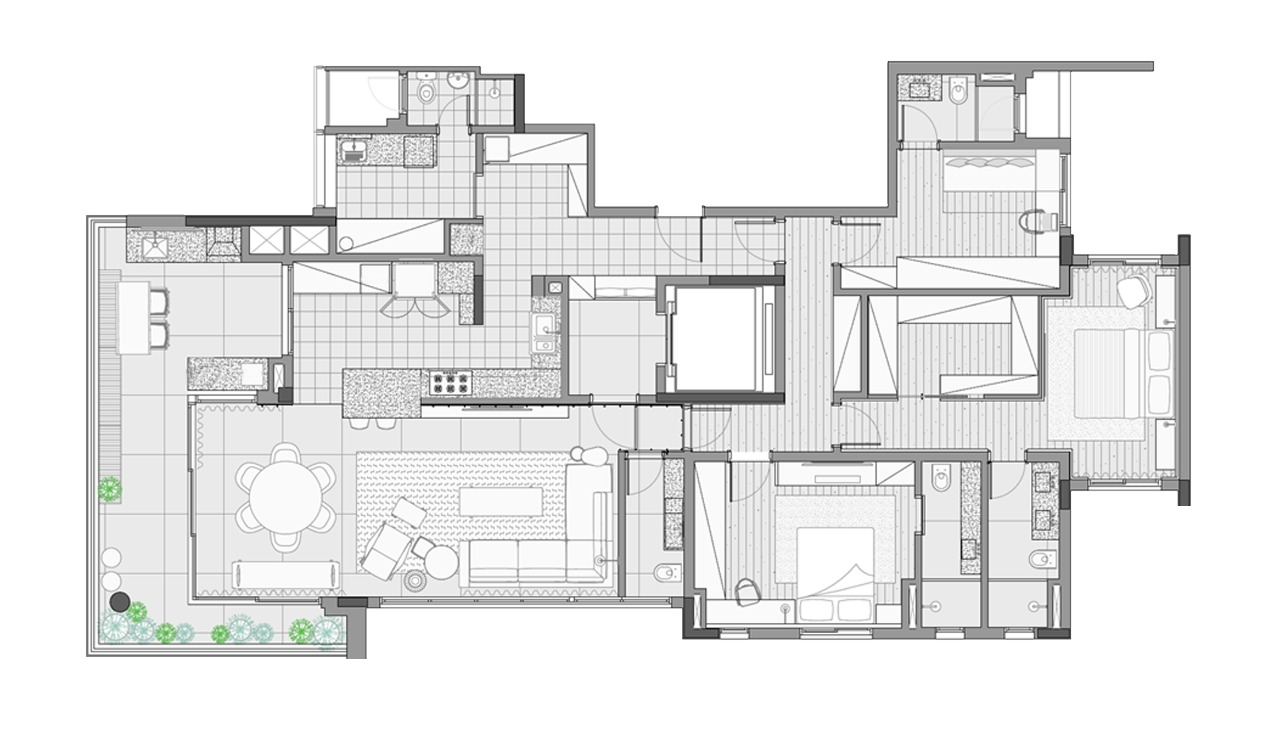
Making an apartment that already has a good layout feel cozy is one of our favorite challenges. In this 210 m² São Paulo project, oak veneers, a blue color palette and the integration of the living area were the main features that designed this style of residence in one to be delighted in. A precise change of space – we took some of the living room and moved the toilet to that corner. The change allowed the establishment of an elegant environment, which repeats the finishes of the living room, and an expansion of the kitchen area, which is widely used in the family’s routine.
The traditional wooden panel was invigorated by making the spacing between gaps in the slats bigger – the 2 cm wide strips are replicated every 30 cm. The apartment’s entrance doors (on the left) are camouflaged by the wood texture, as the ones that give access to the intimate area (at the back) and the bathroom (hidden, on the right).
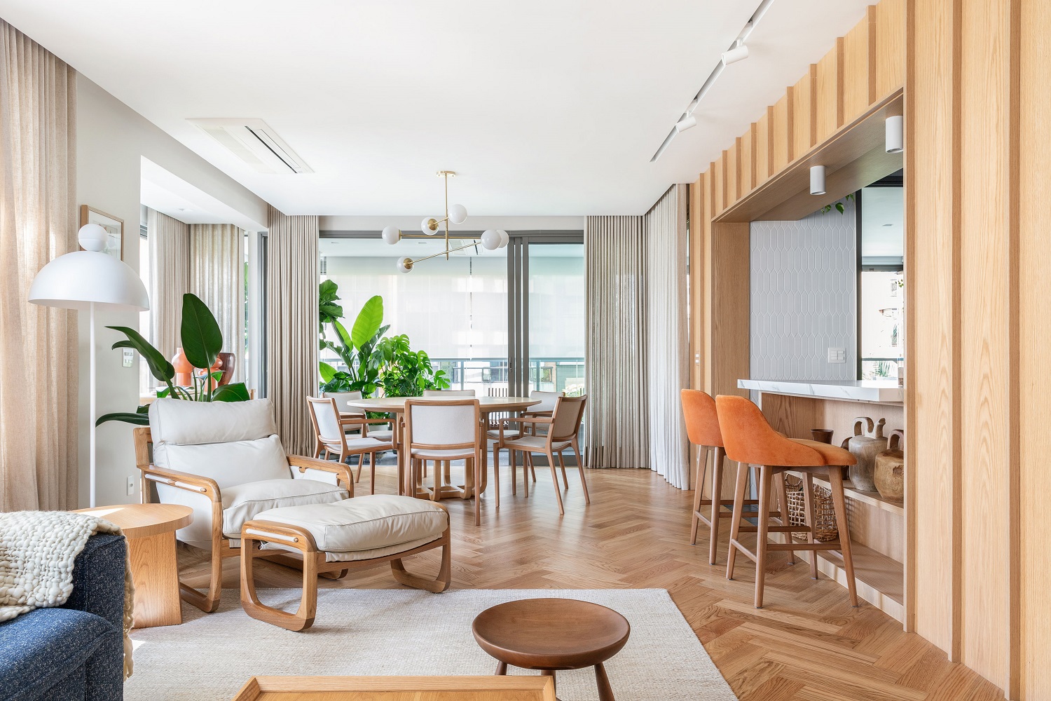
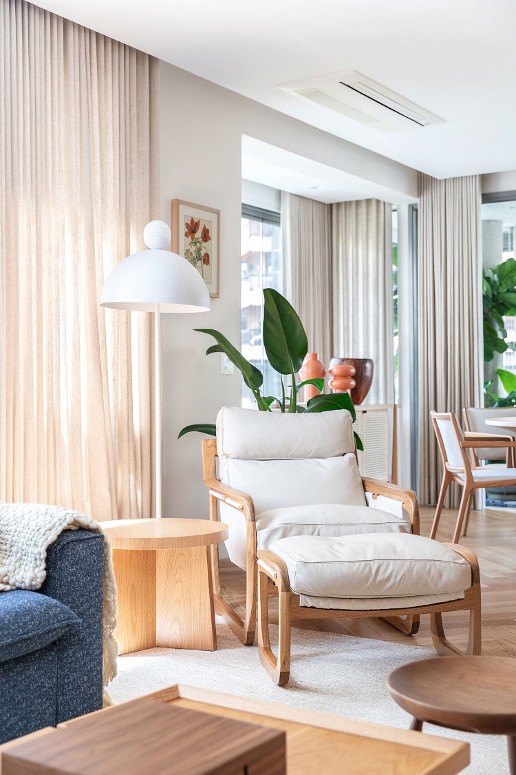
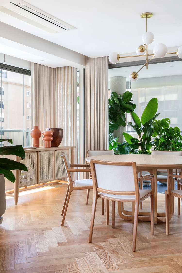
As we enter the apartment, this is the view. The living room is the first area, the reading corner comes next, and then the dining room. In the background, it is possible to notice the landscaping of the balcony – the connection can be integrative or interrupted by simple closing of the frames.
White, off-white, blue and many textures turn the apartment a prime example that mixing wood shades can be a right decision. Another element that deserves consideration: with a comfortable ceiling height, we were able to fit the air conditioning equipment into the ceiling lining, which attenuates its presence.
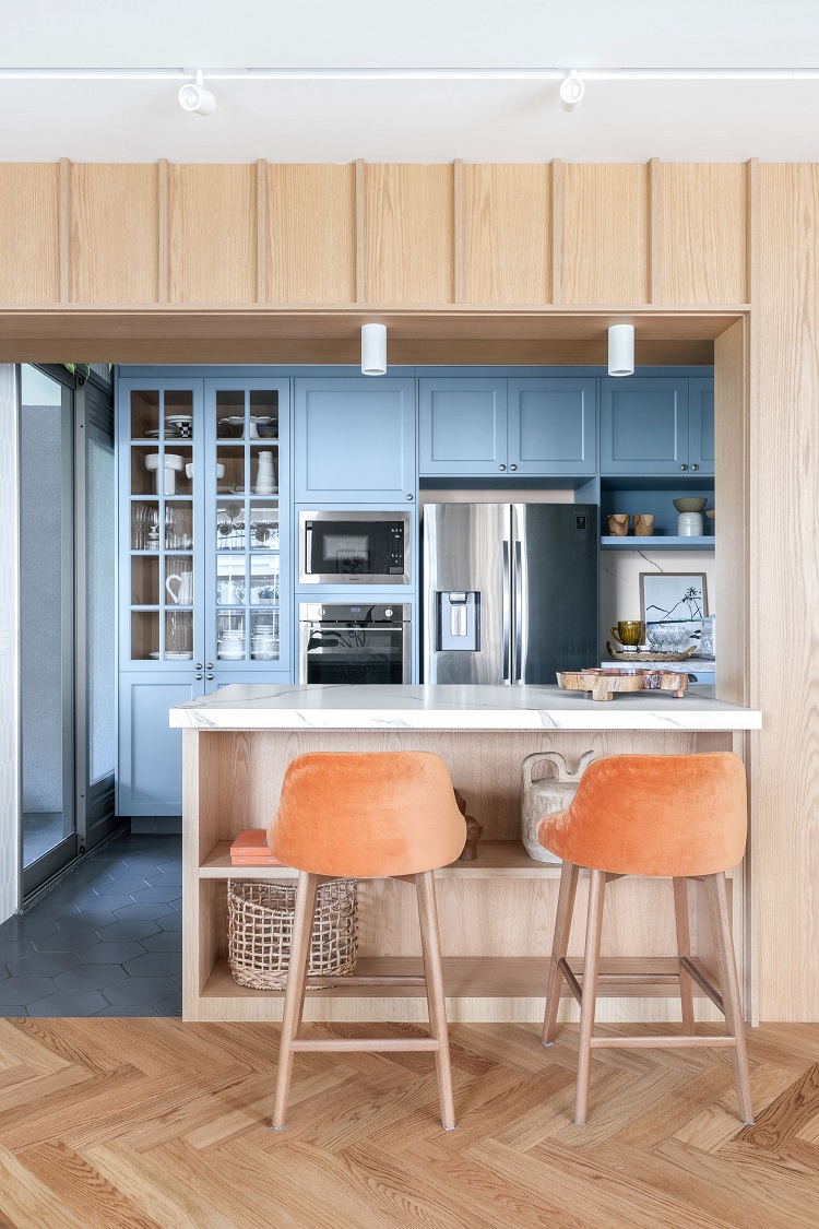
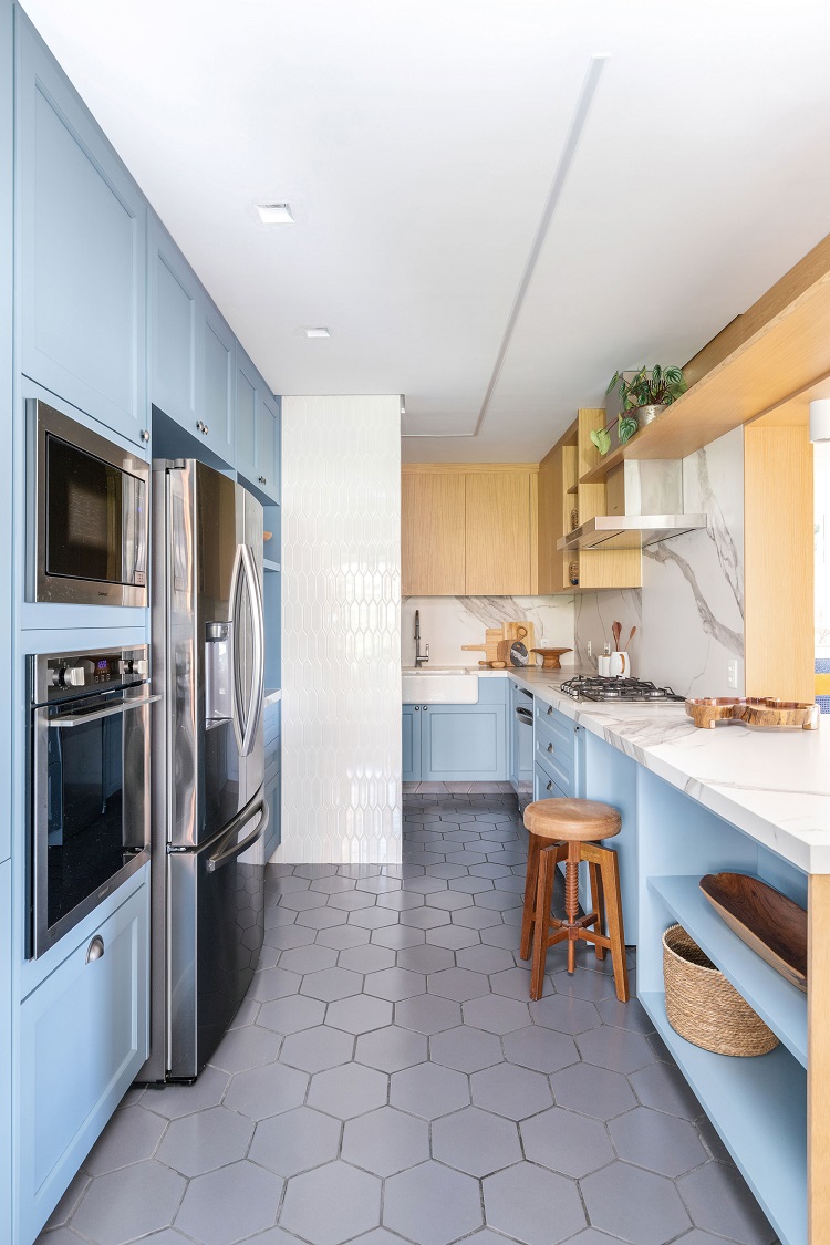
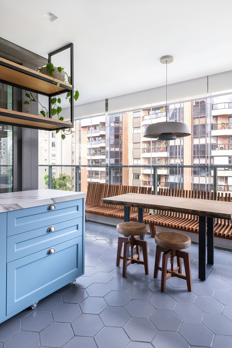
Open to the living room, the kitchen was furnished with an entire wall of cabinets colored by Sayerlack’s N018 lacquer. The bench that connects the environments is double sided: it works as a support for the TV equipment on one front and houses more objects in the other one, that faces the preparation of meals.
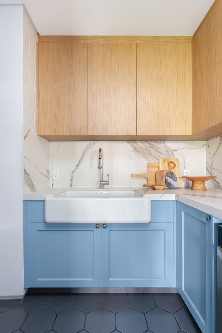
The farm sink fits on the countertop, and increases the retro reference of the project.. As it is very heavy, this style of sink with rounded edges, requires an extra grappa (a kind of shelving bracket) at the bottom, to add security to the set.
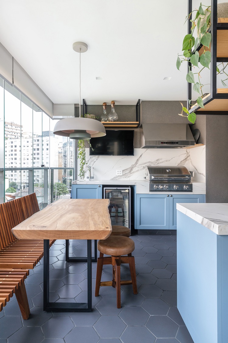
IN THIS PROJECT, THE INTEGRATION BETWEEN KITCHEN AND BALCONY CREATED A PLEASANT SPACE. ANOTHER IMPORTANT CHANGE WAS REMOVING THE BATHROOM TO THE CORNER OF THE LIVING ROOM, IDEA THAT ALLOWED THE REPEATING OF THE SOPHISTIC AREA, A GAIN IN SOPHISTICATION
– MAURICIO ARRUDA,
ASSOCIATE AT TODOS
The balcony keeps the same finishes as the kitchen, promoting the visual connection of the two areas. Adjoining the blue lacquer, the quartz agglomerate countertops stand out. On the floor, the gray hexagonal floor (Lepus, by Cerâmica Atlas) emphasizes the vivid color of the woodwork.
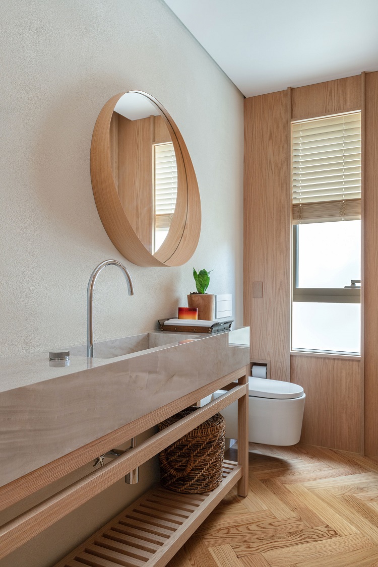
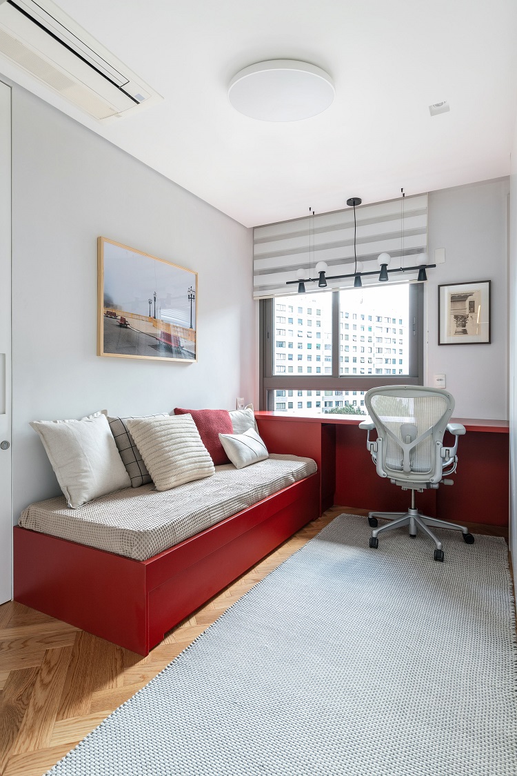
The restroom was given the same coatings as the social area. The countertop has a carved sink made with a sintered coating on an oak structure. In the guest bedroom, we designed the joinery set to accommodate the bunk bed and a work table for the office. The contrast of the wine tone with the wooden floor emphasizes the herringbone weave.
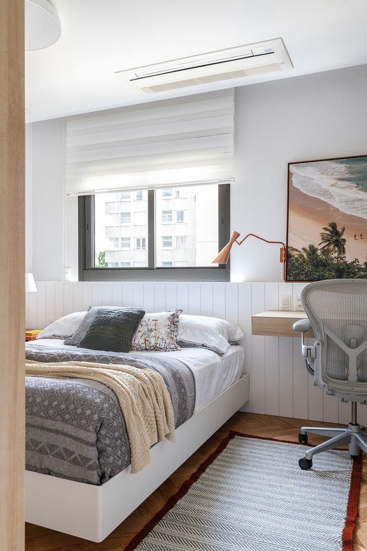
Placing the bed under the window can be a bold decision. For the sake of common-sense, we created a half-height paneling that functions as a headboard and hides the niche that fits the blinds. The space that remains beyond the window supports paintings and engravings on the study bench.
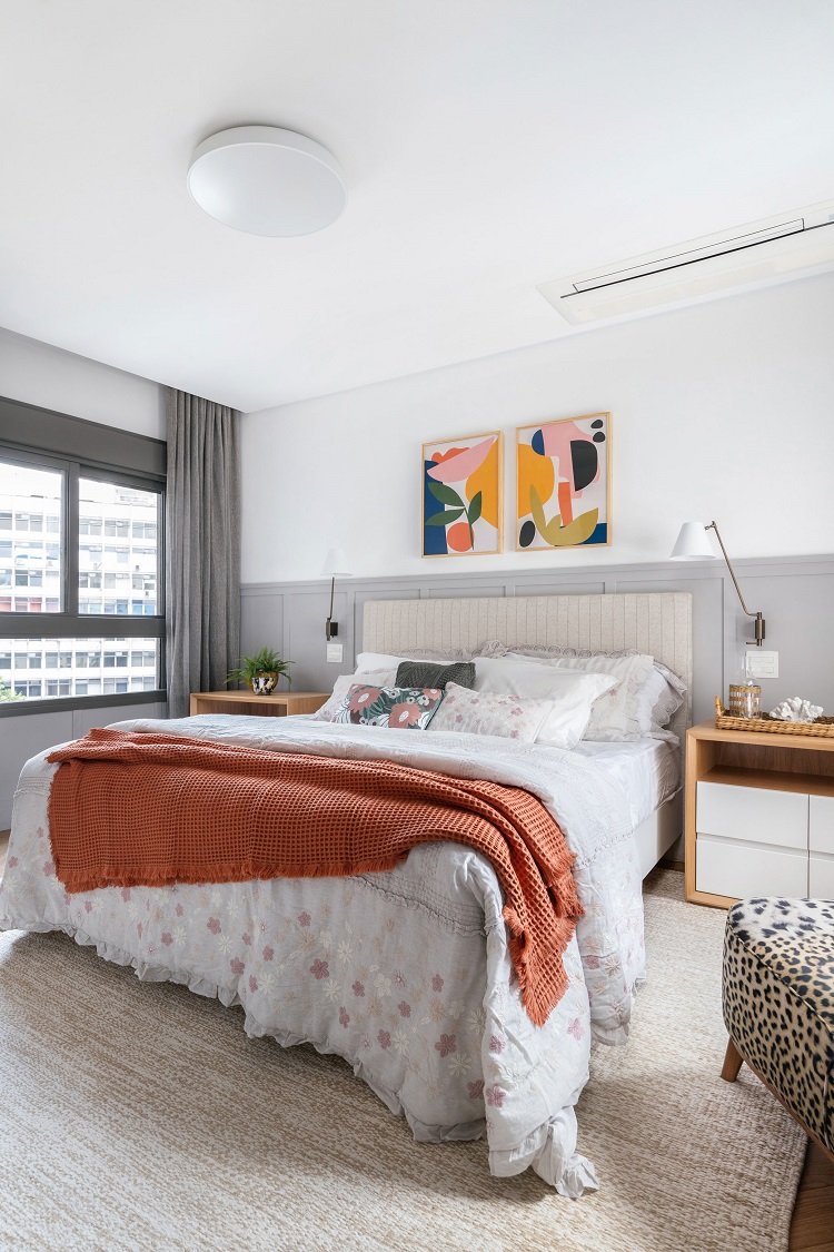
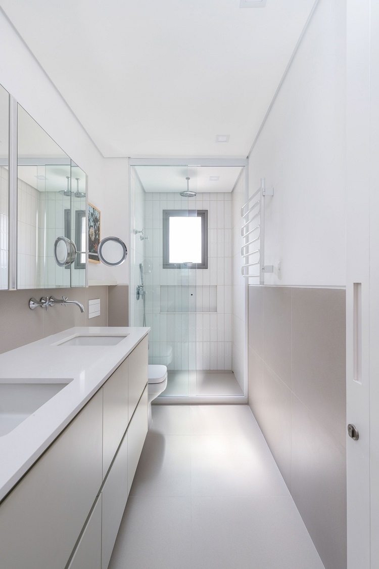
The boiserie that surrounds the entire suite was made with wooden slats applied directly to the wall, without a wooden base. The same light gray tone covering different materials, grants visual unity to the area. Neutrality is the word to abide by in the master suite bathroom. The porcelain tile on the floor extends to the mid-height of the walls. In the shower stall, the off-white coating adds texture to the room.


