POP GRAFITE APARTMENT
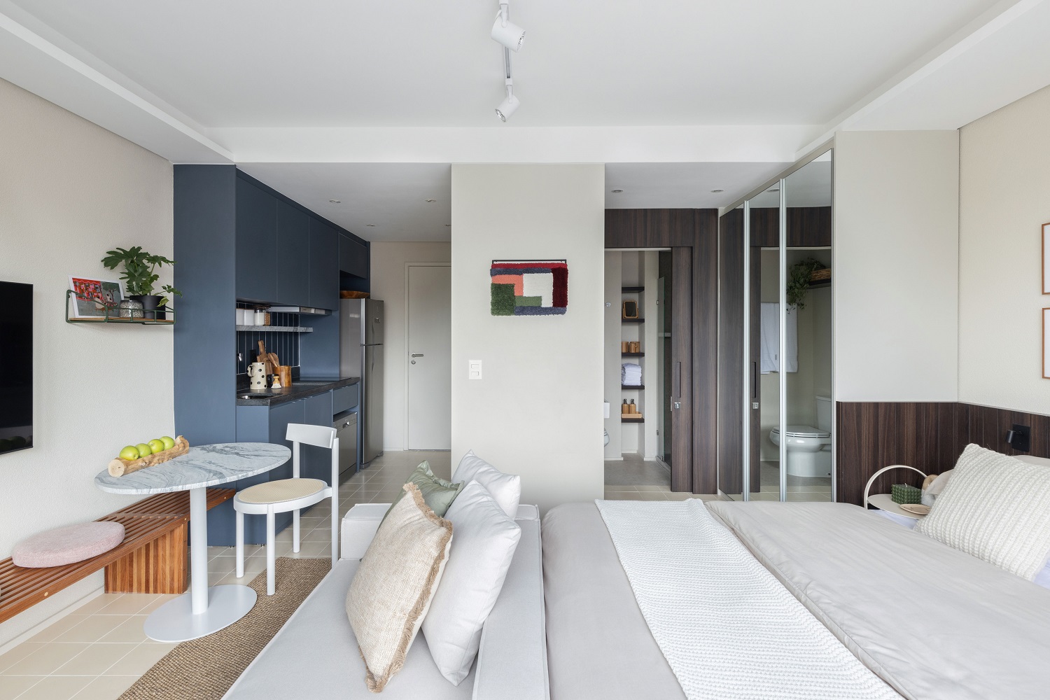
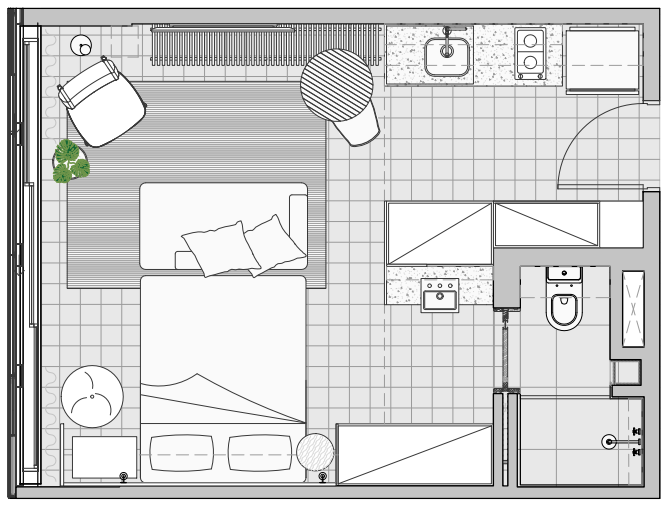
A studio for a practical life – this is how we planned the interiors of the 27 m² apartment we designed for Pop Grafite – which will be sold fully decorated -, a real state project by Idea!Zarvos. The modern atmosphere and comfort of the interior design come from a neutral base, while cabinetry solutions multiply the storage possibilities.
We concentrated the most practical ideas of the apartment in the cabinetry. The kitchen, dining, living, bedroom, closet and even a reading corner fit in the area of 27 m²
– MAURICIO ARRUDA
ASSOCIATED AT TODOS ARQUITETURA
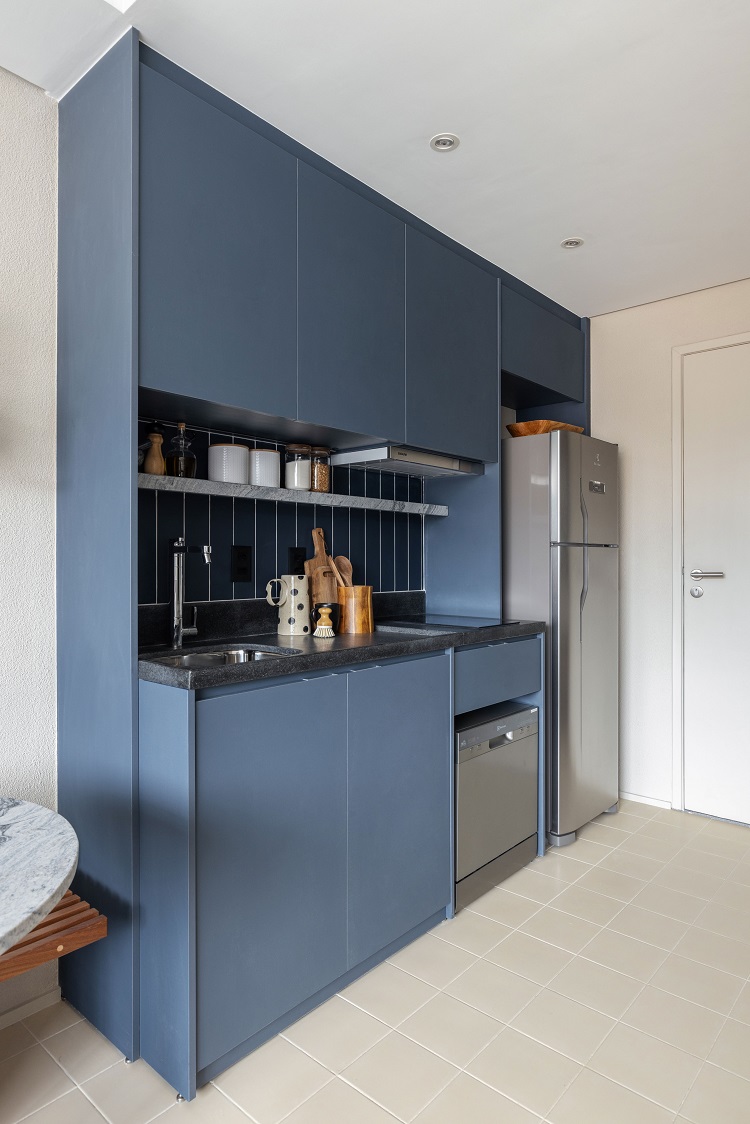
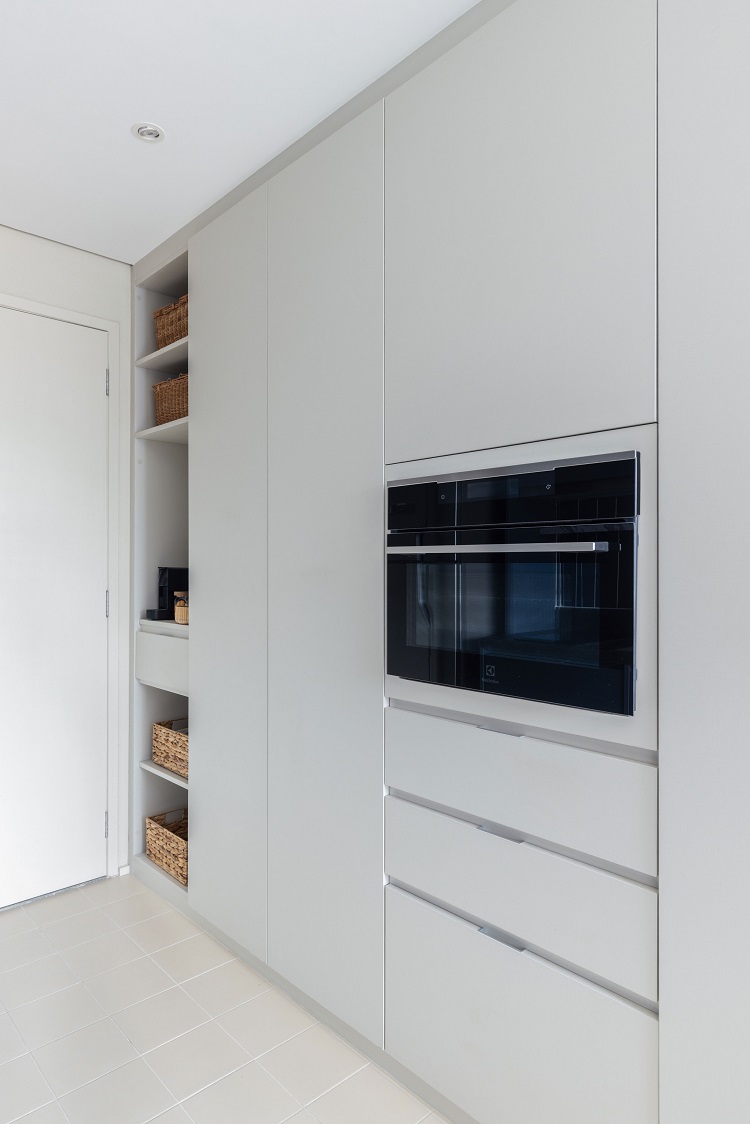
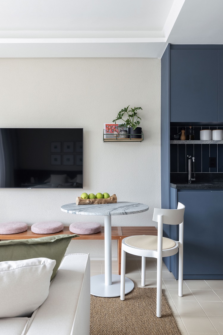
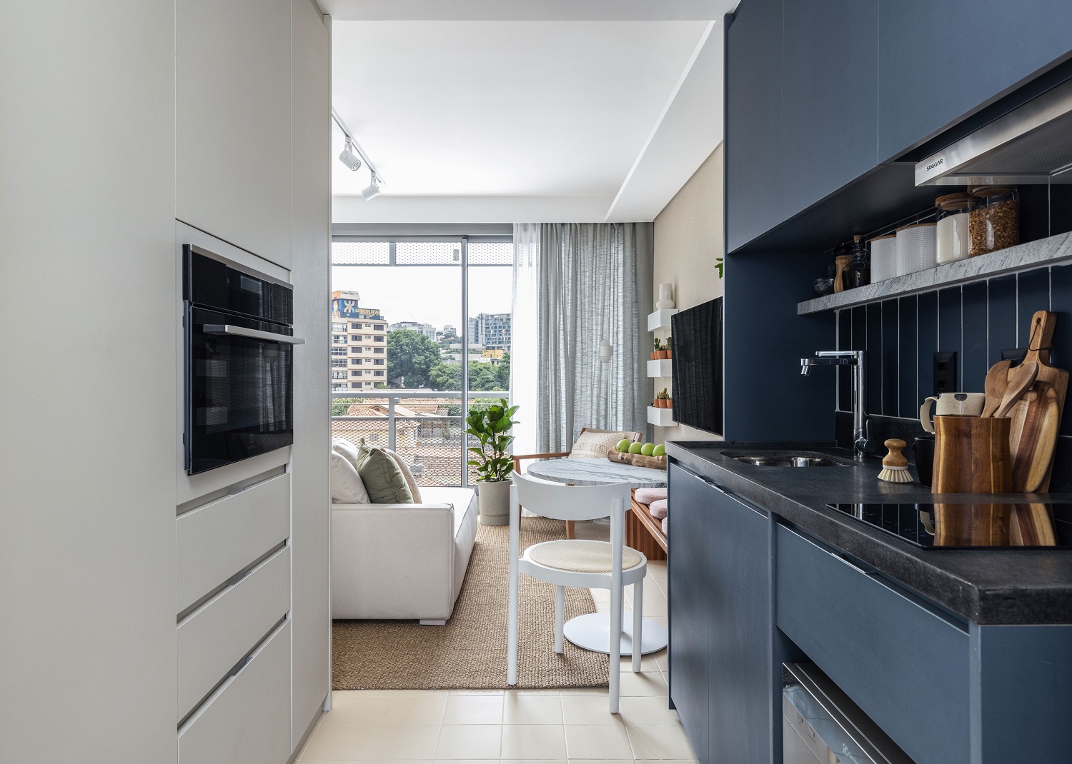
Refrigerator, dishwasher, cooktop, hood and sink are gathered in the blue cabinet (the finish is MDF Fontana, from Marcatto Móveis), which accommodates all the appliances of a complete kitchen. The backsplash follows the navy blue color with the Terralma Bora Bora tile, by Portobello. We used granite Branco Nepal to create a shelf and the brushed granite Preto São Gabriel for the countertop. The gray volume has a niche next to the entrance door in which we made a coffee corner and, under it, there is a shoe rack. Beside that, two doors hide the pantry and the laundry room. Then, there is the hot tower in which we built in the electric oven, and a last cabinet that we planned to use as a cupboard. On the floor, the light tone appears again in the ceramic tiles Ladrilho 1900 (color marfil, by Colormix).
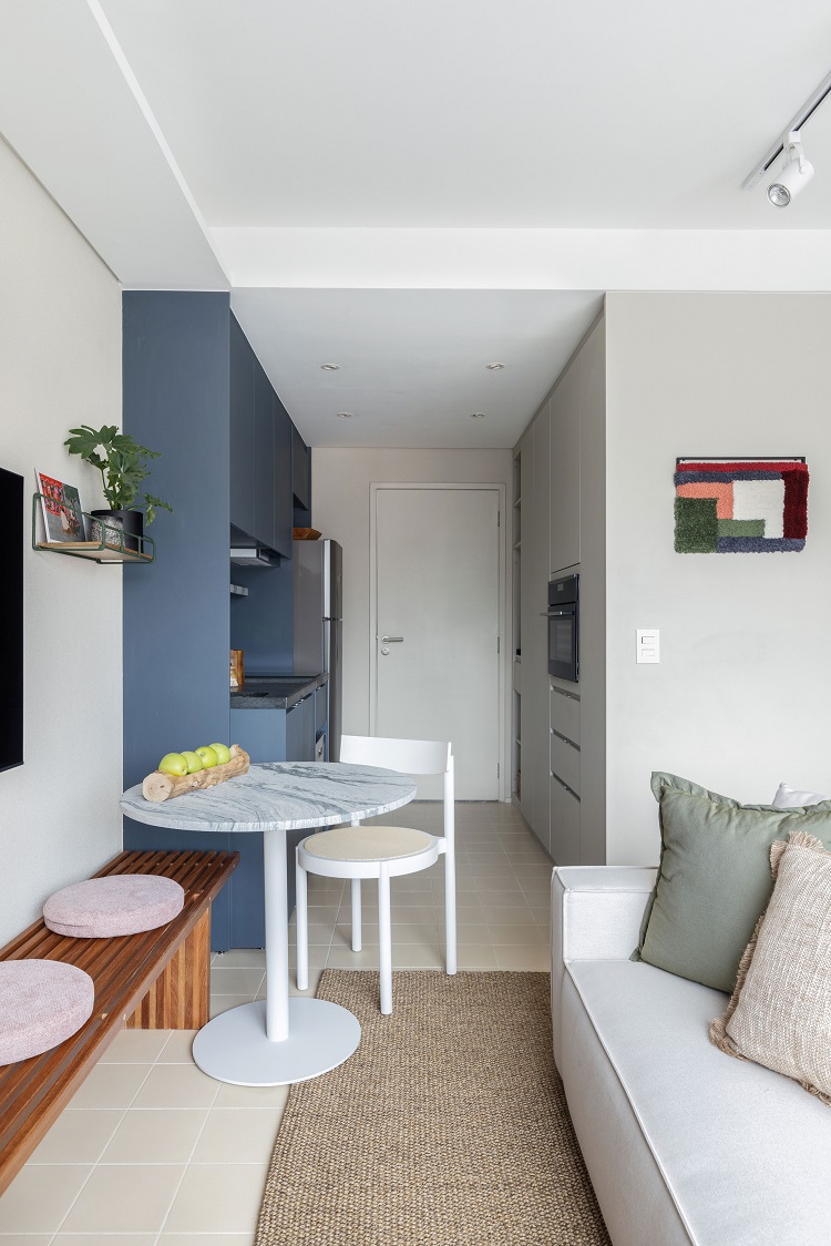
In the transition between the rooms, we included a dining corner by combining the round table (Mezas Mob) with the Gravatá chair (Wentz Design). The slatted wooden bench (Estúdio Volanti) offers more seating spaces.
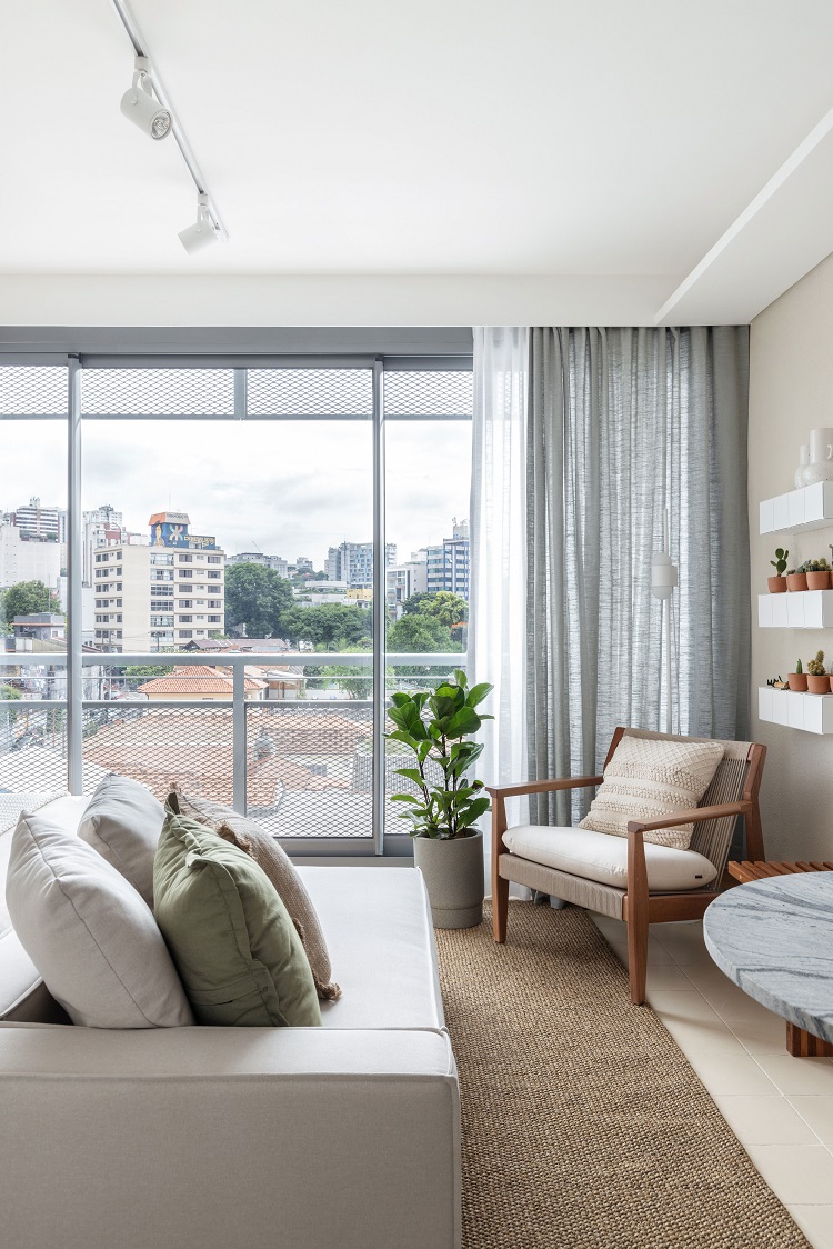
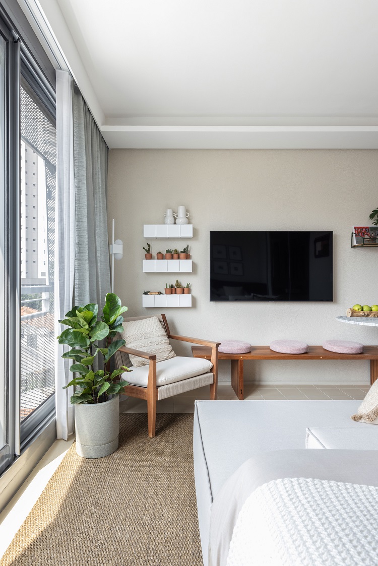
There is a generous entrance of natural light, thanks to the floor-to-ceiling window. So much light makes it inviting to read or just observe the view, seating in the Jardim armchair, by Fernando Jaeger. The floor lamp is designed by Melina Romano for Luxion. On the wall, the Block shelves came from Estúdio Parrado.
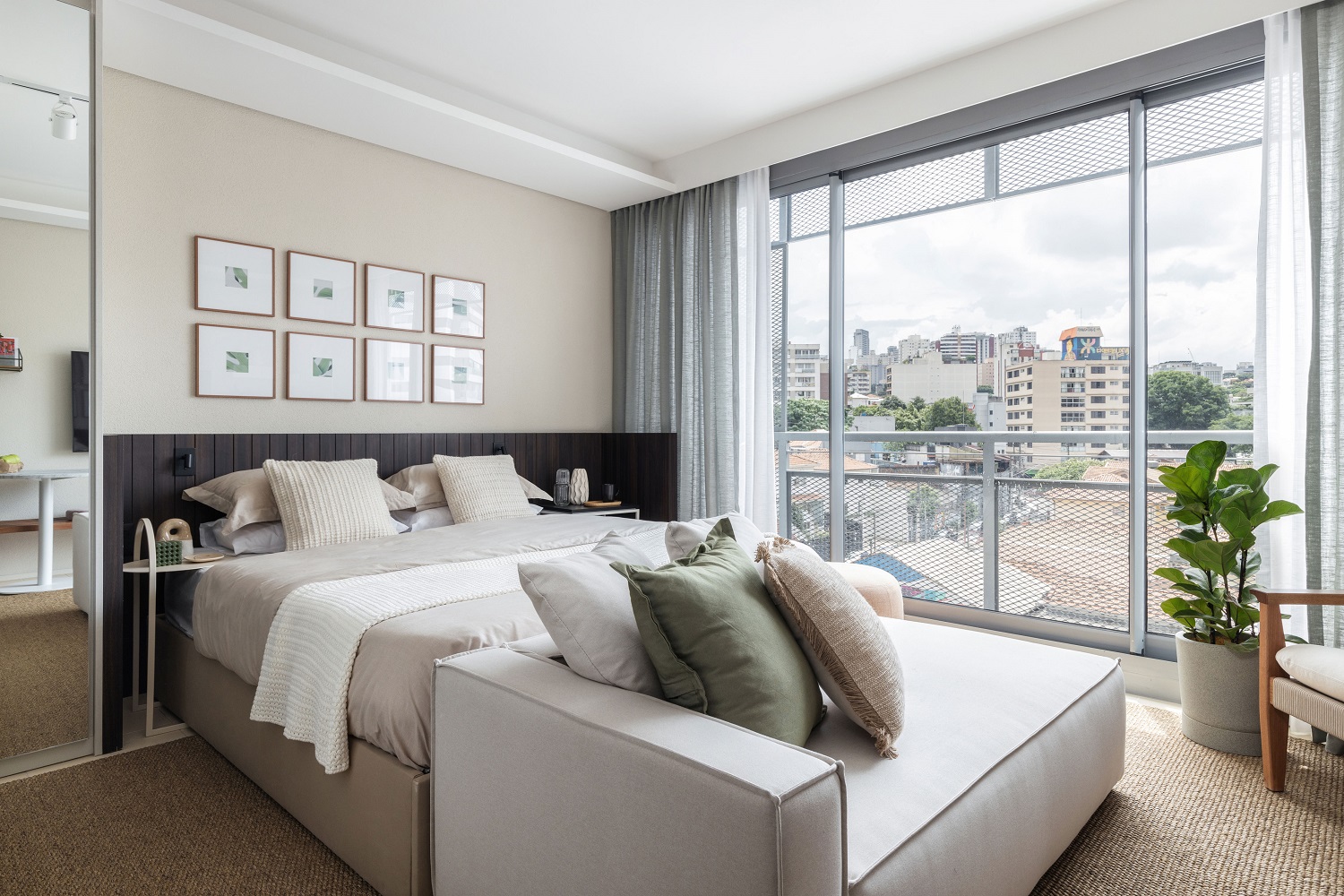
The right sofa was enough to create a living room in the apartment. We looked for a model (Cube, by Estofados WG) that had the same width of the queen size bed and with only one arm – to be comfortable, and at the same time, a piece of modern design. Note the palette in earthy tones and the lighting: the indirect light that comes from the plaster moldings in the ceiling (over the TV and the bed) and the central rail with spots for directional lights.
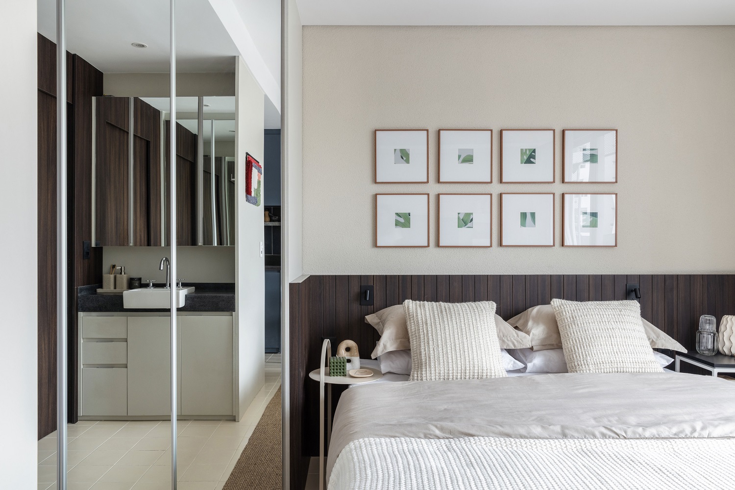
The soft beige tone on the wall behind the bed comes from color Textura Design, by Tintas Coral. We designed a headboard that embraces the two side tables, a subtle way to delimit the sleeping space. The soft night lights come from the sconces Less W, by Lumini. In this photo, we can also see the closet next to the bed, with its three mirror doors.
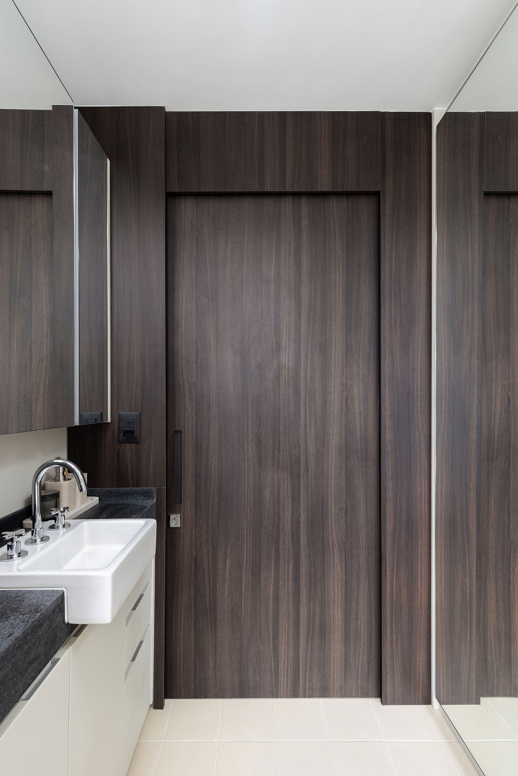
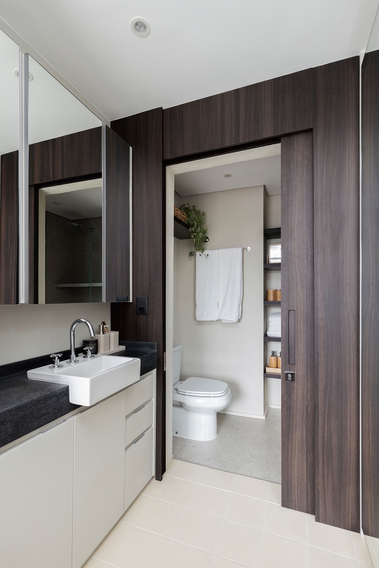
A great practicality for compact spaces is to have the sink out of the bathroom area. Behind the sliding door, there is a toilet and a generous shower box with walls covered with Yass Gray porcelain tiles, by Portobello. The other walls of the bathroom are painted with Textura Design, by Tintas Coral, which brings uniformity to the interiors.
FLOOR PLAN
