MOFARREJ APARTMENT
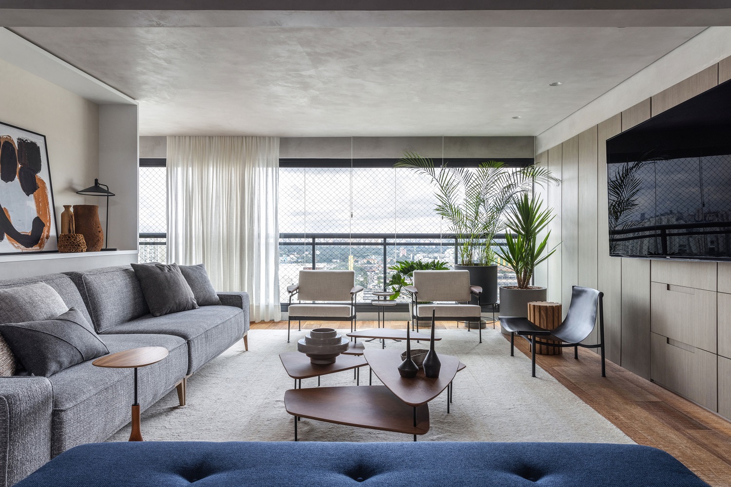
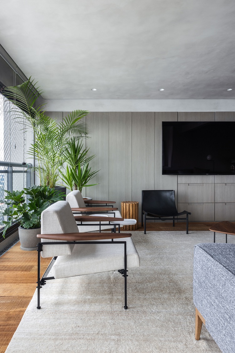
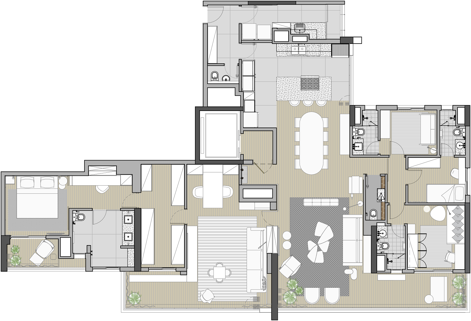
In this refurbishment project of 240 m² (previously two apartments of 153 m² and 87 m²), in São Paulo, the connection started with the balconies, which outline the social area, and had the help of the gray palette – a choice of the residents that reinforces the identity, now unique, of the new home. The blue bench in the foreground and the sofa came from Lider Interiores. Coffee tables by ,Ovo and black leather armchair by Jader Almeida. In the background, the pair of armchairs Beto is a 1958 creation signed by designer Sergio Rodrigues.
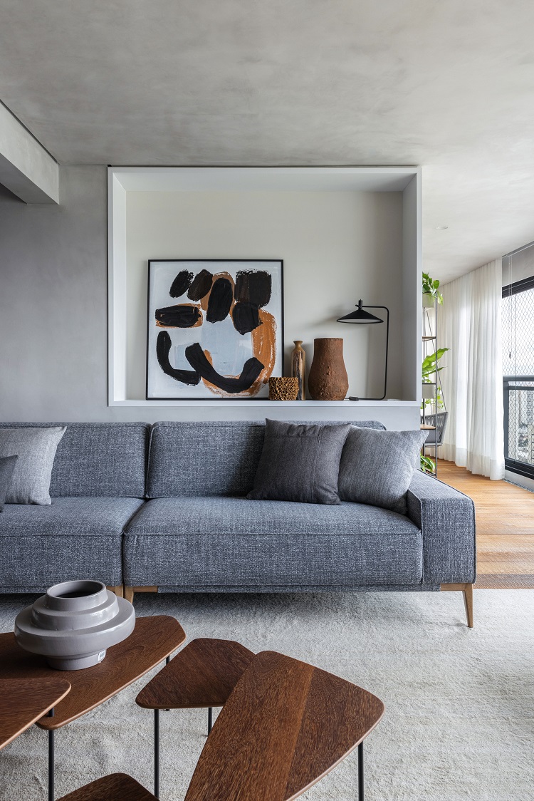
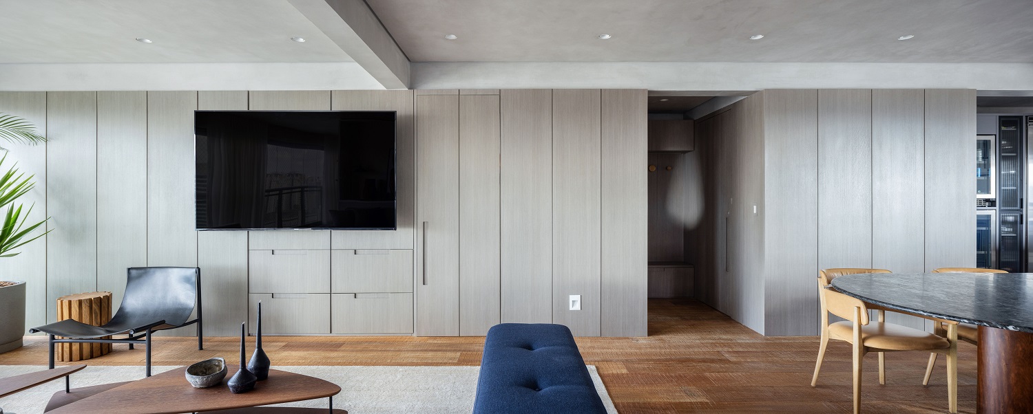
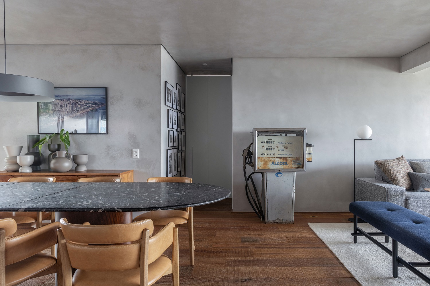
Combining two spaces brings challenges that can be surprising. The niche behind the sofa, for example, was designed in order to compensate the unevenness created by the volume of the washroom, which is behind the neighboring wall. At night its internal lighting gives a soft light to the space and highlights the decorative objects. We used wood veneers (pattern Linheiro Chumbo) to finish the cabinetry of the living room (executed by Maria Joaquina Marcenaria). Ceiling and walls are covered with a burnt cement texture. The floor is composed of reclaimed cumaru wooden planks (Indusparquet) to make the space cozier.
Joining two apartments seems like a simple solution for those who need more space. Smoothing the transitions of spaces and redesigning rooms that repeat themselves, however, requires double attention to functionality
– MAURICIO ARRUDA,
SÓCIO DA TODOS
The dining room is right after the gas station. The unusual item is a residents’ finding that is used as an art installation. The access to the private area has a wall covered by family portraits. Dining table by Jacqueline Terpins for Dpot, chairs by Lider Interiores.
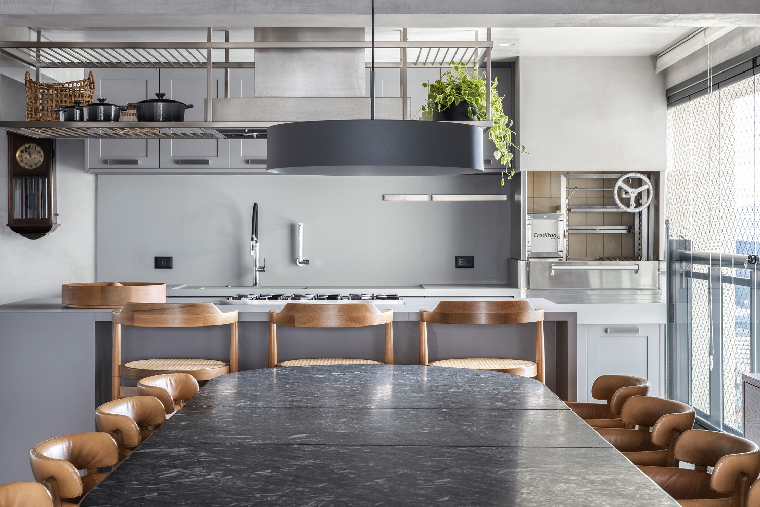
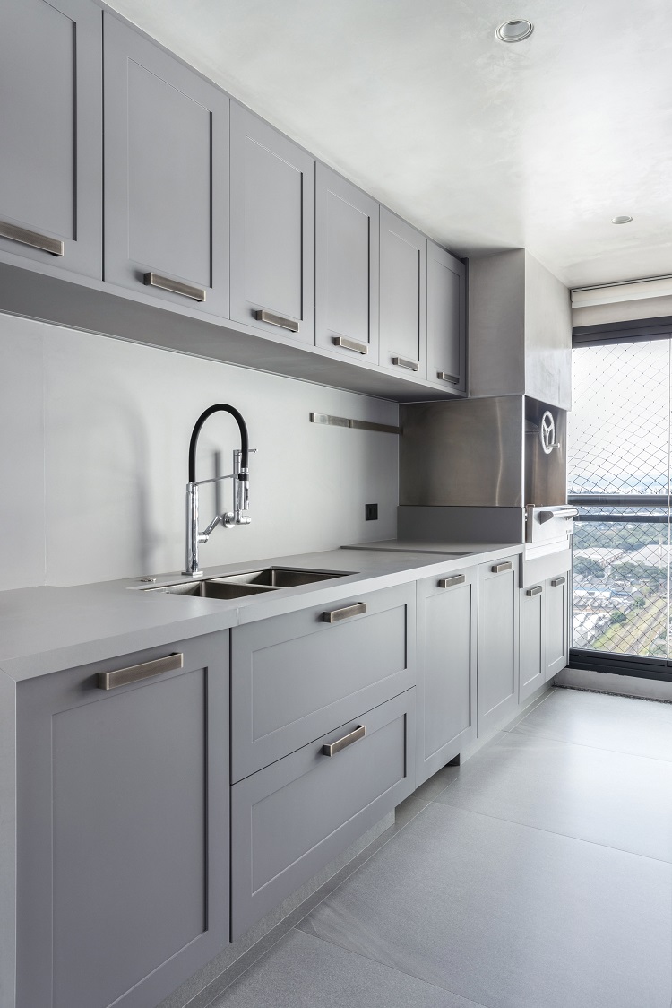
Connected to the social area, the kitchen also reveals that part of the balcony now belongs to the interior of the apartment. The grill, for example, is subtly integrated into the sintered stone countertop.
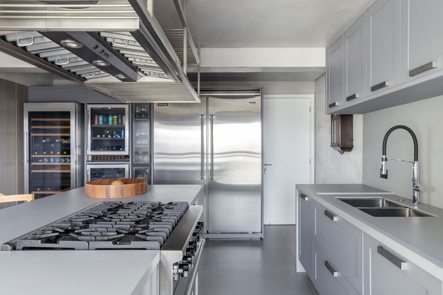
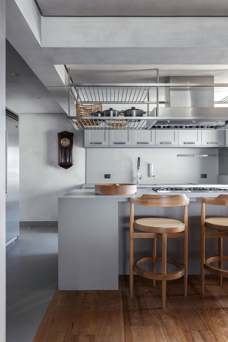
Monochromatic, the kitchen has a wall of appliances on the left and a preparation countertop on the right, next to the grill. The porcelain tiles flooring makes the cleaning easier (model Stone Valley White MT, by Roca) and the cabinetry has a shaker finish, with simple frames on the doors and drawers. Bar stools around the island are from Ameise Design.
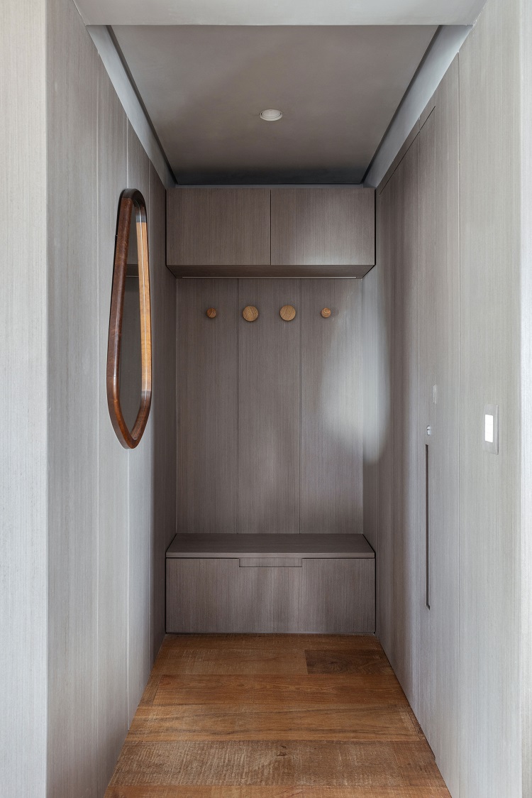
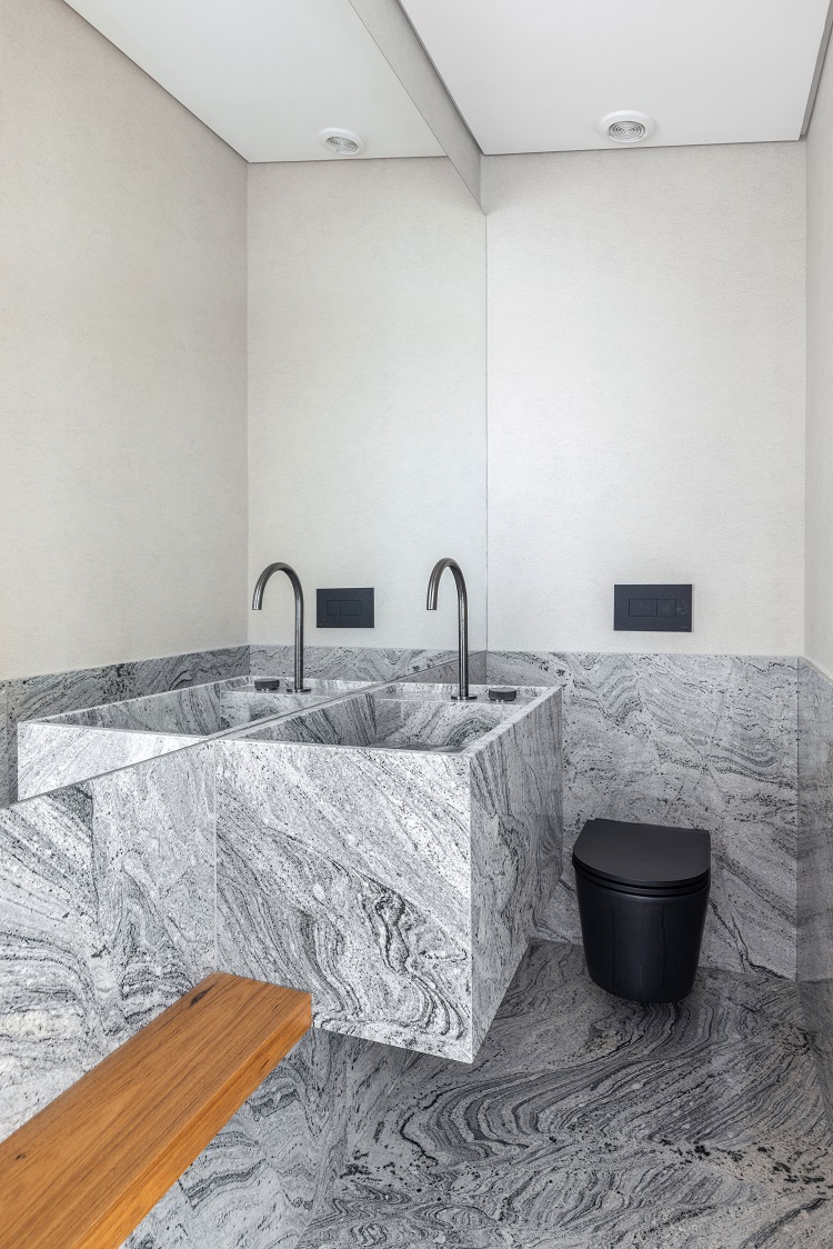
A small entrance hall concentrates useful resources for the family’s routine: a bench, a shoe rack, coat hooks and a mirror help the residents organize themselves when arriving and leaving the apartment. The elegance of the exotic natural stone is the great attraction of the washroom. Here the granite Antartic White, by Brasigran, is used on the floor, on half-height of the walls, and on the sculpted sink.
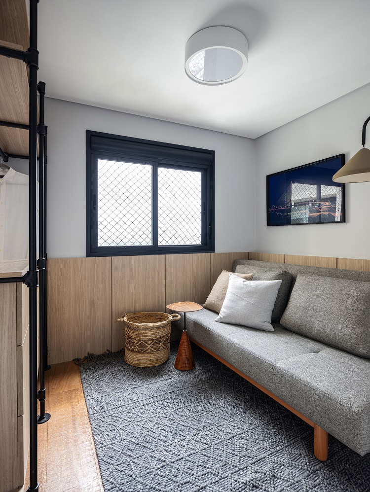
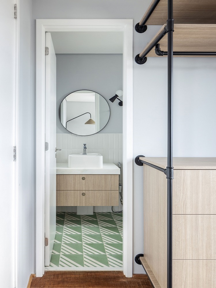
The new layout provides an en suite for guests. An open closet that combines metalwork and woodwork holds clothes and objects. Sofa bed by Fernando Jaeger. In the bathroom, the floor features cement tiles Geraldo, by Mauricio Arruda for Ladrilar.
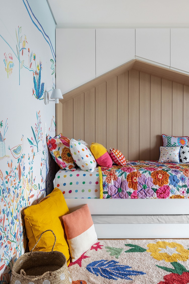
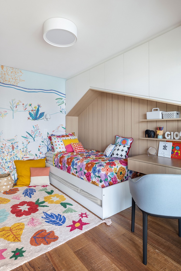
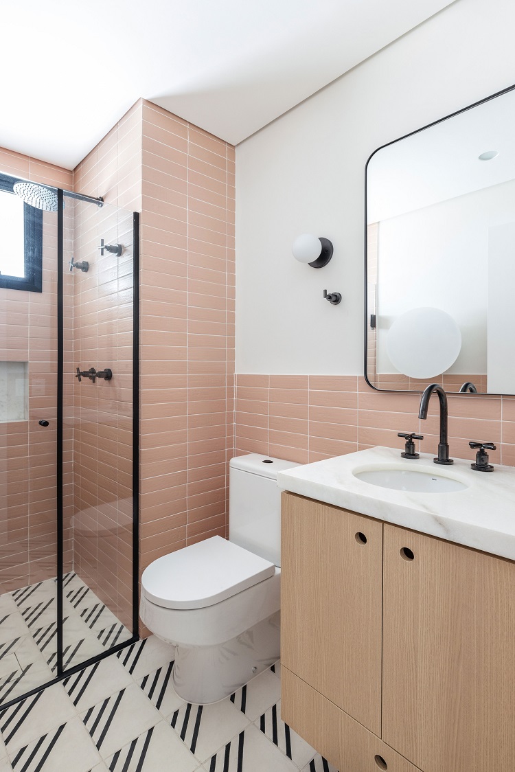
The girl’s bedroom takes advantage of the well-designed cabinetry that puts many cabinets over the bed inserted in a niche with a house outline design. The bathroom repeats the soft pink shade of the bedroom in the wall tiles (model Liverpool Flamingo, by Portobello). On the floor, the cement tiles are the same model of the guest bathroom (model Geraldo, by Ladrilar), in a different color.
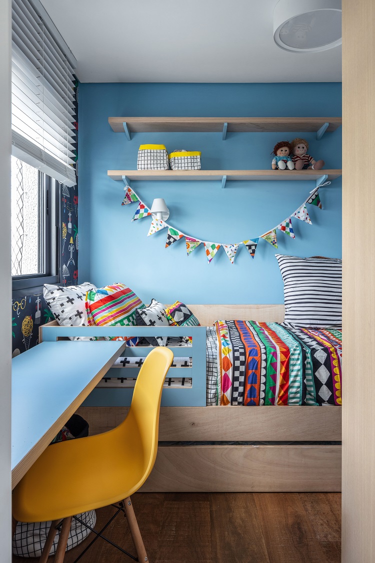
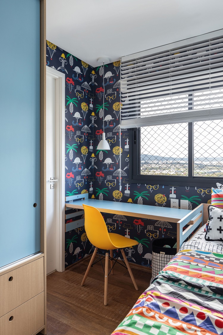
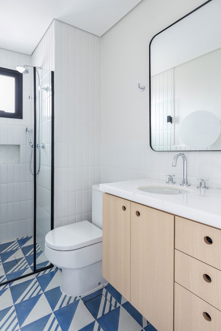
A world of colors inhabits the boy’s bedroom, that features wallpaper from Branco Casa and furniture that is height adjustable. Bed linen from Mooui. In the bathroom floor, cement tiles Geraldo, from Ladrilar, now in a blue and white version.
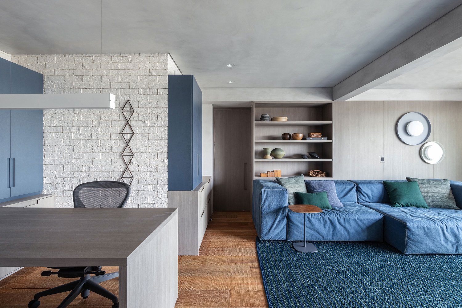
Workstation and TV room share the same space, which provides a splash of blue to the apartment palette. In the office area, table and part of the cabinetry are finished with laminate Sirena, by Duratex. In the living corner, the generous Lego sofa is from estudiobola. On the floor, the rug from Cia. das Fibras combines two shades of nautical rope.
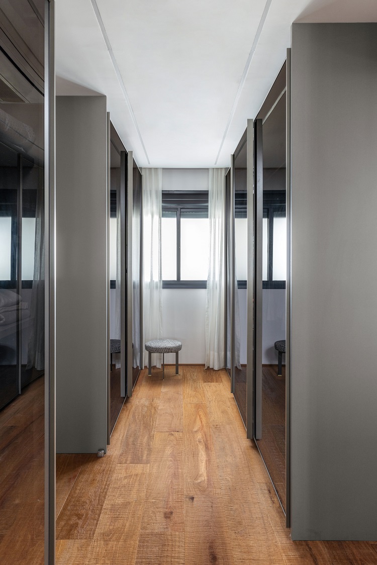
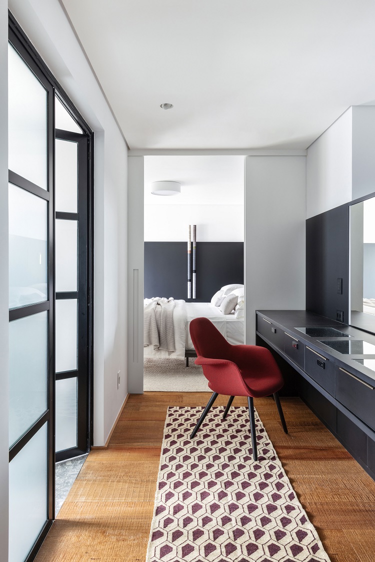
With a private area exclusively for the couple, it was possible to design a double closet with generous dimensions (note the reflective glass doors). On the passage to the bedroom, a dressing table with lighting serves the woman. The armchair Organic is from Micasa.
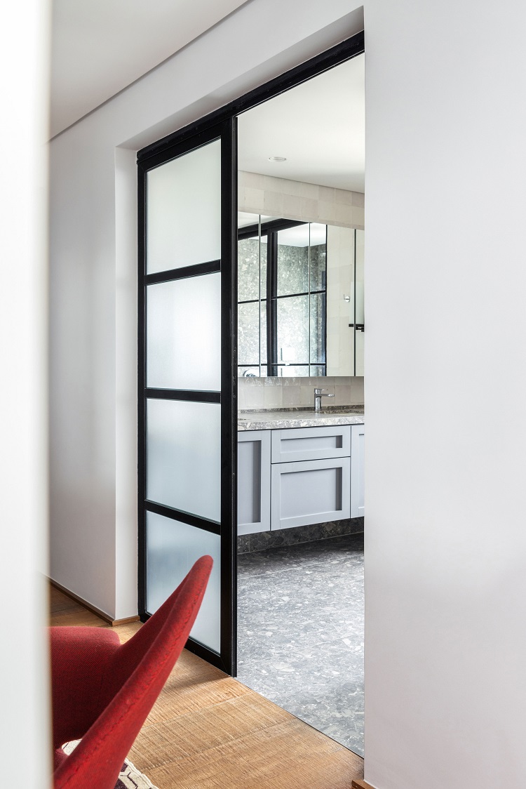
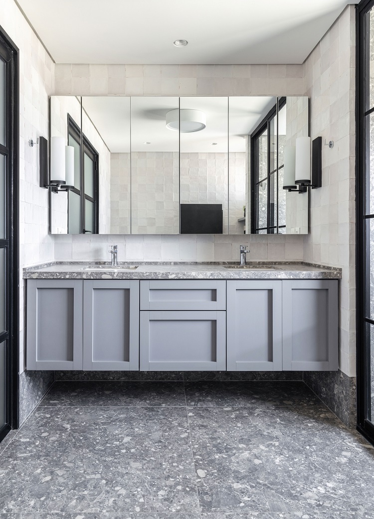
Floor, countertop and wet area of the shower box feature the same porcelain tile (model Pietra Lombarda Grigio, 90 cm x 90 cm, by Portobello). The medicine cabinet with mirror doors designed by our team hangs on the wall covered with off white tiles Casablanca Nuage, 12,5 cm x 12,5 cm, also by Portobello. Sconces by Goldenart.
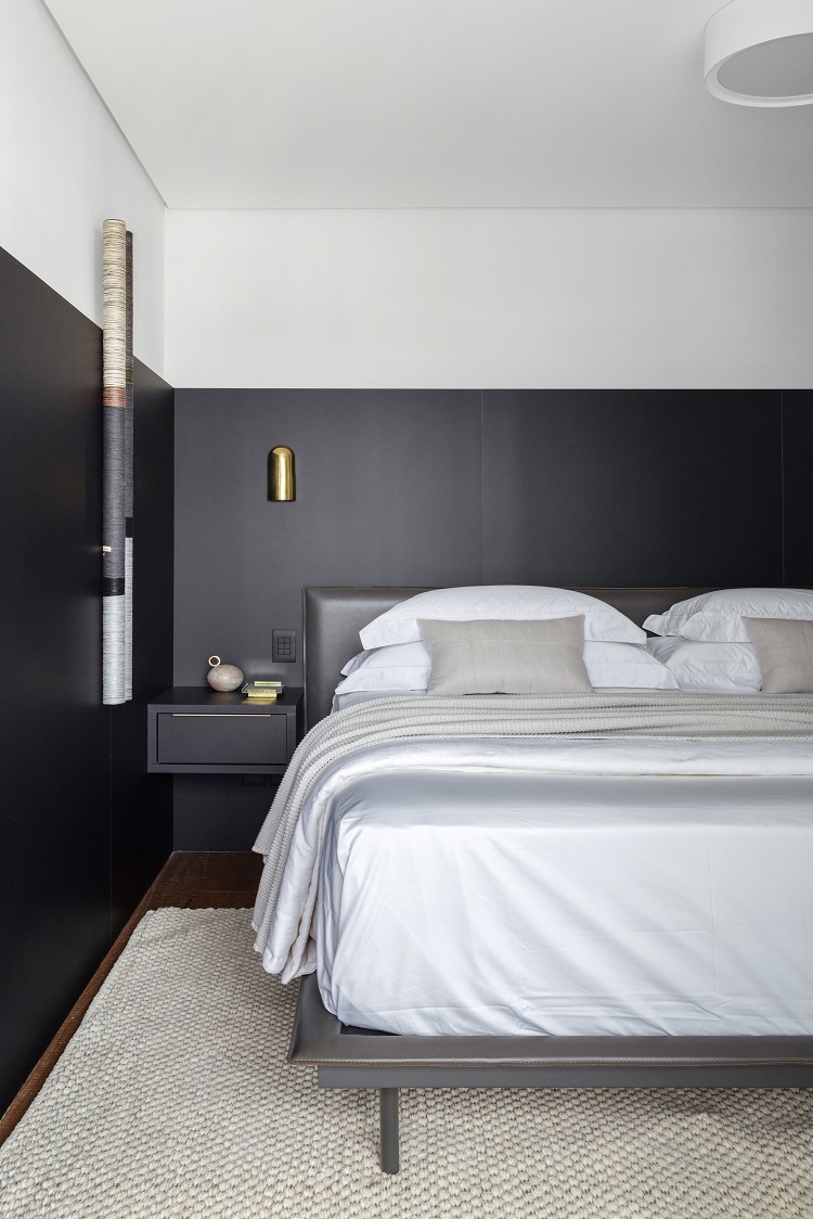
The wall paneling that frames the bed adds an extra layer of texture to the sleeping corner. Golden sconces from Estudio Orth.


