LEAF LOEFGREN APARTMENT
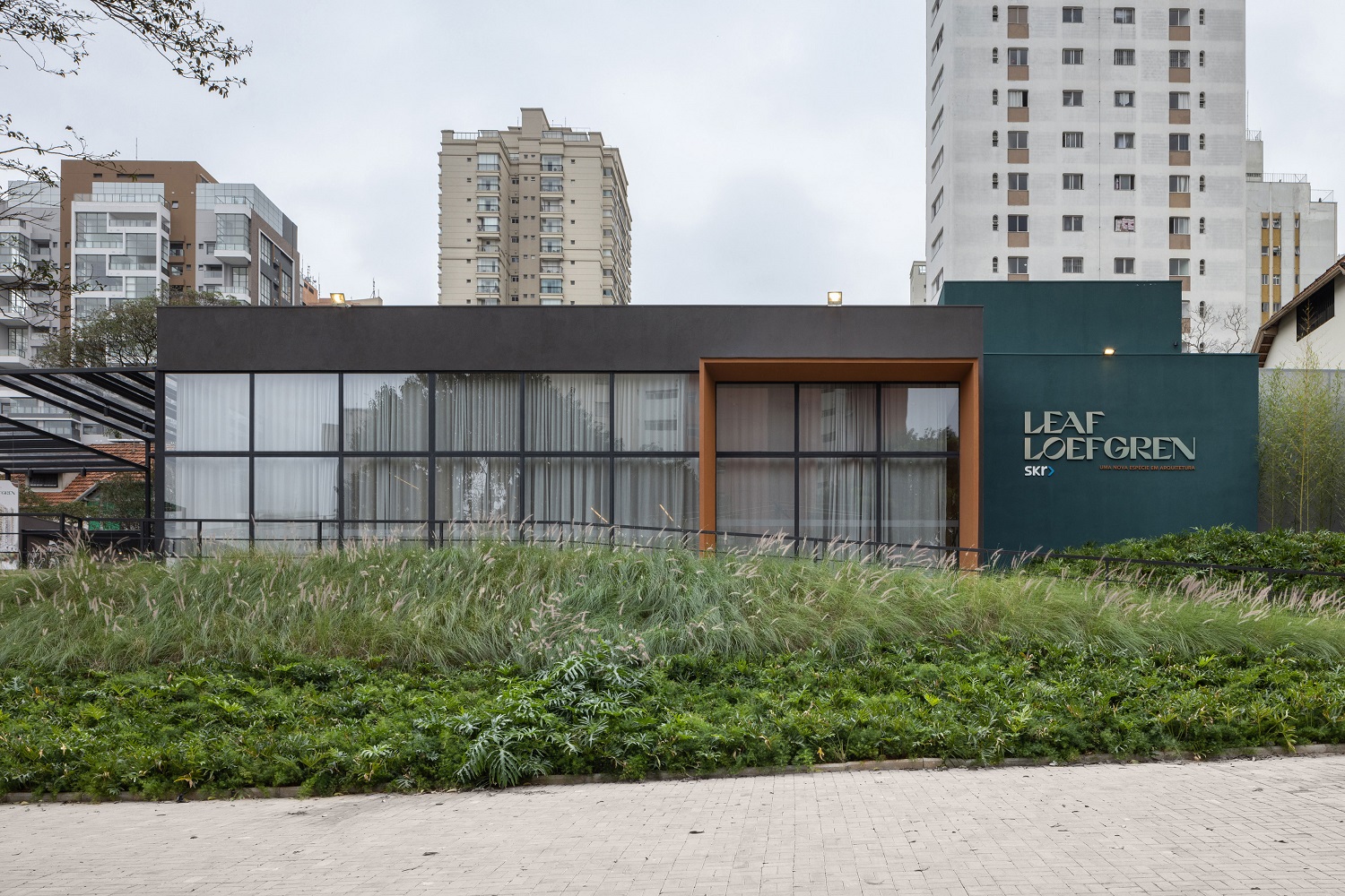
Natural ipe veneer in the cabinetry, mashrabiya panels opening the way to the kitchen, the shade of dark green spreading throughout the apartment, many pieces of brazilian design: we gathered all these traits of Brazilianness in the interior design of this 160 m² apartment in São Paulo, in the Leaf Loefgren building, SRK’s new estate project in São Paulo.
The well-designed layout offers a large living room, which we divided in two spaces – one of them features a workstation – and we also integrated the balcony into the social area. The private area has three en suites and plenty of storage space. Brazilian ornamental stones appear as a prominent element in the bathroom and in the kitchen, highlighting the value of another national product.
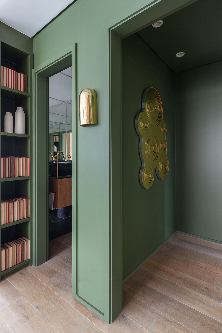
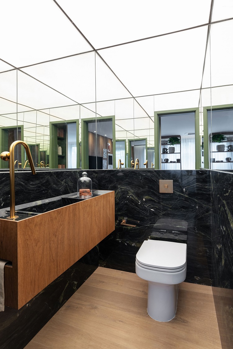
Folha de Louro, by Tintas Coral, is the shade of green that colors the entrance hall of the apartment and welcomes guests. The mirror – which is a work of art – has the signature of Estúdio Rika. We believe that the toilet is a great space to dare, at least a little. Here, we chose polished Vitória Régia marble to cover the walls and to shape the carved sink. The cabinet is covered by ipe veneers, the same material that appears in the social area. The ceiling presents a diffuse lighting fixture made with tensioned canvas.
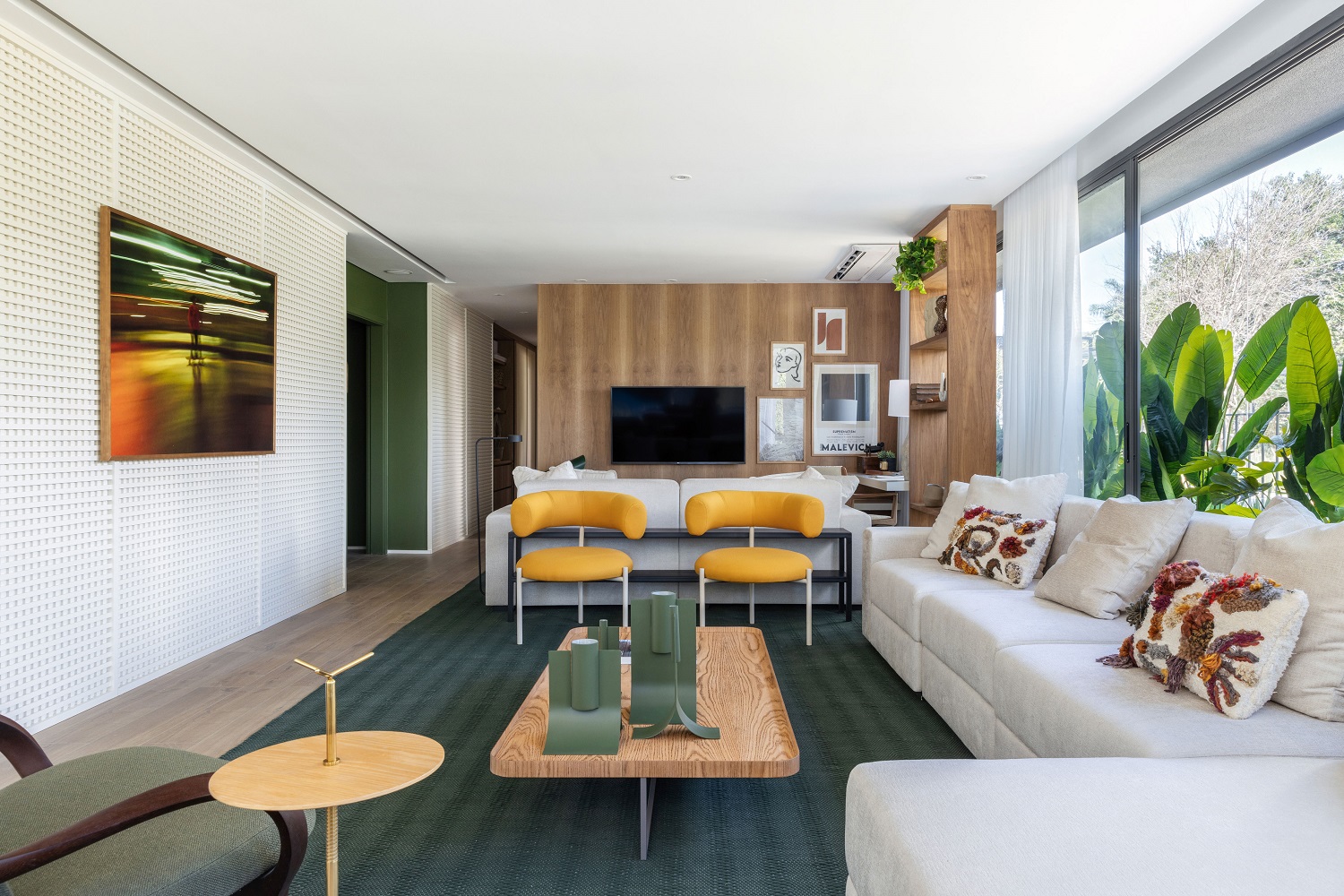
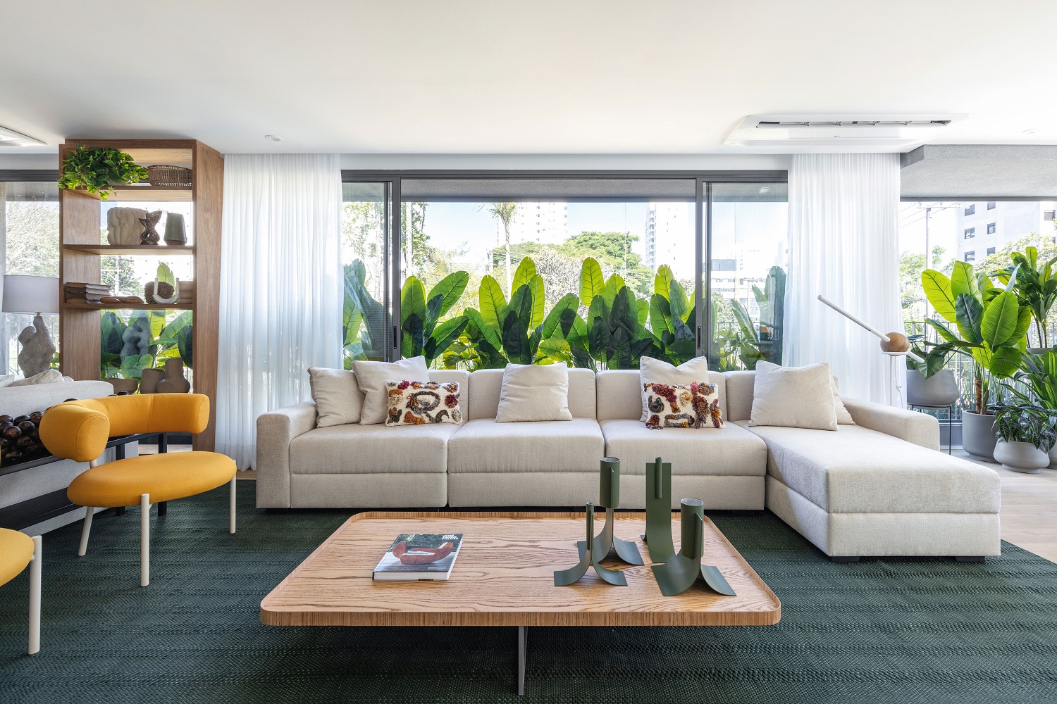
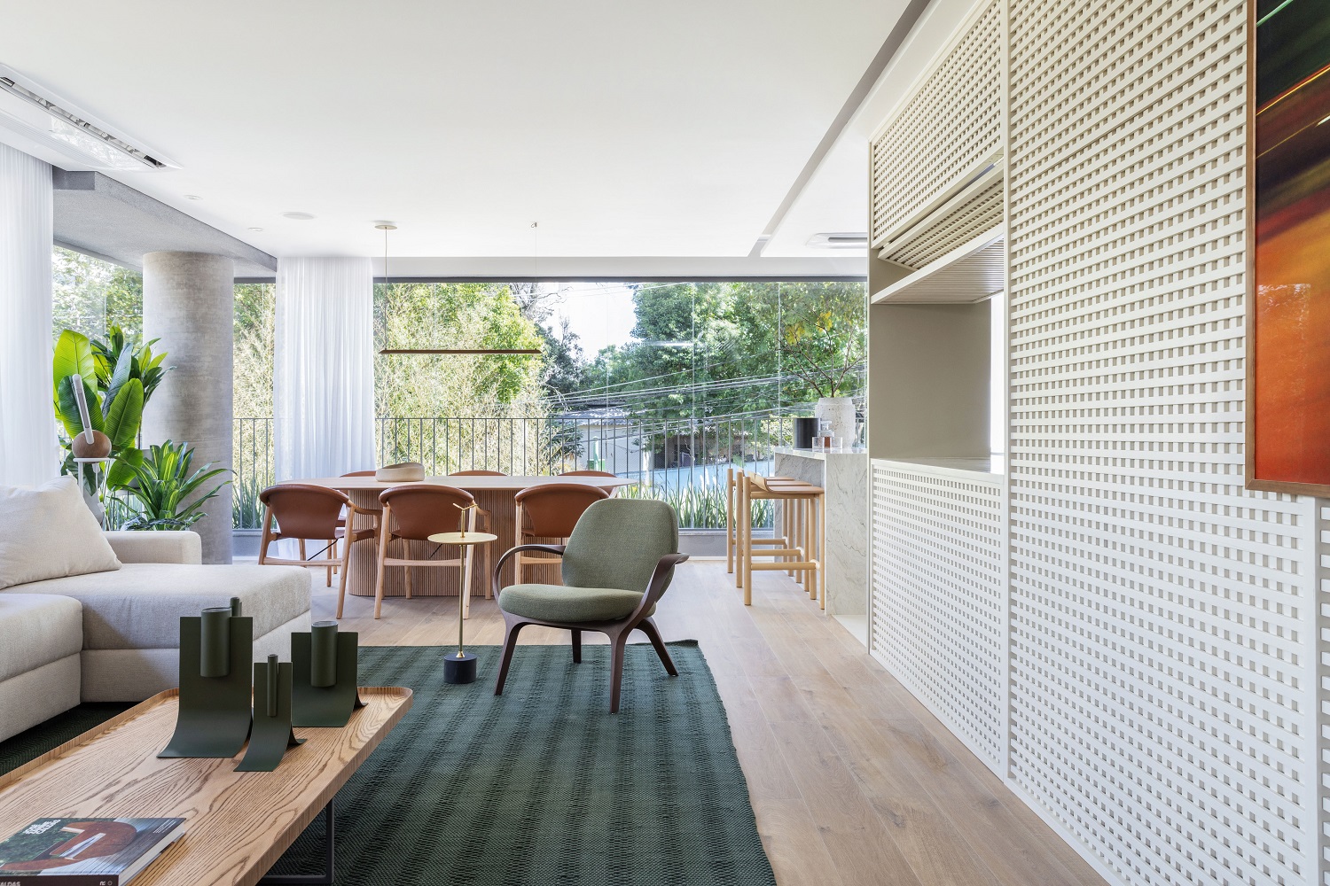
Lacquered mashrabiya on the left, ipe panel in the background, green rug that follows the color palette of the entrance hall – everything seems to be in balance in the living room, in its two areas. The yellow armchairs are by Roberto da Mata and the cushions are from Oiamo Design. Rug by Cia das Fibras.
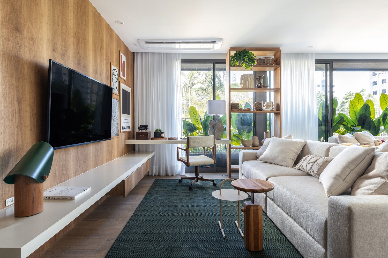
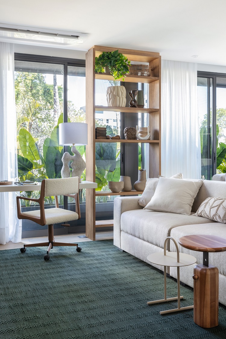
Next to the access to the private area, this corner has a TV and a workstation. The floating shelf that fulfills the role of a support and bench is made of quartz slab, the same material used to compose the table in the small workstation. Note that the rug is the same along the entire social area. Swivel chair by Casa de Alessa with bouclé fabric from M Decol Home
We created an apartment for people to connect. We seek inspiration in traces of colonial architecture, but with a modern mix and a lot of brazilian design
– MAURICIO ARRUDA,
ASSOCIATE AT TODOS
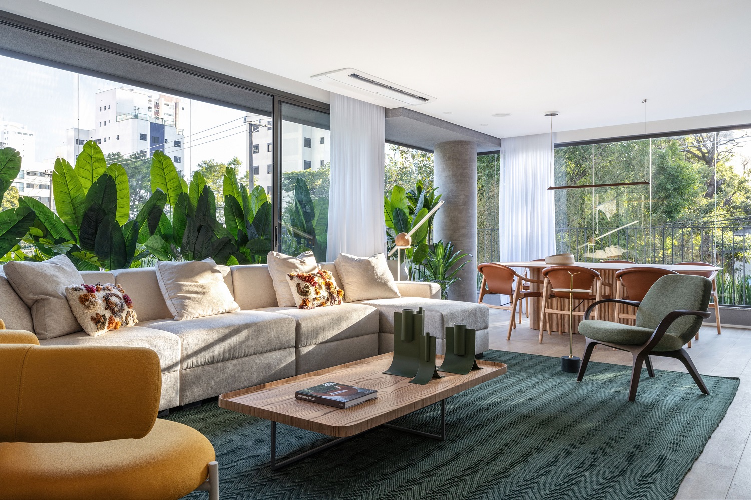
In this project, we integrated the balcony to the social area, letting the laminate flooring (Carvalho Natural Soft pattern, by Quickstep) advance until the glass panels. Originally, the social area ended with the mashrabiya panel – which gained a horizontal articulated shrimp window that allows the kitchen to be isolated when necessary.
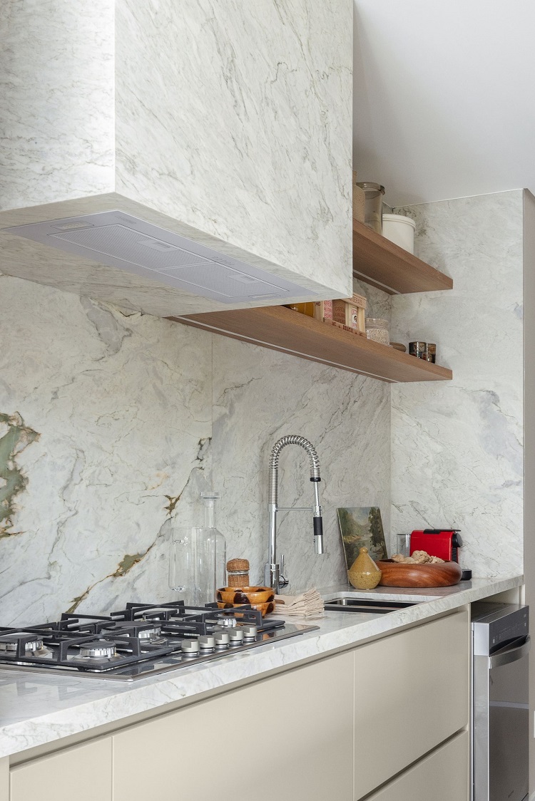
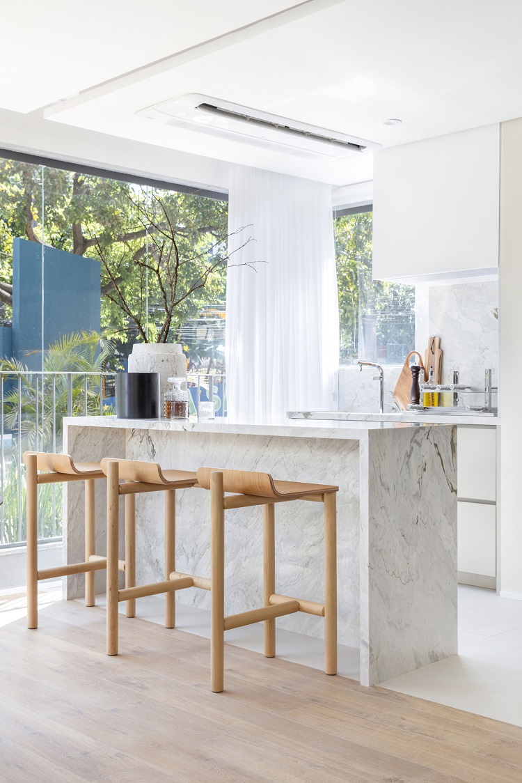
We choose Branco Paraná, a dolomitic marble that offers adequate physical and chemical resistance for this kitchen. We also applied a good protective resin over the surface. The high backsplash and the range hood box are made of the same marble. The stone appears again in the project, this time in the grill area. On one side of the island counter, there are wooden stools to welcome guests by Mais 55 Design; on the other, there are shelves to support kitchen accessories.
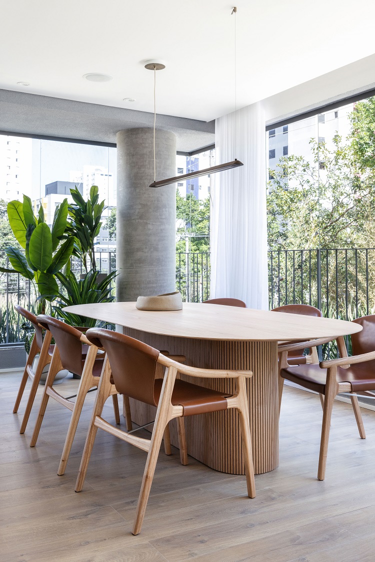
The dining room advances to the integrated balcony area and serves both the social area and the relaxing space. The table with rounded edges came from Wooding and the leather chairs are by Lider Interiores. Pendant light by Ana Neute for Items.
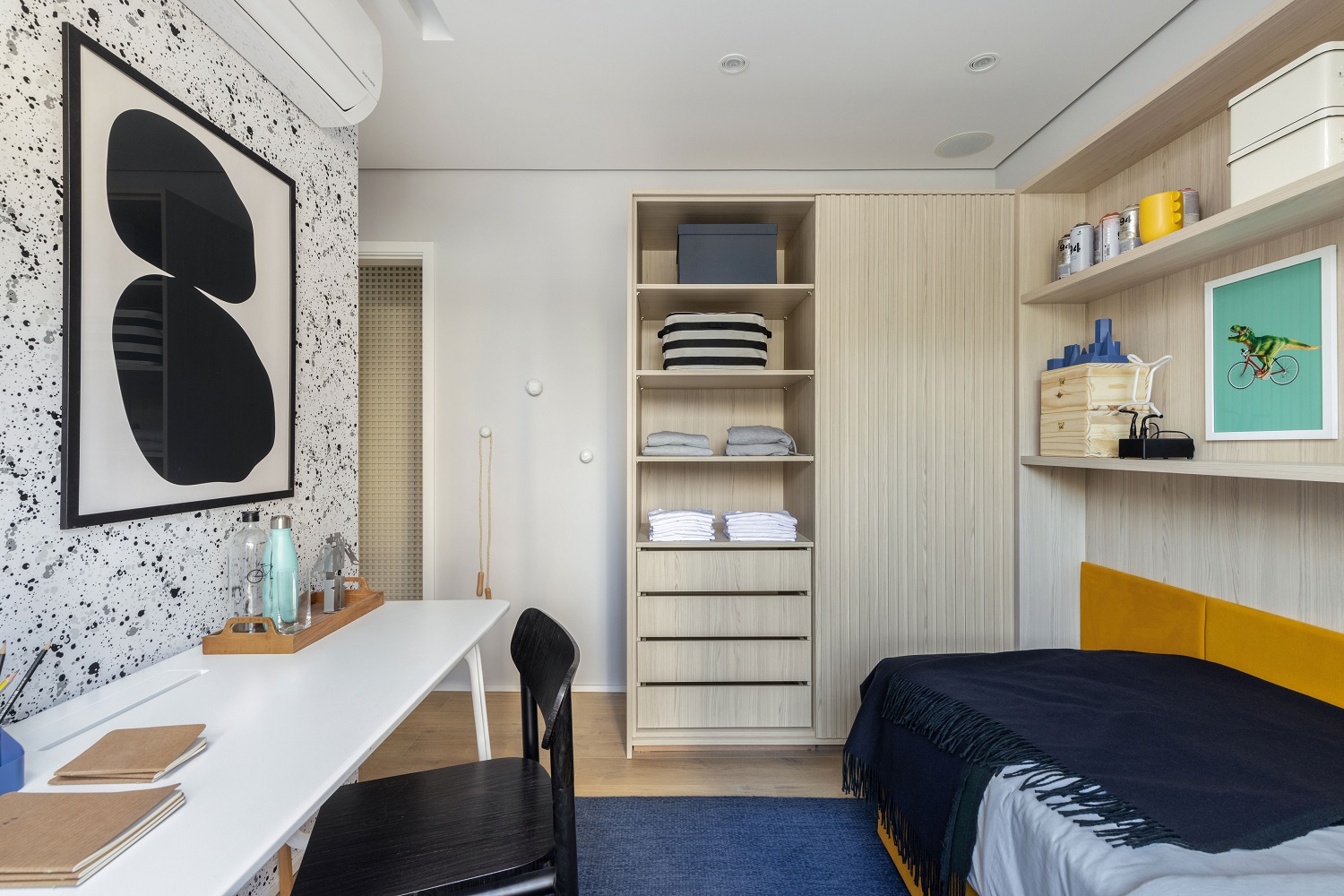
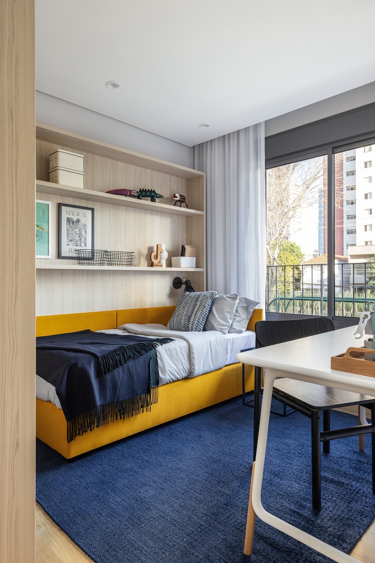
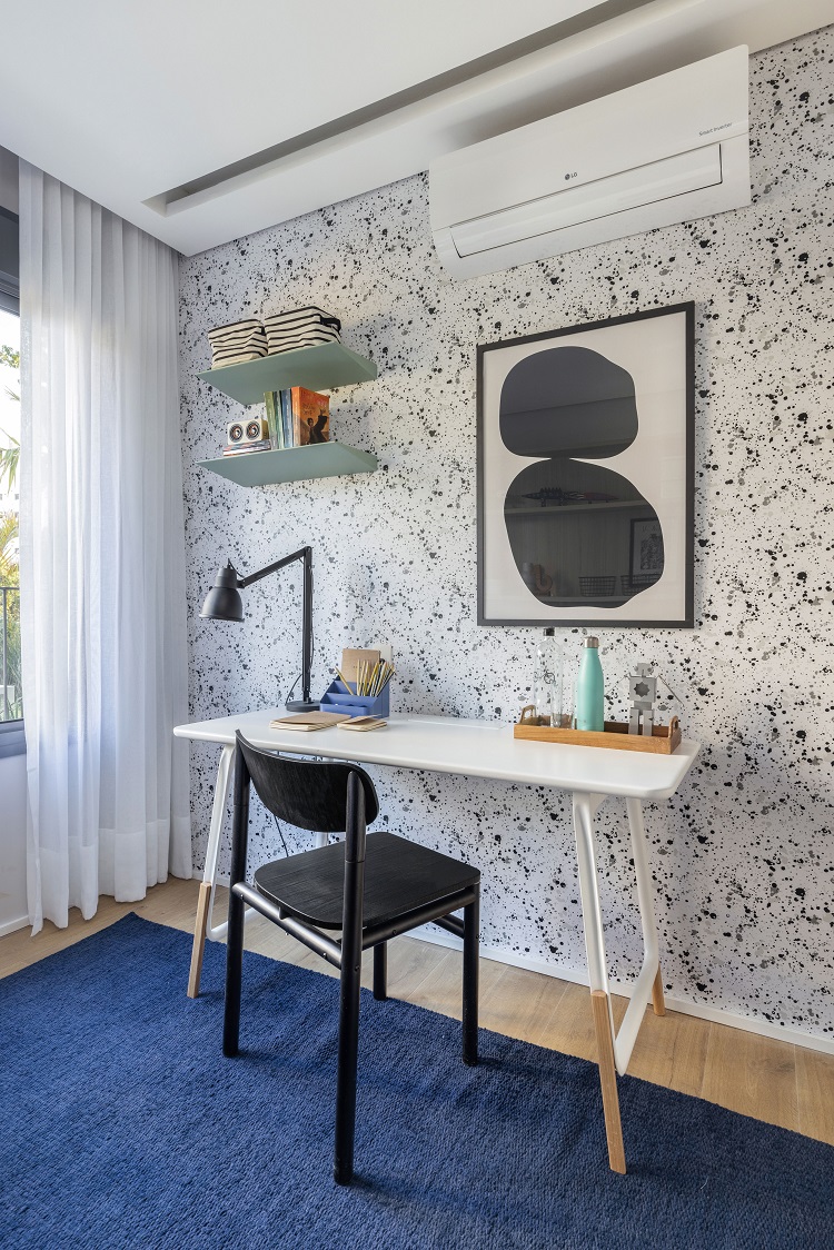
We designed the first en suite for a teenager who loves practicality, that is why there are open cabinets which allow easy access to books and decorative objects. The headboard is upholstered with mustard canvas. The desk came from Jabuticasa and the wallpaper from Branco Casa.
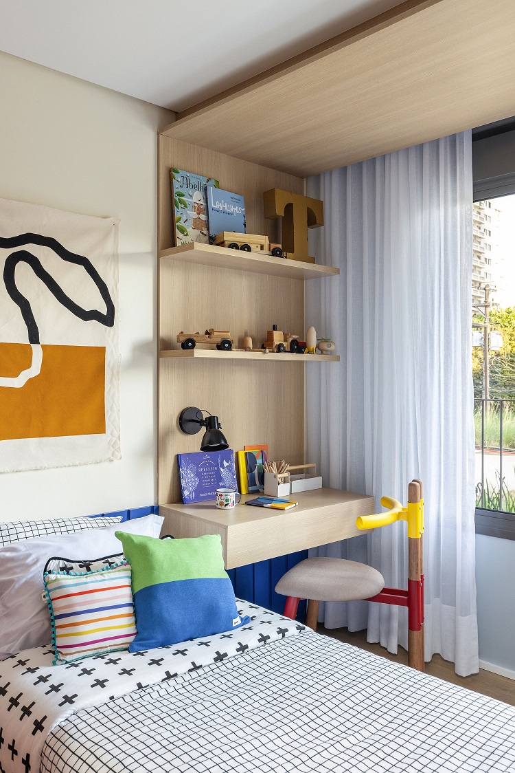
The second en suite, idealized for a kid, repeats the practicality with shelves on one side and pegboard on the other, both placed under the porch by the window. Above it, the LED strip lighting produces a soft diffused light.
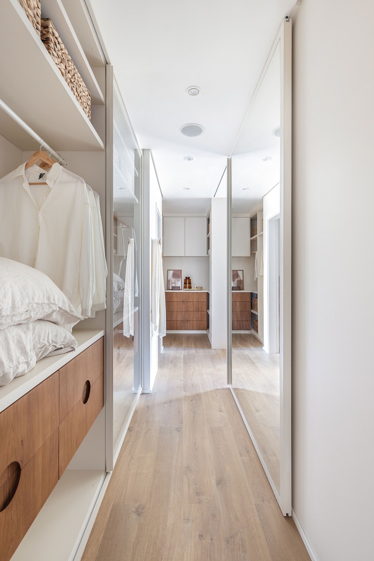
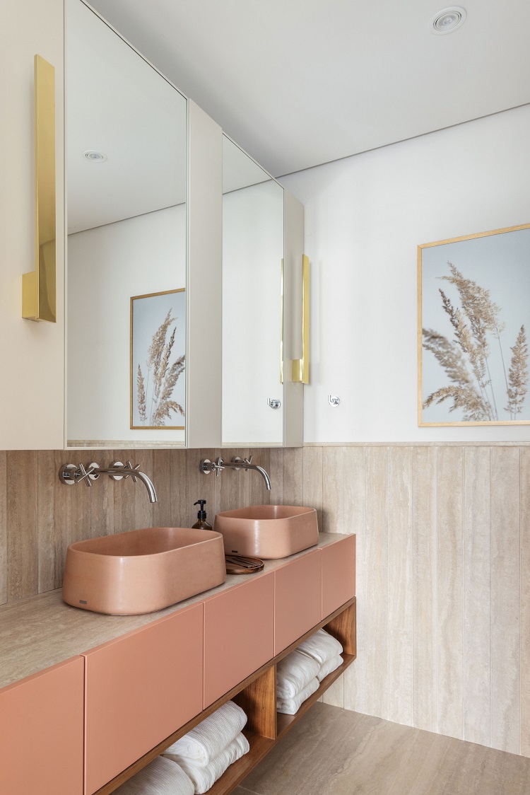
At the entrance of the master bedroom, the hallway presents side closets with glass doors. On the opposite side, the mirror also runs on rails – and opens or closes the passage to the sleeping area. Another elegant version of natural stones: we chamfered the marble slabs and arranged the veins vertically, creating a finish that looks like a wainscoting. The pink vessel sinks are made of cement, by Konkre Design. Finally, the cabinetry is painted in a tone similar to the color of the sinks, and the niches at the bottom are composed by wooden slats. Over the countertop, on the wall, there are mirrored cabinets designed by our team.
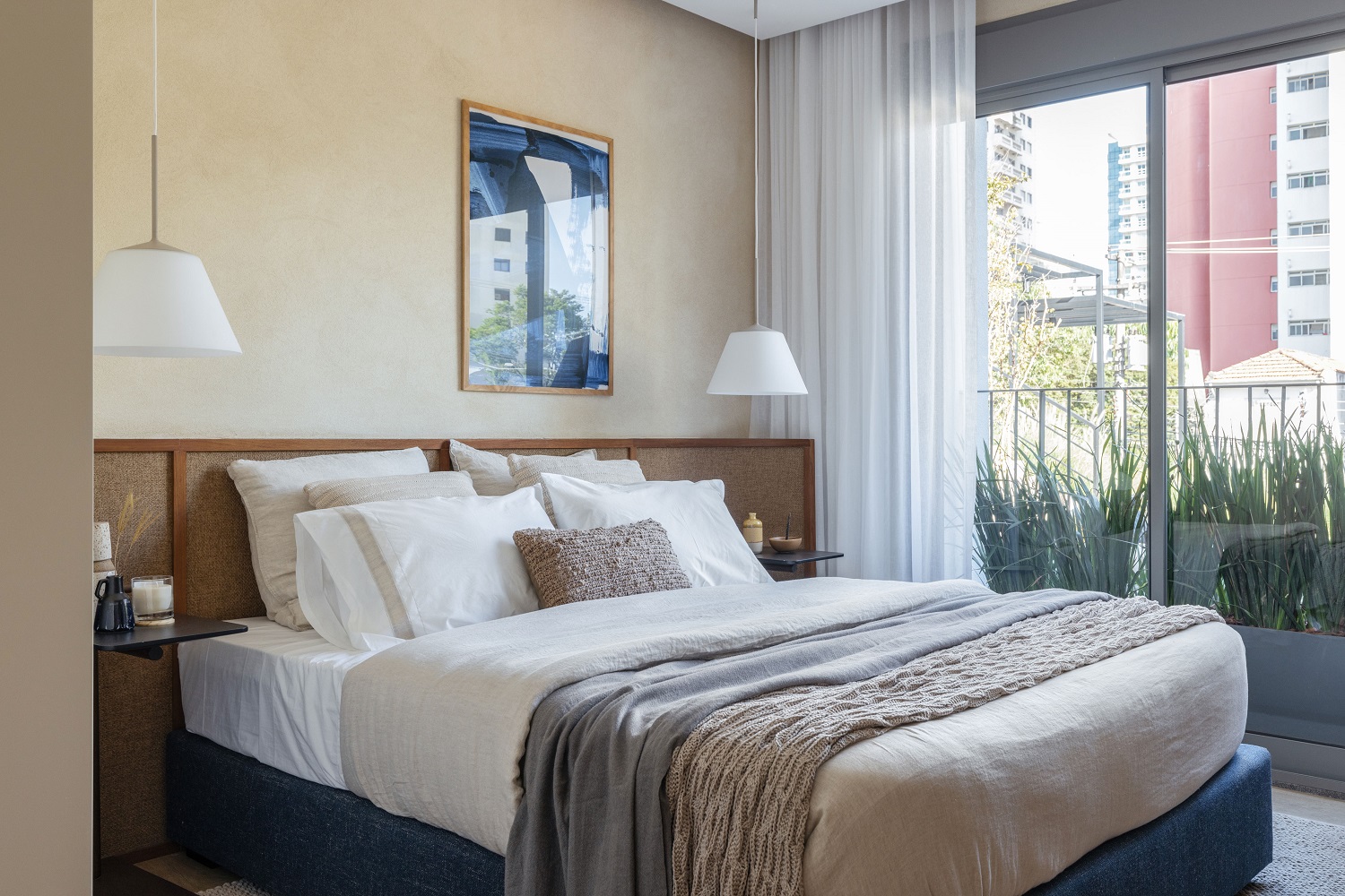
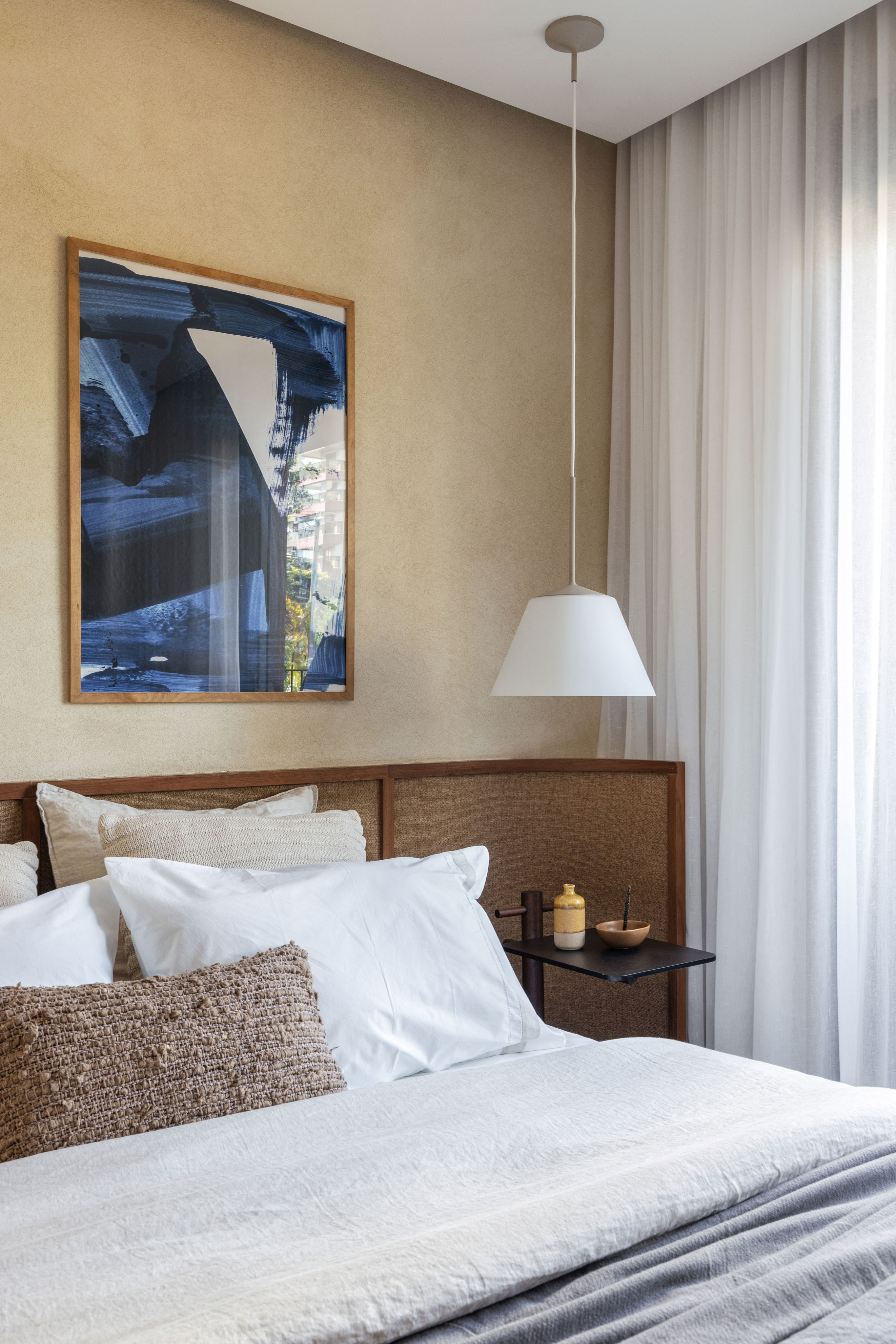
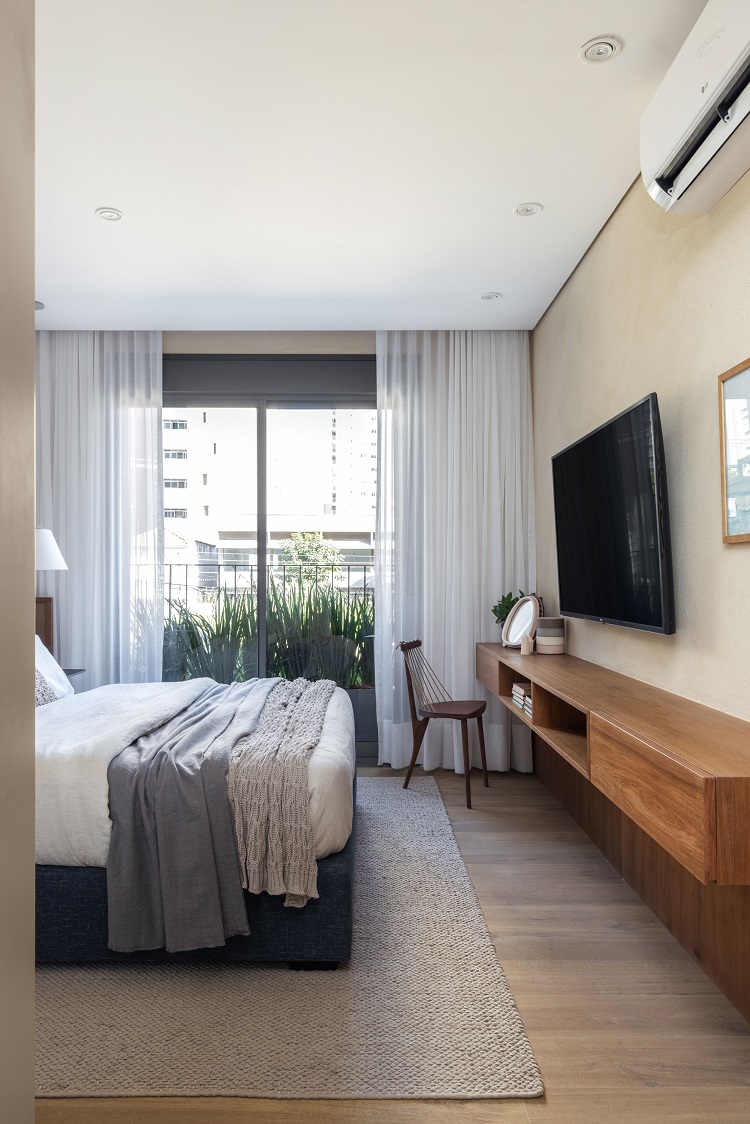
To have a more welcoming atmosphere in the room, we used layers of textures. Starting with the one applied to the wall (color Stuccato 732, by Terracor), followed by the curved headboard with a bouclé fabric in a shade of brown that involves the bed and the side tables – a piece designed by us. On the opposite wall, space was left to include the floating cabinetry that serves a small dressing table and storages the TV equipment. Pendant lights by Lumini and bed linen by Zara Home. Chair by O Ebanista.


