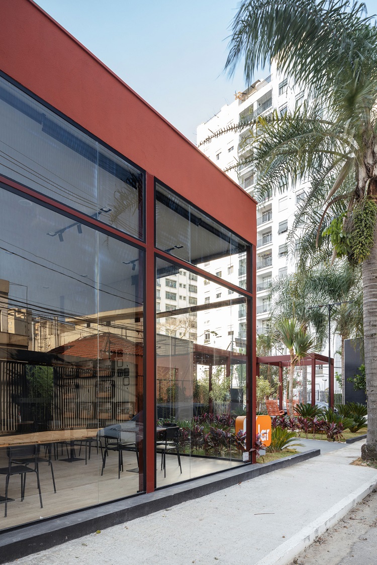
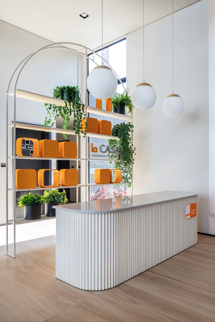
LA CASA PÁSSAROS
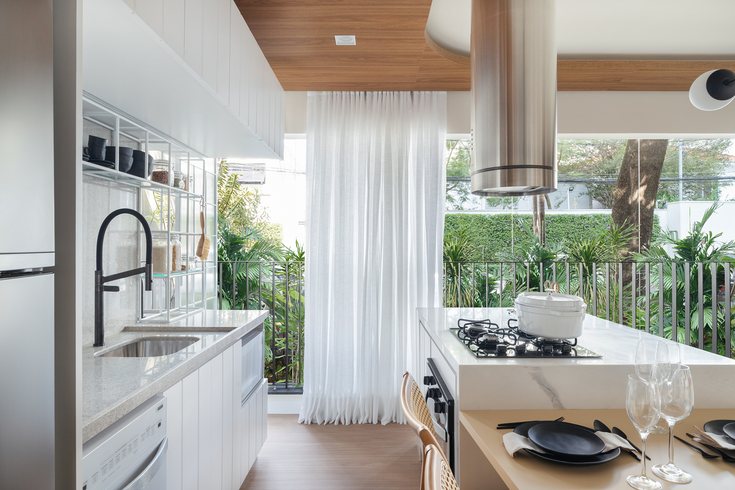
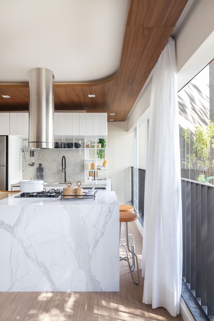
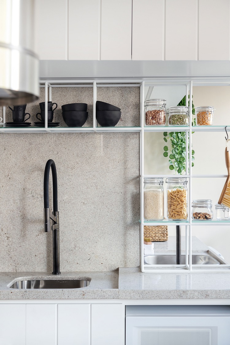
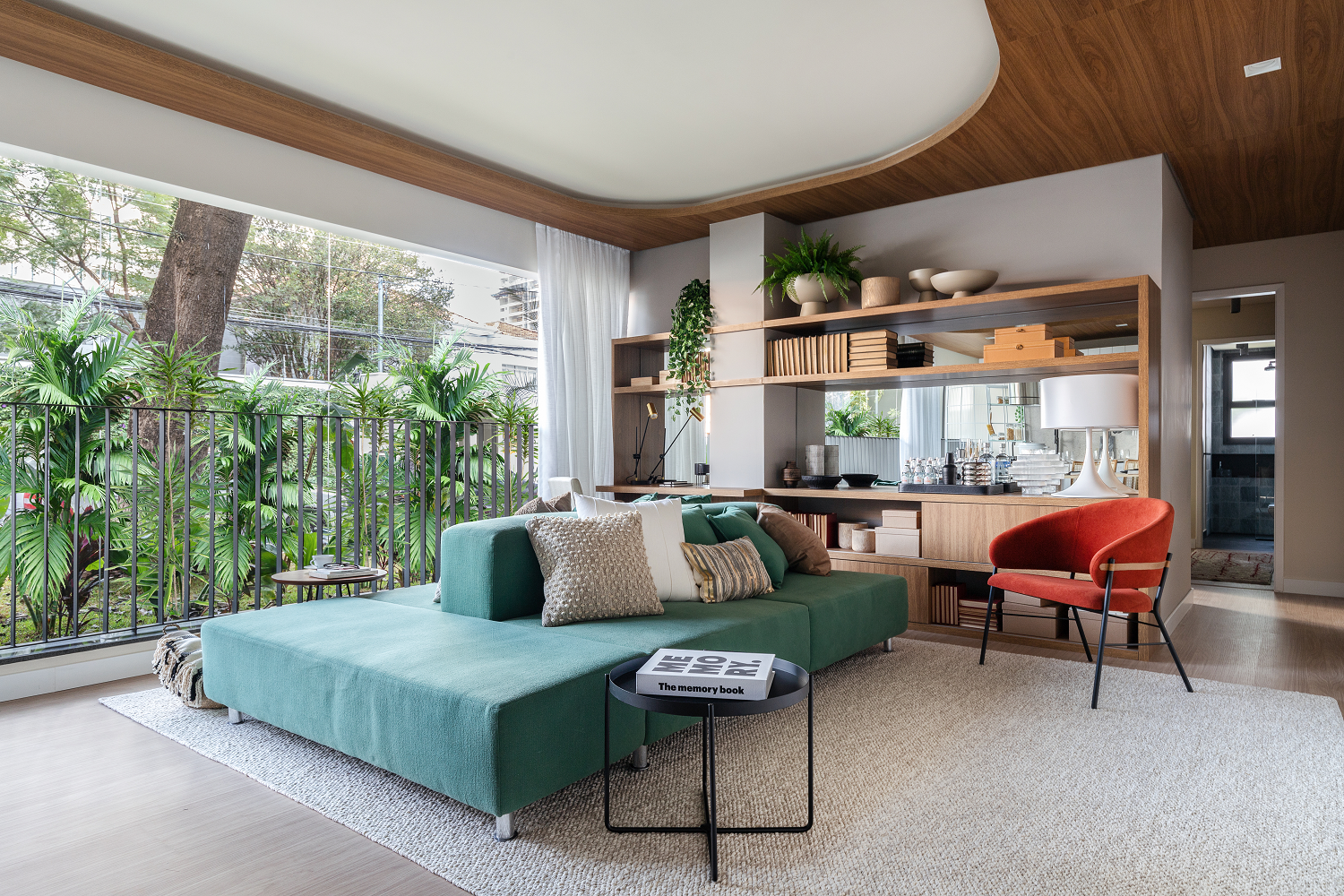
Integrated rooms and fluidity: these two words are capable of encompassing the main characteristics of this 71 m² apartment with two en suites, launched by Grupo Lar in the southern region of São Paulo. The versatile floor plan, with plenty of openings that favor the penetration of daylight, features two en suites and a balcony incorporated into the living room. The open kitchen in the social area brings the feeling of a more up-to-date living, connected with the routine of those who want to fully enjoy every space of the apartment.
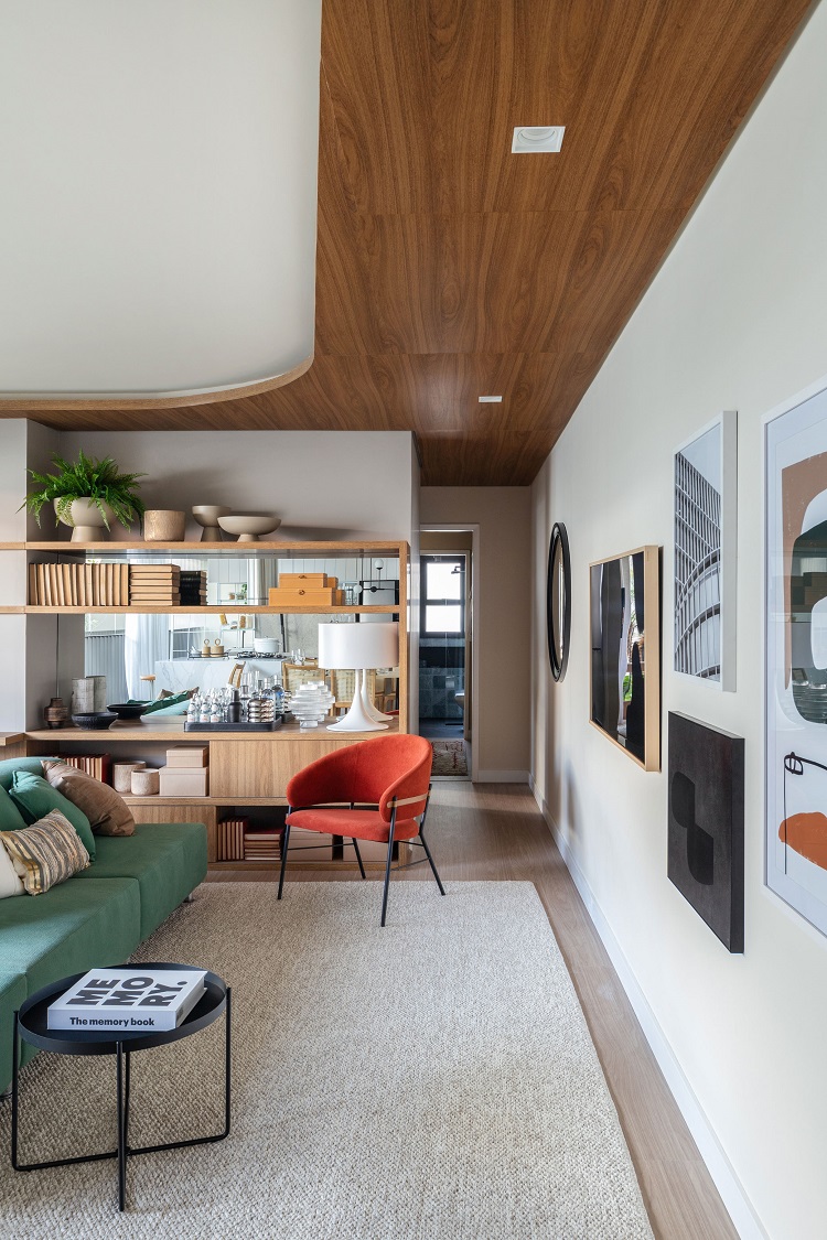
We chose the same laminate flooring to cover the social, private and service areas. We reinforced the welcoming atmosphere by adding a wooden finishing to the sections of the ceiling that are above the circulation areas. This way, the spaces where people spend their time, like living and dining rooms, feature higher ceilings, which are more comfortable. A led strip built-in between the plaster and the ceiling creates light scenarios.
This is the first sight we have when entering the 71 m² apartment. Note how free circulation is – the pathways are subtle, space is not lost with corridors and the wooden finishing on the ceiling works as a guide. On the wall, the thin TV is camouflaged between the pictures, in a very modern gallery wall.
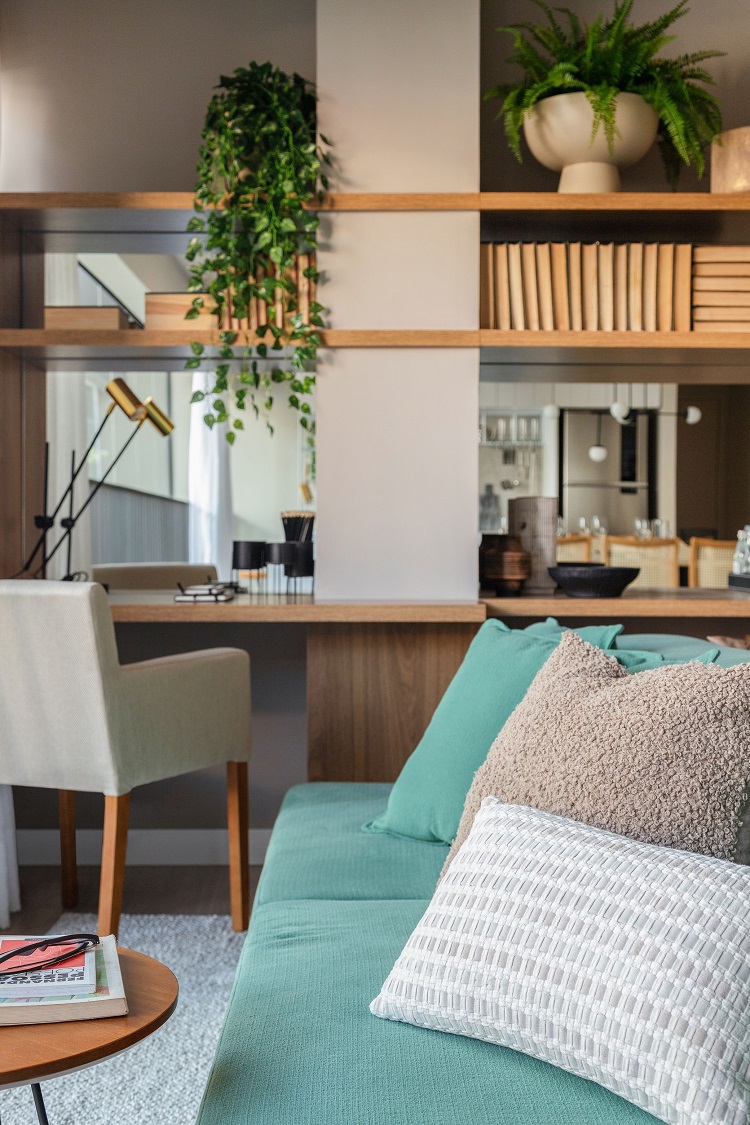
In current times, it is almost impossible not to have a work corner at home. Here, we created the home office in the corner of the bookshelf, right after the pillar that used to separate the balcony, now connected to the living. The upholstered and more formal armchair disguises the corporate look.
– MAURICIO ARRUDA,
CREATIVE DIRECTOR OF TODOS ARQUITETURA
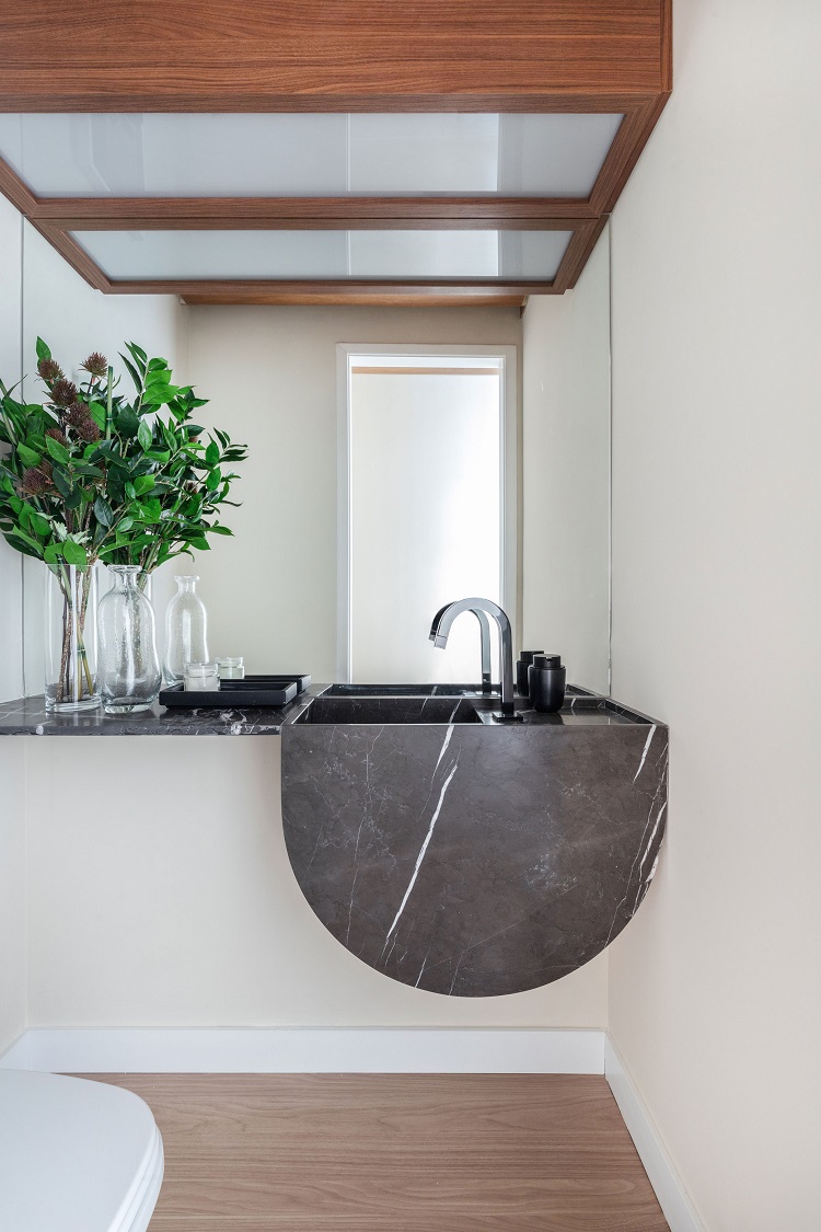
The apartment’s toilet is next to the social entrance, which guarantees complete privacy to the residents in the private area. We designed a simple countertop, with a semi-circle front edge to hide the sink pipes. We chose pietra gray marble, with highlighted veins, and Deca black bathroom hardware installed on the sides.
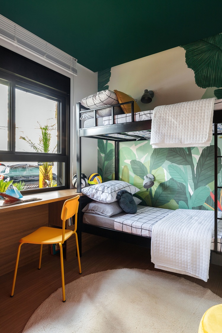
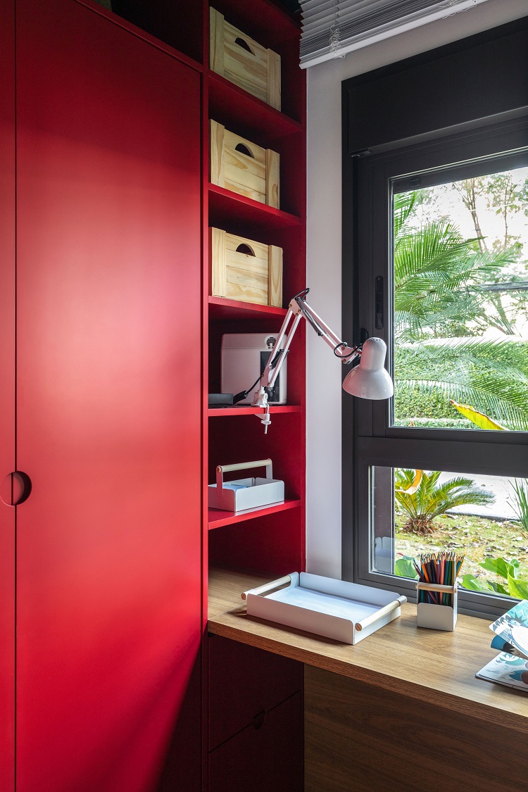
Inspired by the name of the building, we chose a wall panel with an urban jungle feel to color the children’s en suite. We painted the ceiling in a shade of dark green that goes well with the foliage print. We designed a bench that fits into the trundle bed and holds space for storing books and other objects. On the other side, a large red closet houses niches and drawers that serve to store children’s clothes and shoes. The articulated lamp attached to one of the shelves lights the study corner.
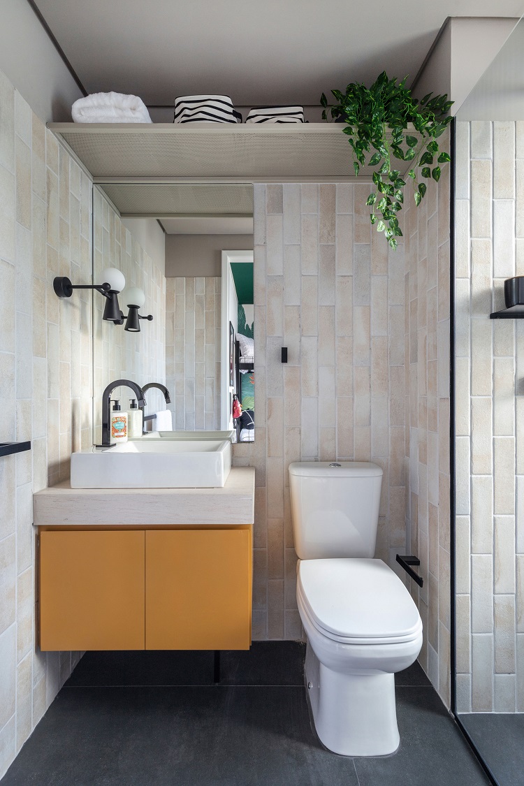
Much practicality in a small space: at the top, a metal shelf aligned with the height of the shower door brings beauty and supports towels and plants. The ceramic tiles in the shape of a brick were laid vertically to make the room more charming. The dark porcelain tiles on the floor contrast with the yellow cabinet.
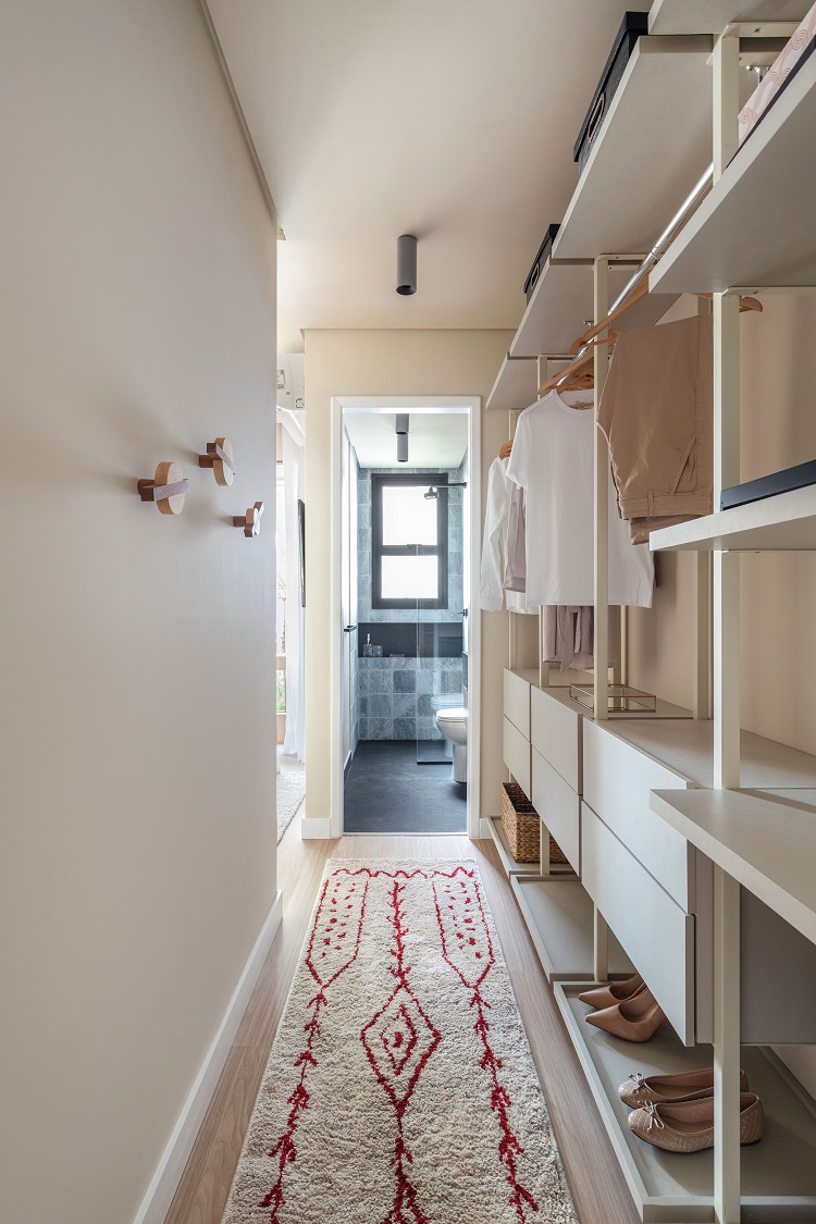
We took advantage of the access to the master suite and transformed the passageway into a closet. Thus, there is no shortage of space to store clothes and accessories. Here, we kept the structure apparent, but installing sliding doors is an alternative solution for those who prefer to keep everything out of sight.
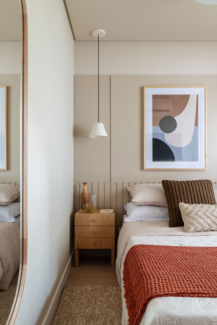
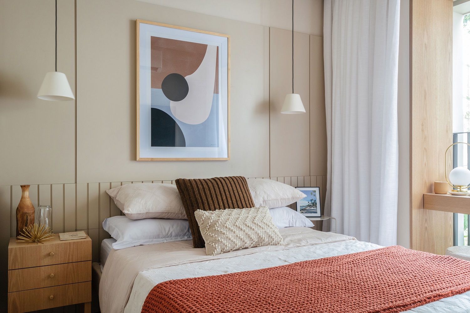
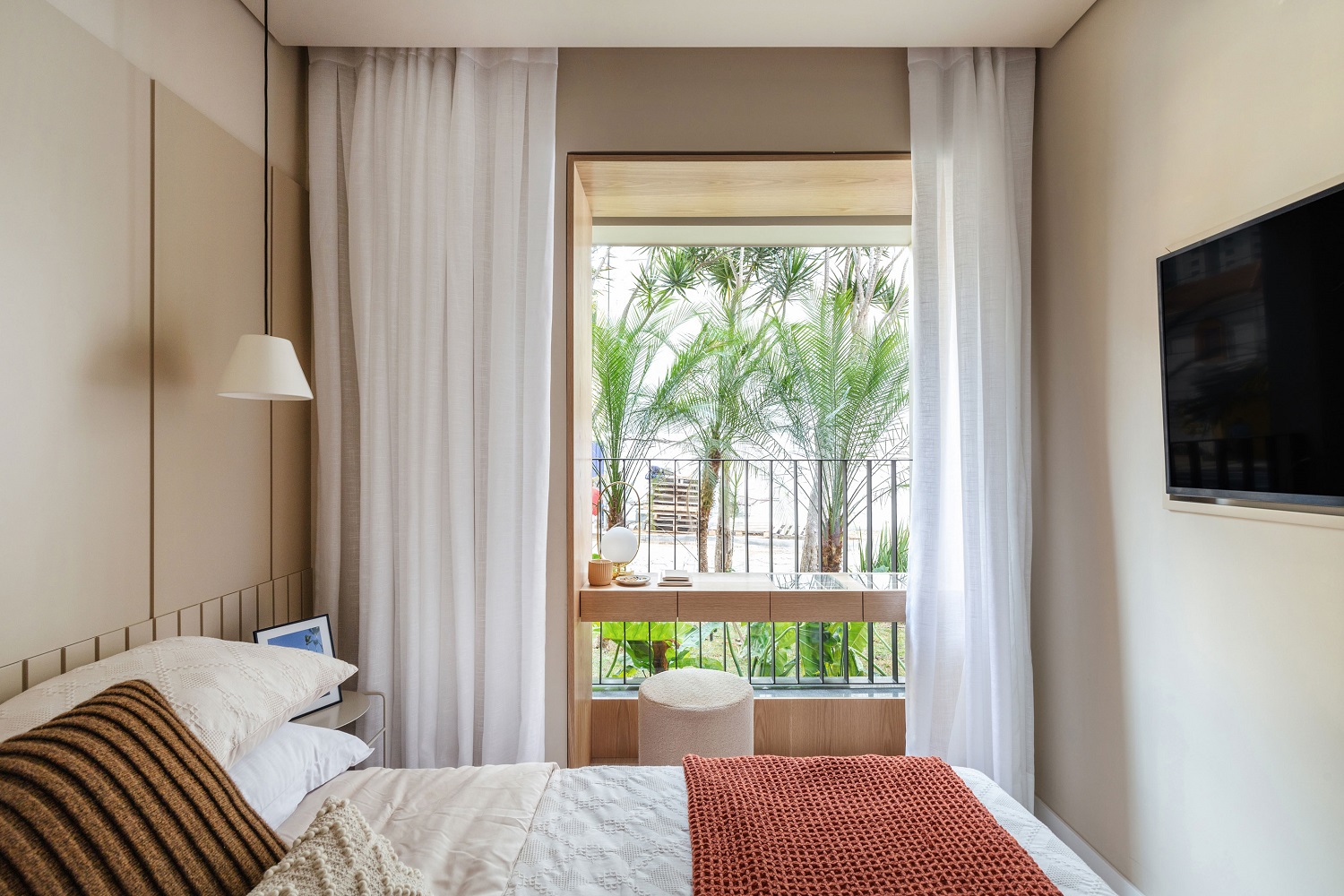
Earthy tones are present in the palette of the master bedroom. Calm and welcoming colors appear in accessories, since the base is completely neutral. The slatted headboard up to half height gains the companion of panels in the superior part of the wall. Pendants provide punctual lighting and leave the surface of the side tables free. We created a frame with natural oak veneers to frame the generously sized window. There is so much space that even a makeup table fits in – from where the user has a beautiful view.
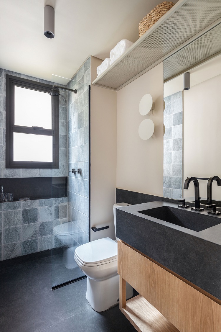
Giving a new use to a known material can be a design asset: we used the ceramic tiles that are normally seen in swimming pools to give a cooler look to the shower area. The pieces that resemble volcanic stones have modernized the space and make a beautiful set with the niche and the black granite carved sink.


