Kopenhagen
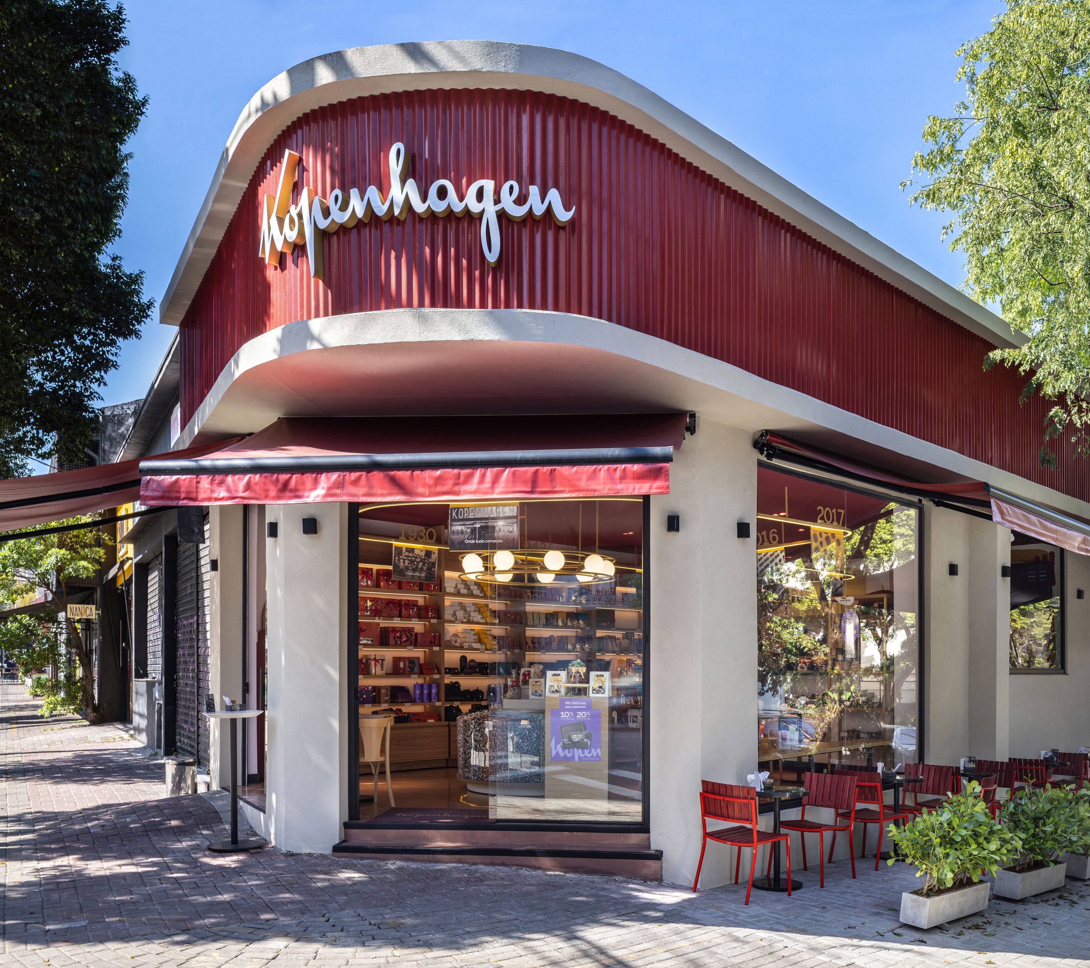
In retail design projects, the big challenge is to incorporate the brand concepts and translate its history in an inviting and welcoming way. For the Kopenhagen flagship in the district of Pinheiros, in São Paulo, it is possible to note these elements applied in a contemporary way.
The design was conceived to be replicated in other stores and it reconciles the proposals of interiors and architecture with the accelerated time of retail
– FÁBIO MOTA
FOUNDING PARTNER TODOS ARQUITETURA
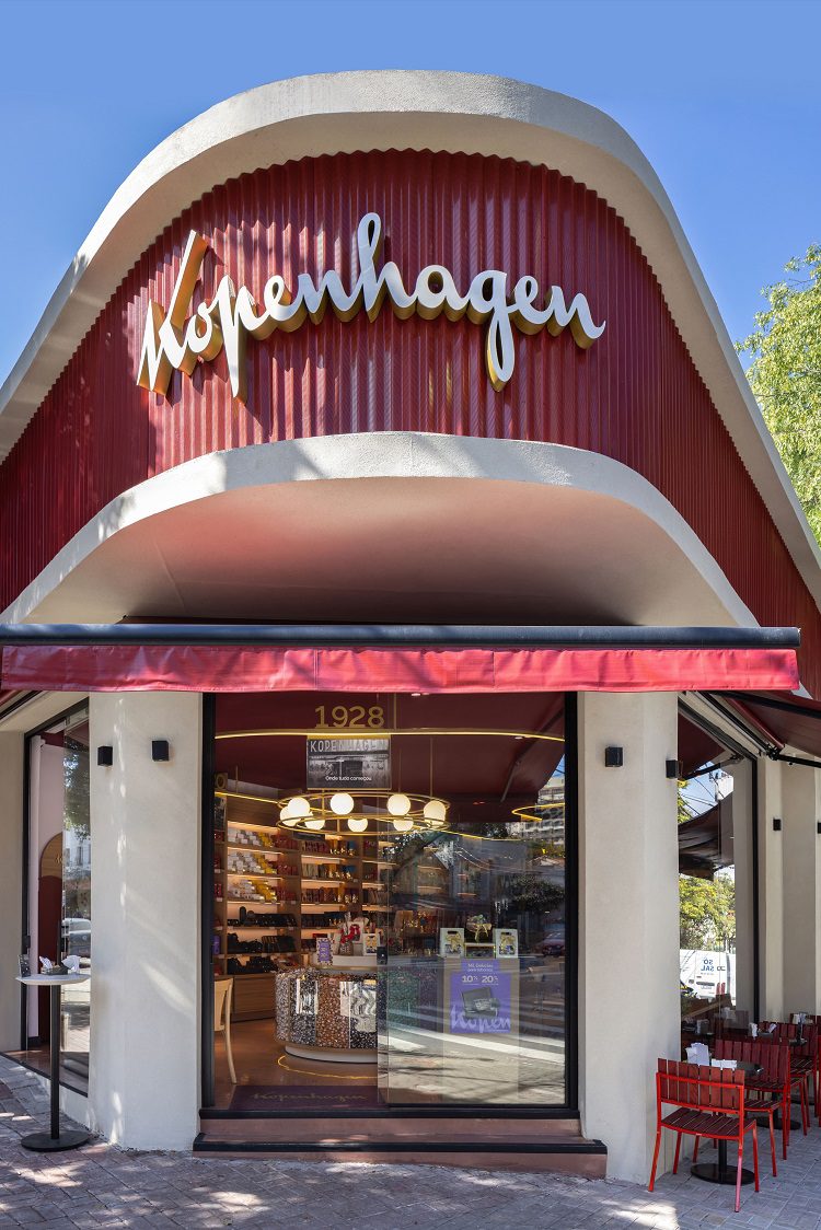
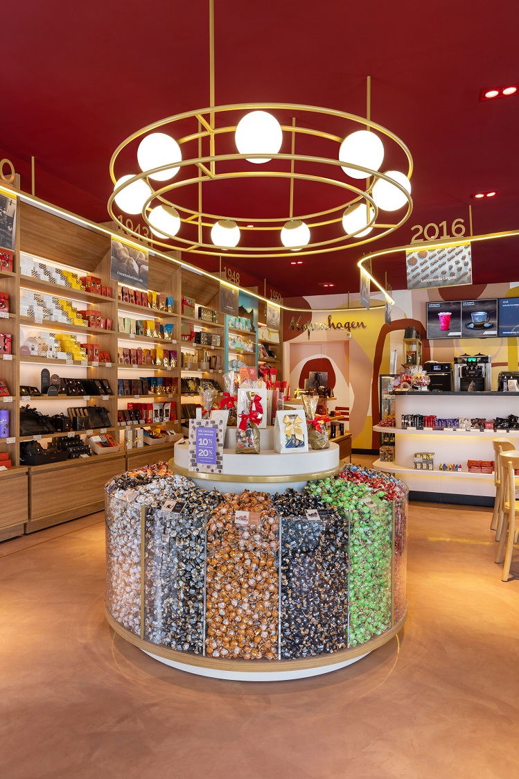
The façade of the store reflects the color palette of the brand and explores the different materiality between the base and the voluminous red roof that presents a hanging part at the entrance. From the door, the customers already see the Mil Delícias, a central, sculptural element that stores many Kopenhagen products and leaves them at hand – a sensory stimulus that invites touch.
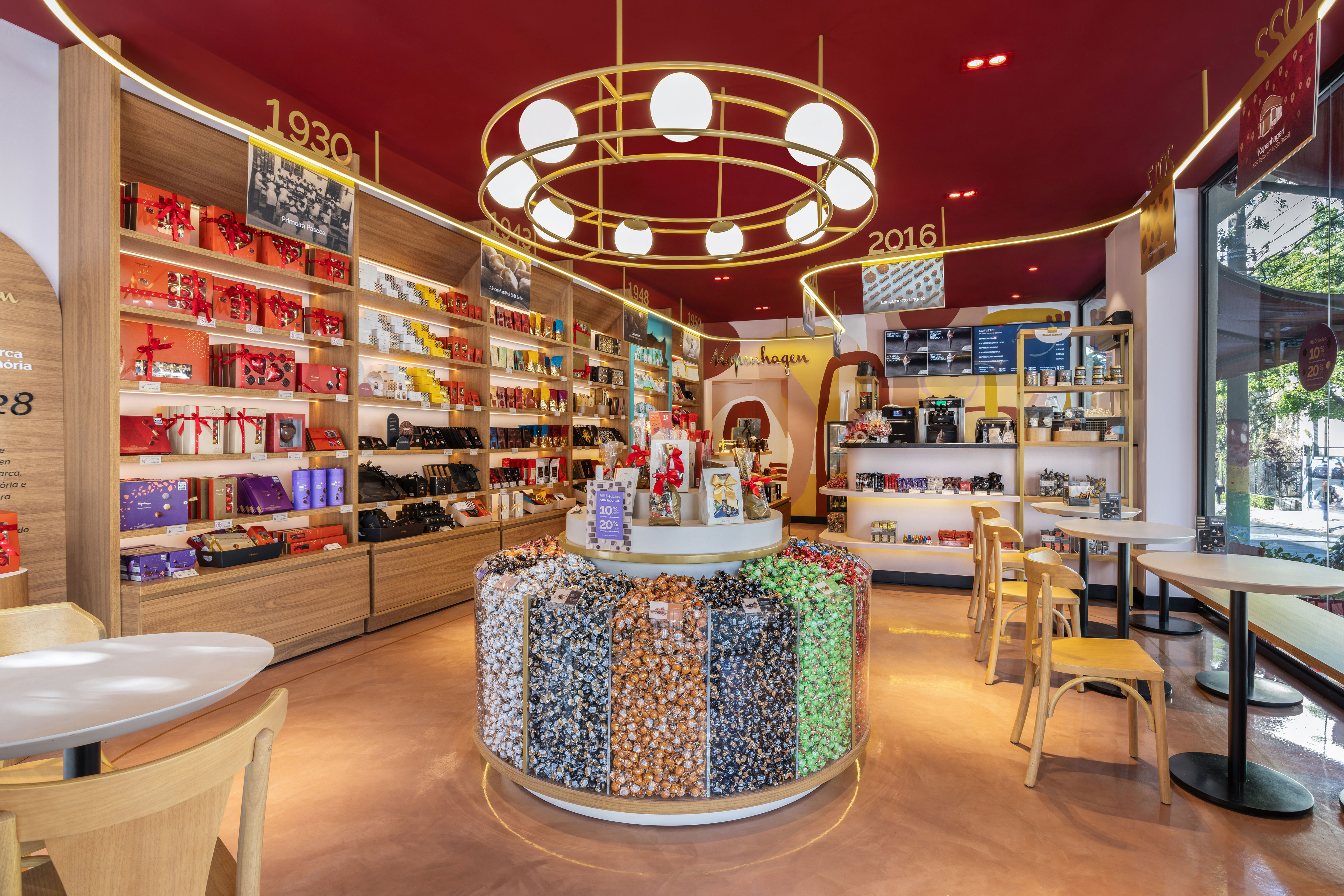
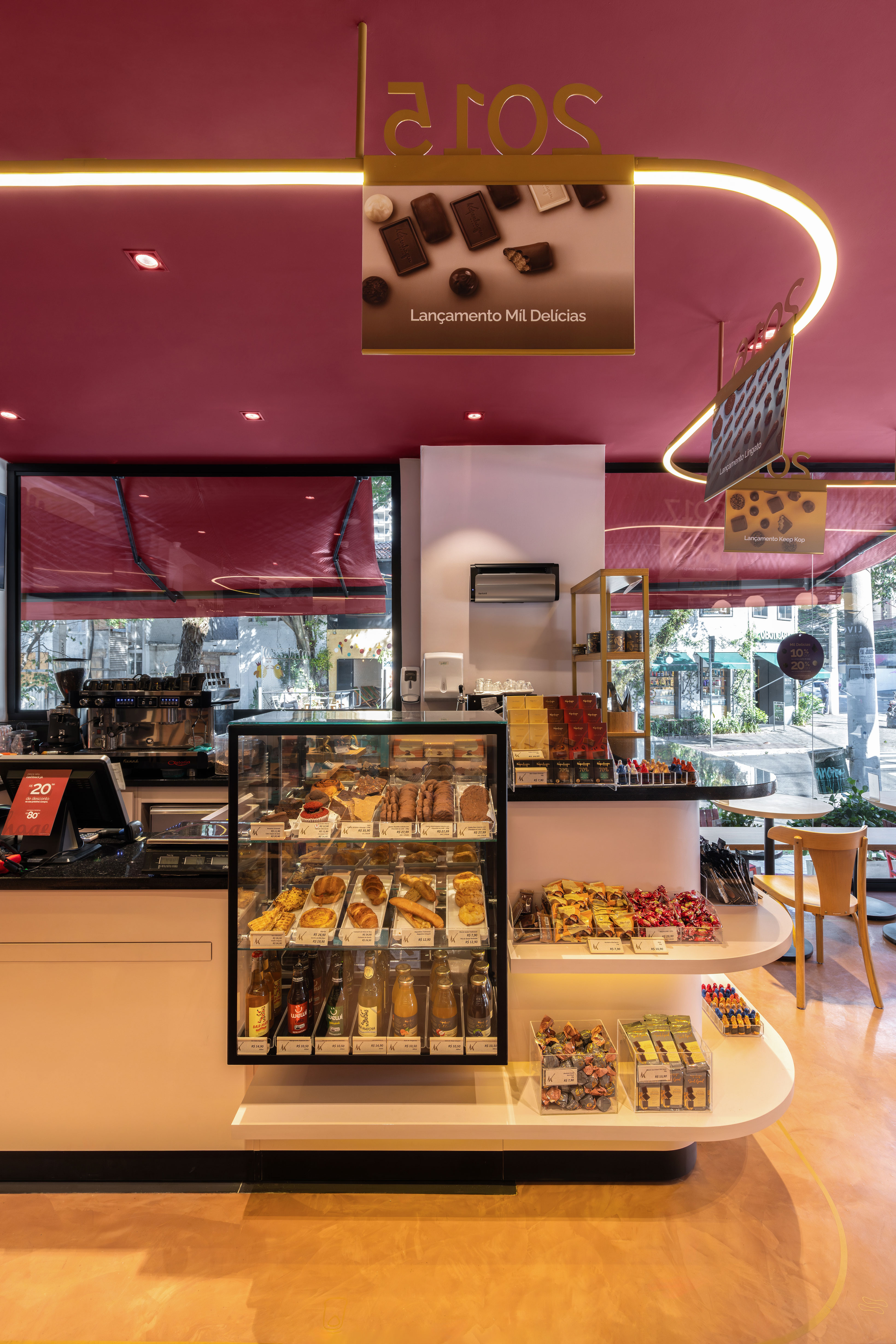
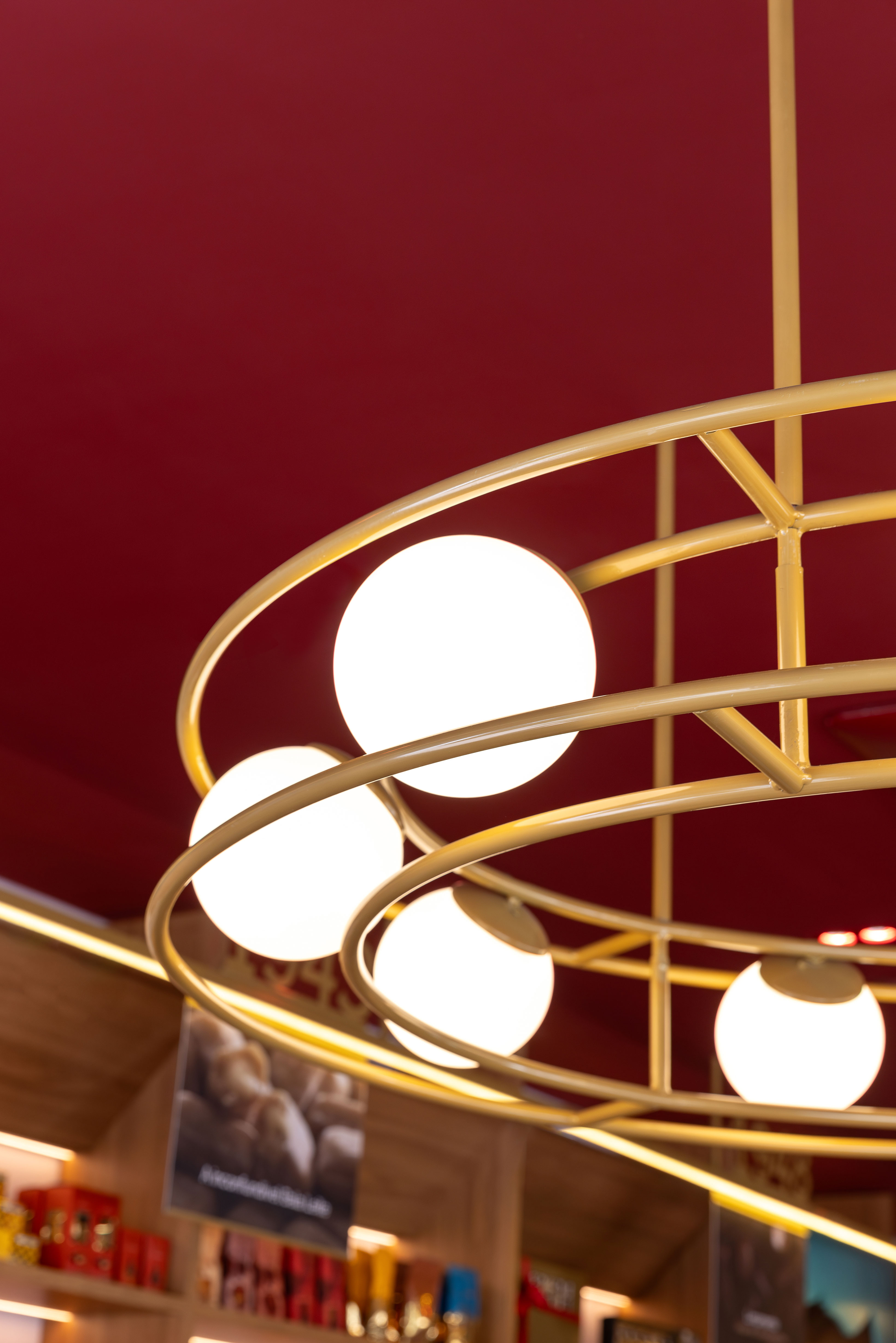
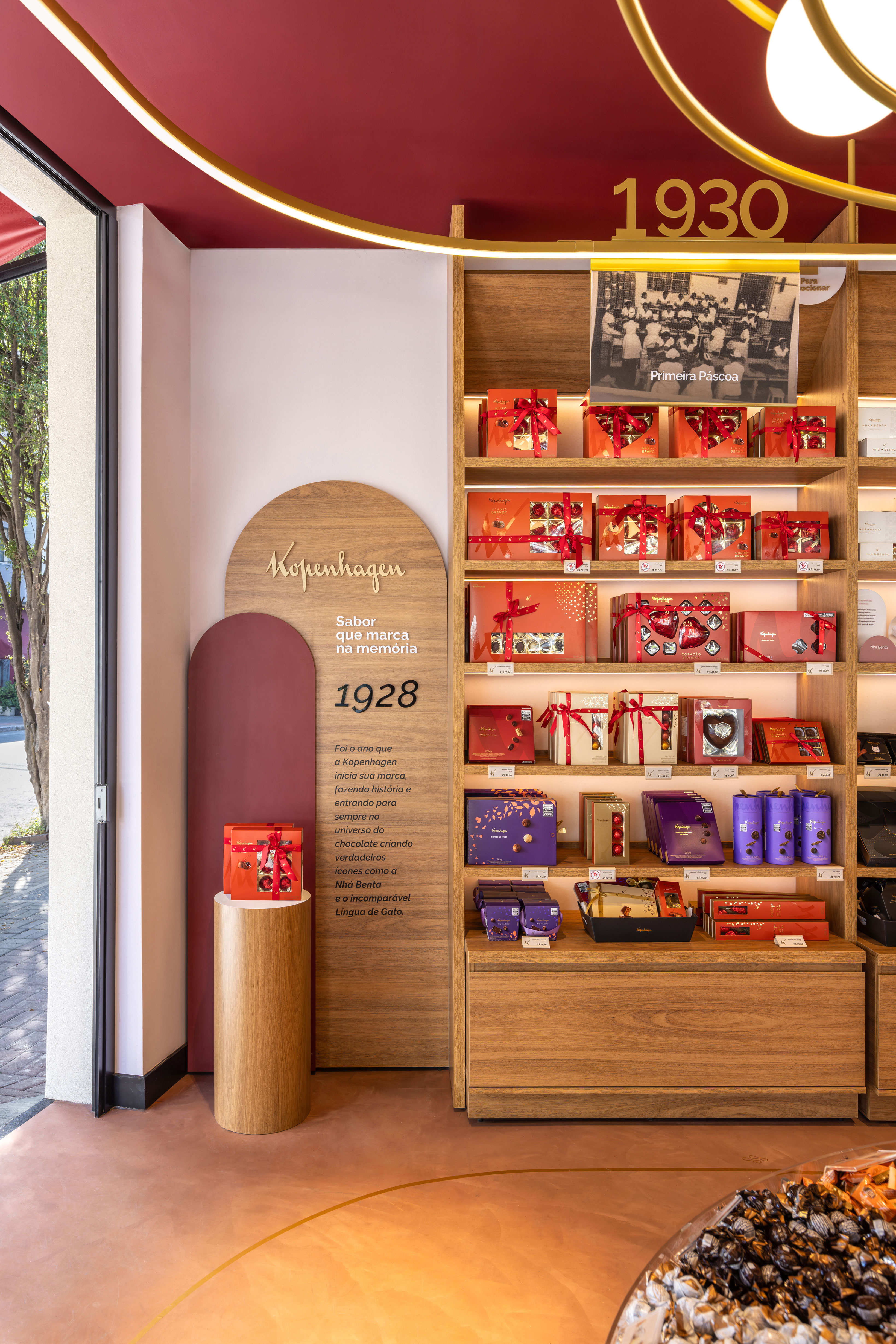
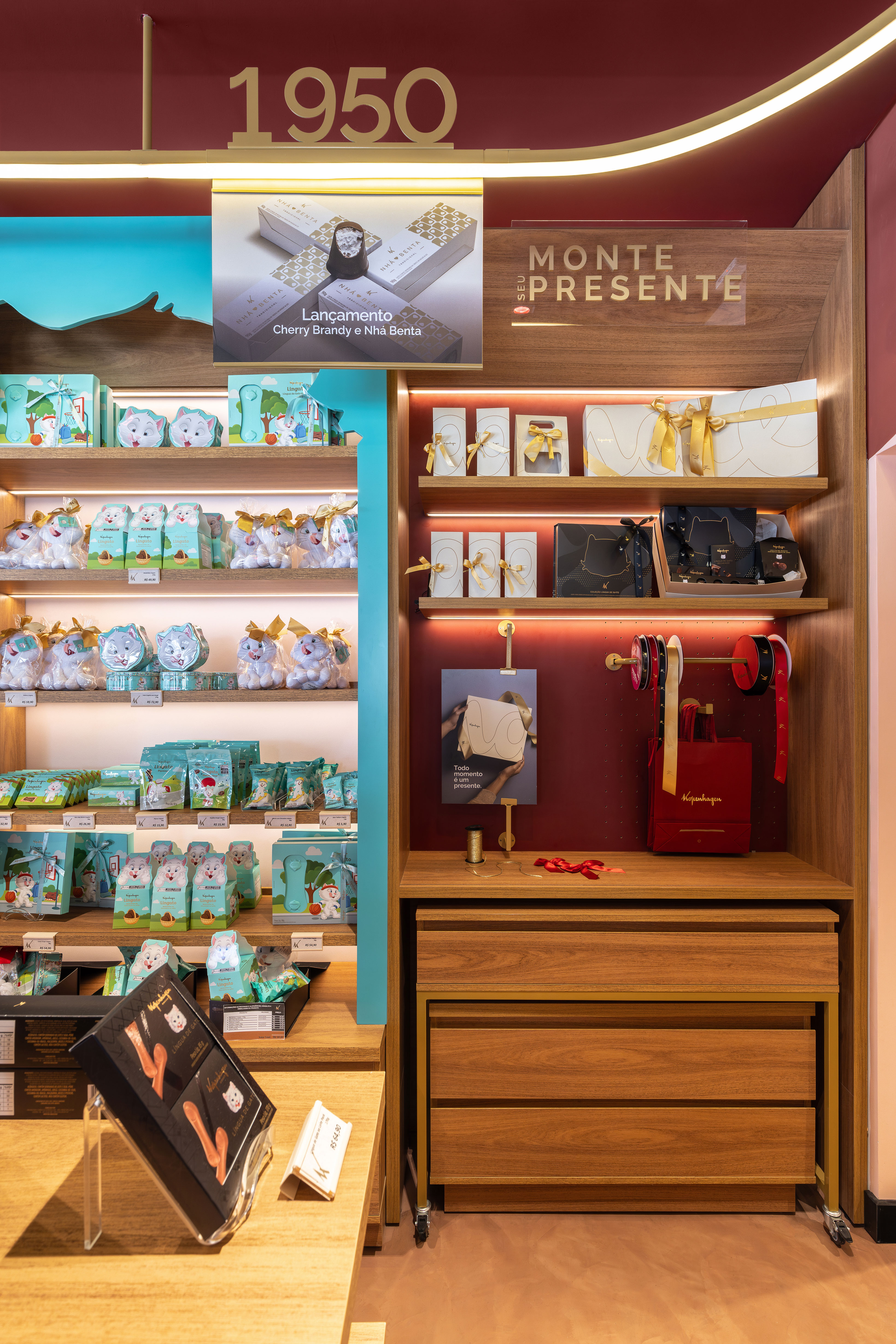
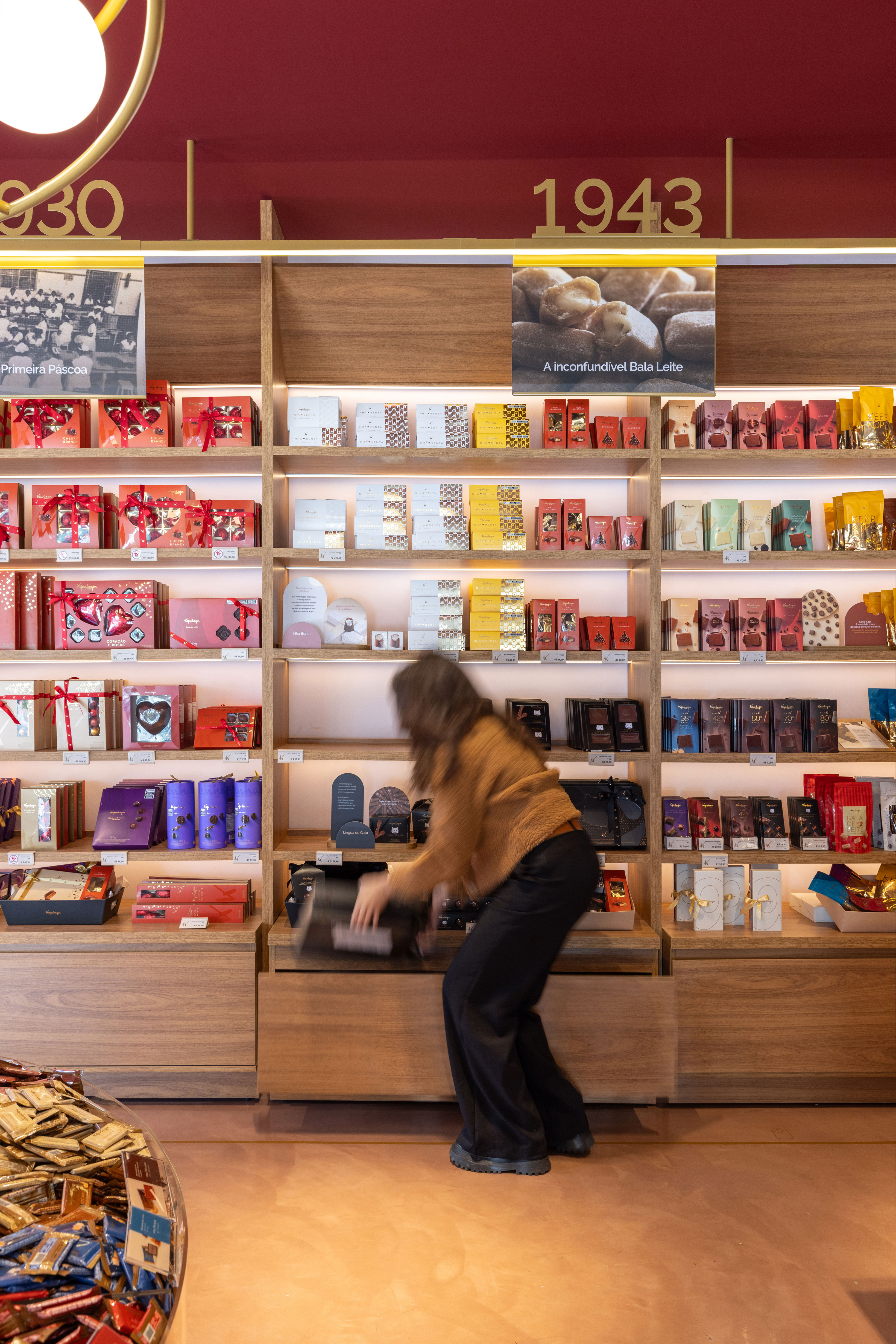
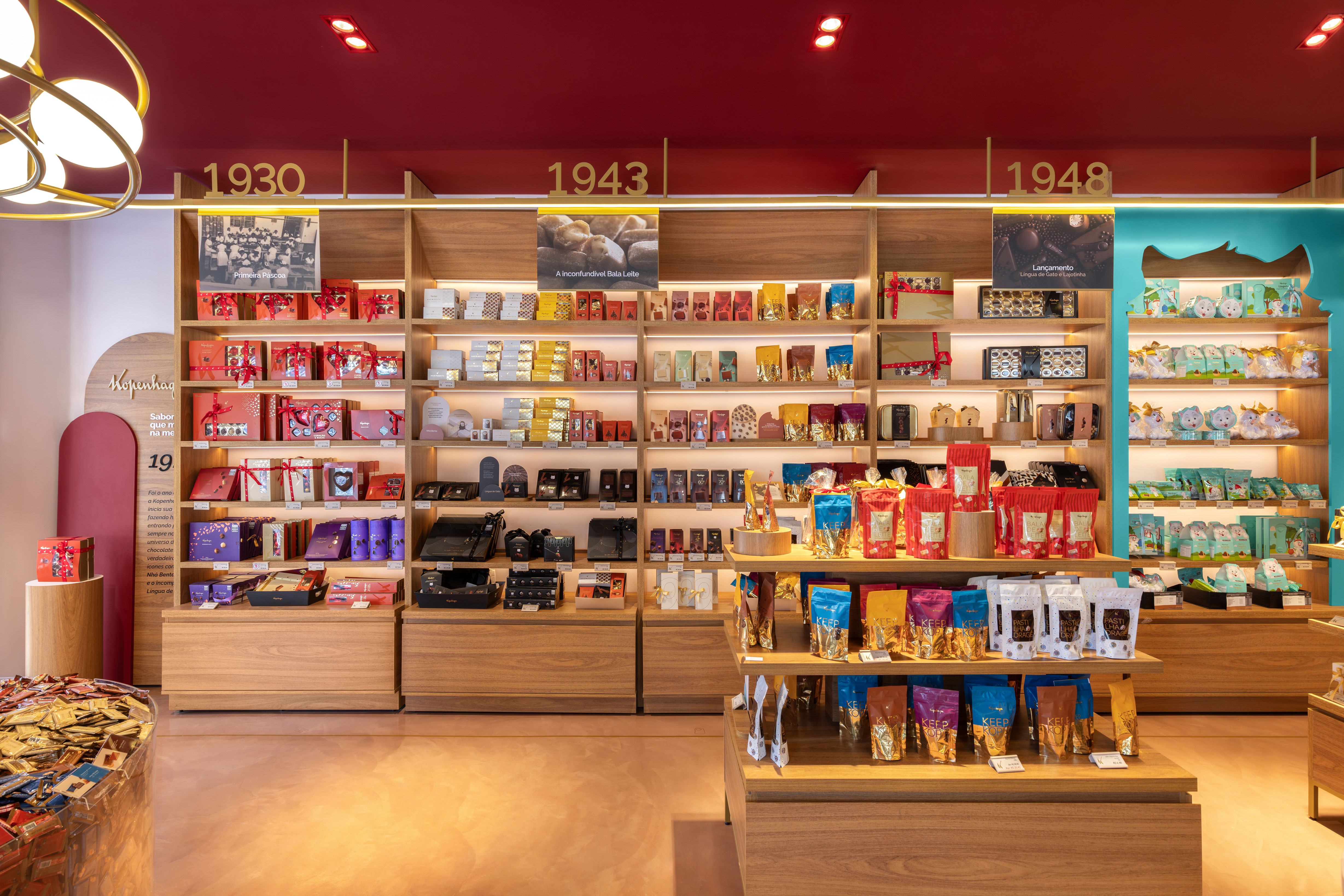
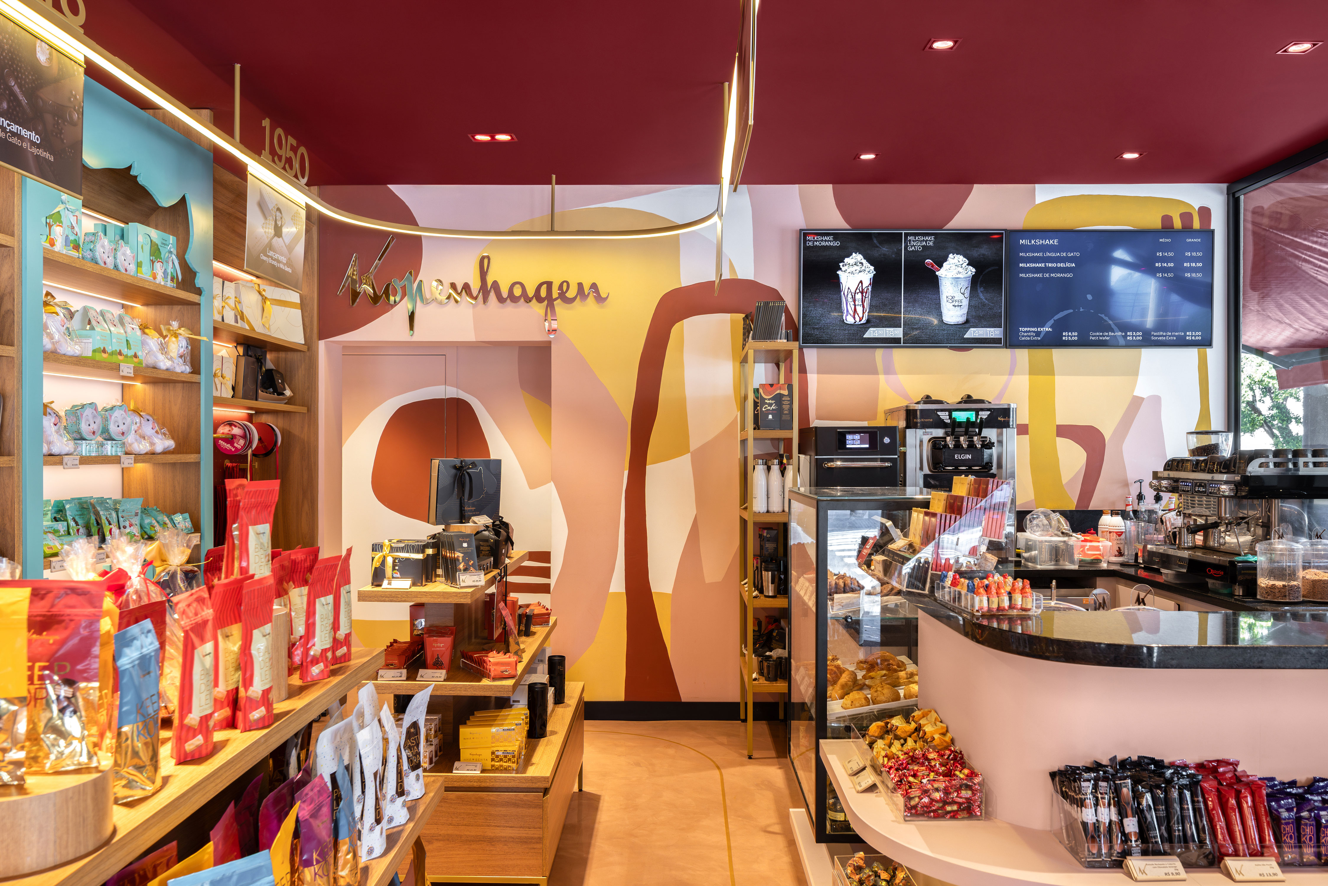
Throughout the store, there is a non-linear golden track with LED lights to highlight the products on the shelves. This element also functions as a timeline, starting in 1928 and going up to the present day. All the timeline dates are accompanied by photos that reveal the company’s milestones.
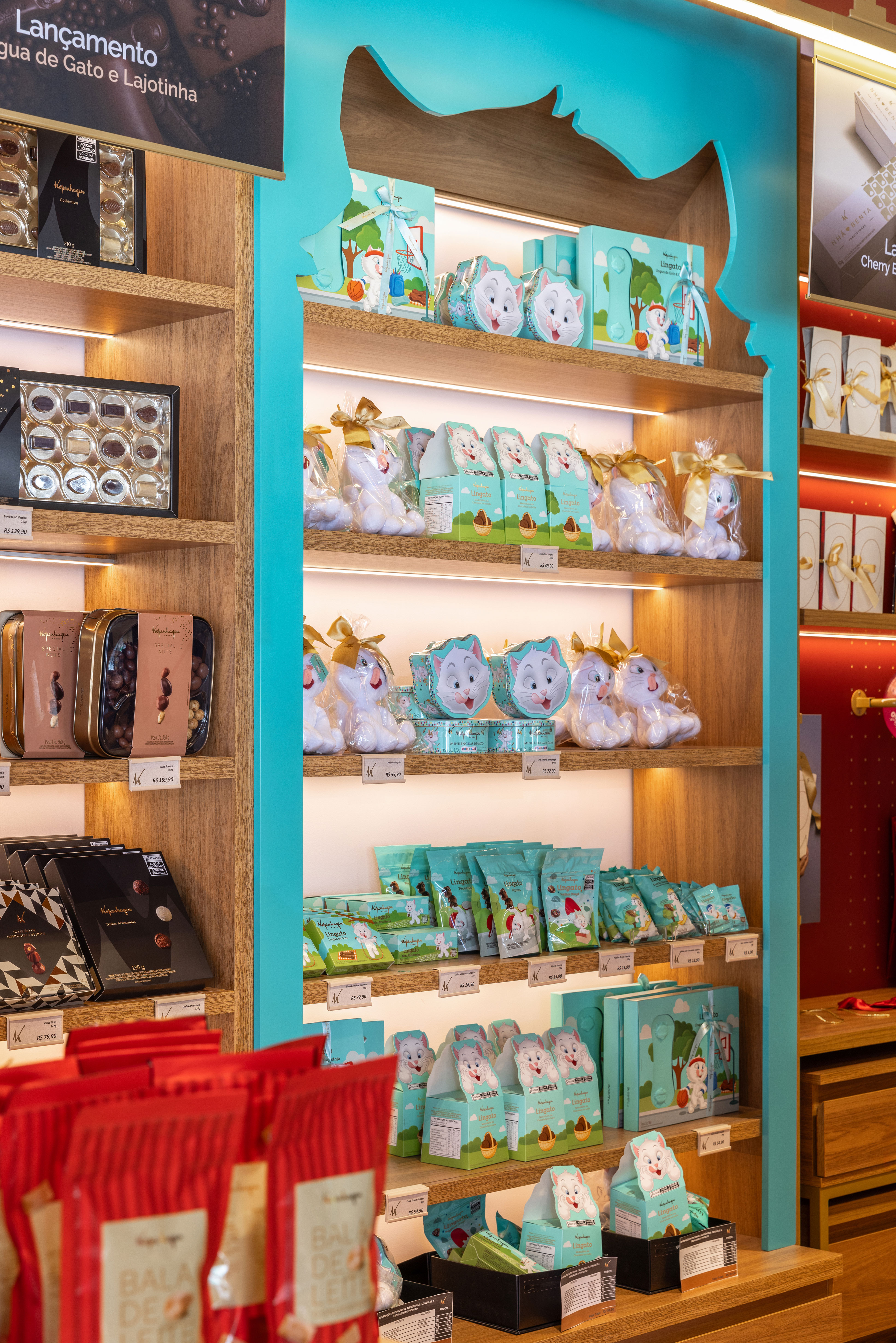
Just below, the custom-made wooden display racks present shelves and drawers at the bottom – to keep the stock at hand for easy shelf replenishment. Note also that the lighting is enhanced by recessed directional spots that allow the creation of different scenes with the products.
The color palette of the brand was creatively absorbed and transformed into a work of art by artist Marcella Riani, who created the organic painting on the wall at the back of the store. Above it, the red ceiling complements Kopenhagen’s striking visual identity.
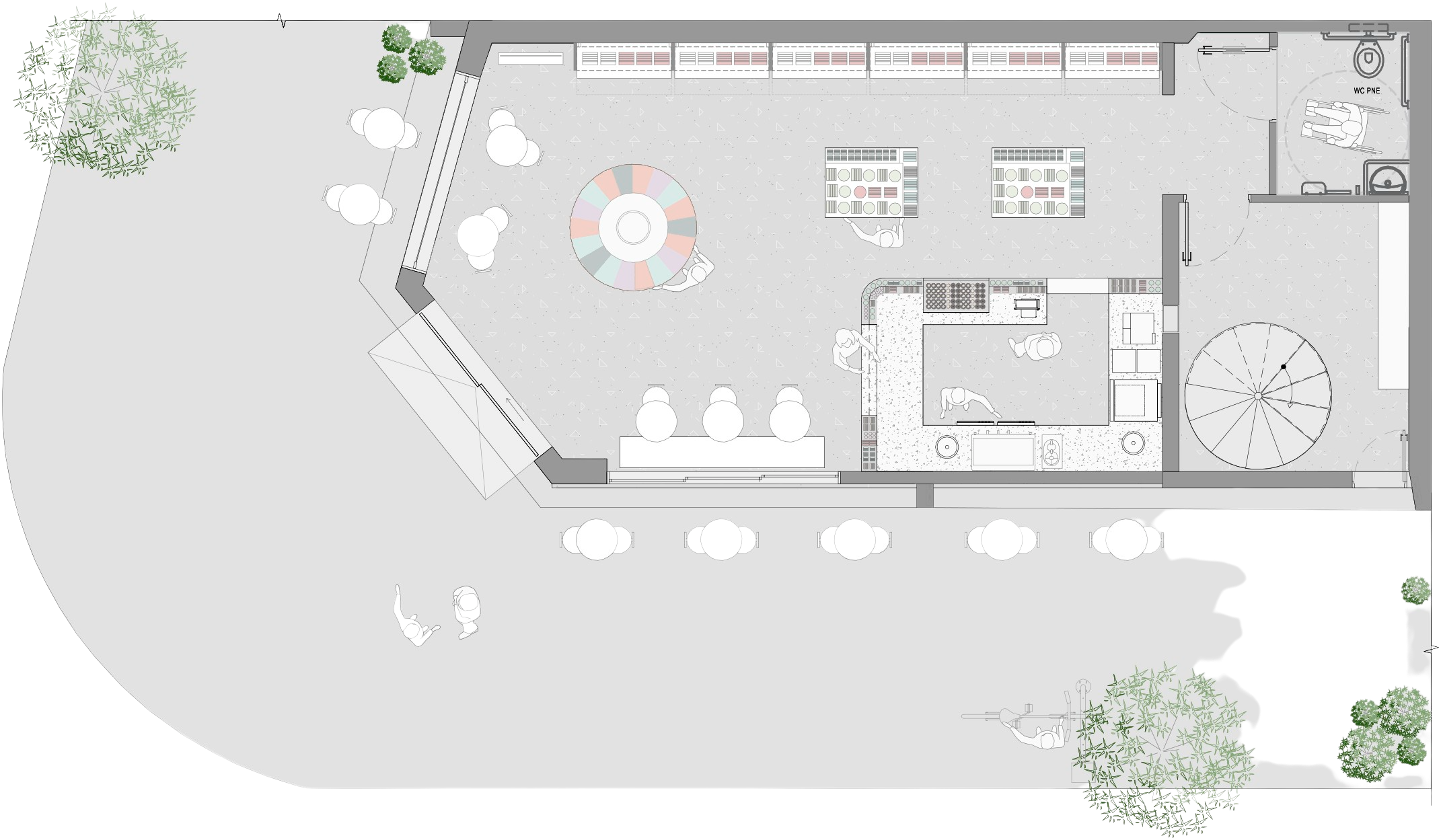
FLOOR PLANT
