IS VILA BUARQUE APARTMENT
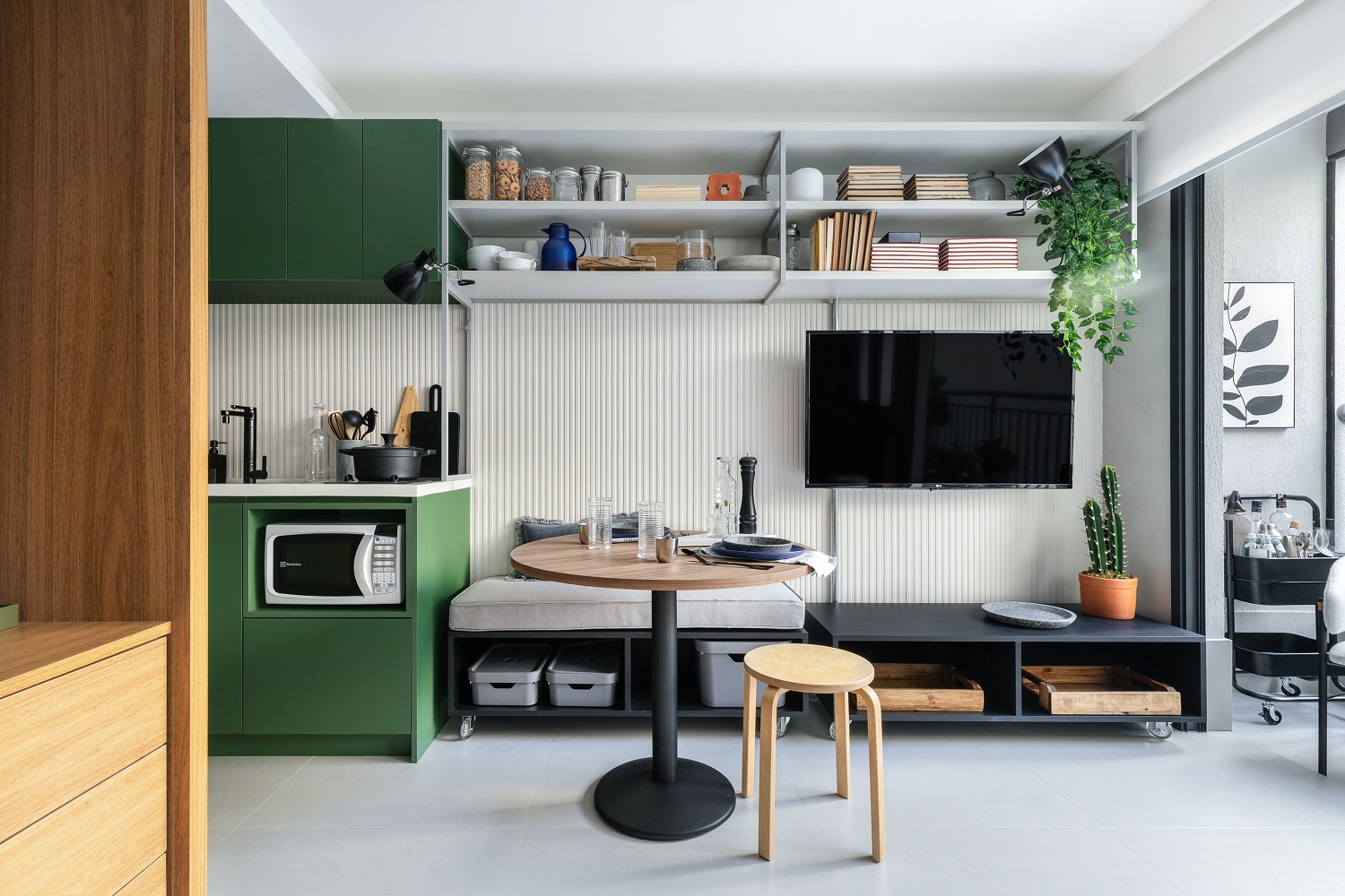
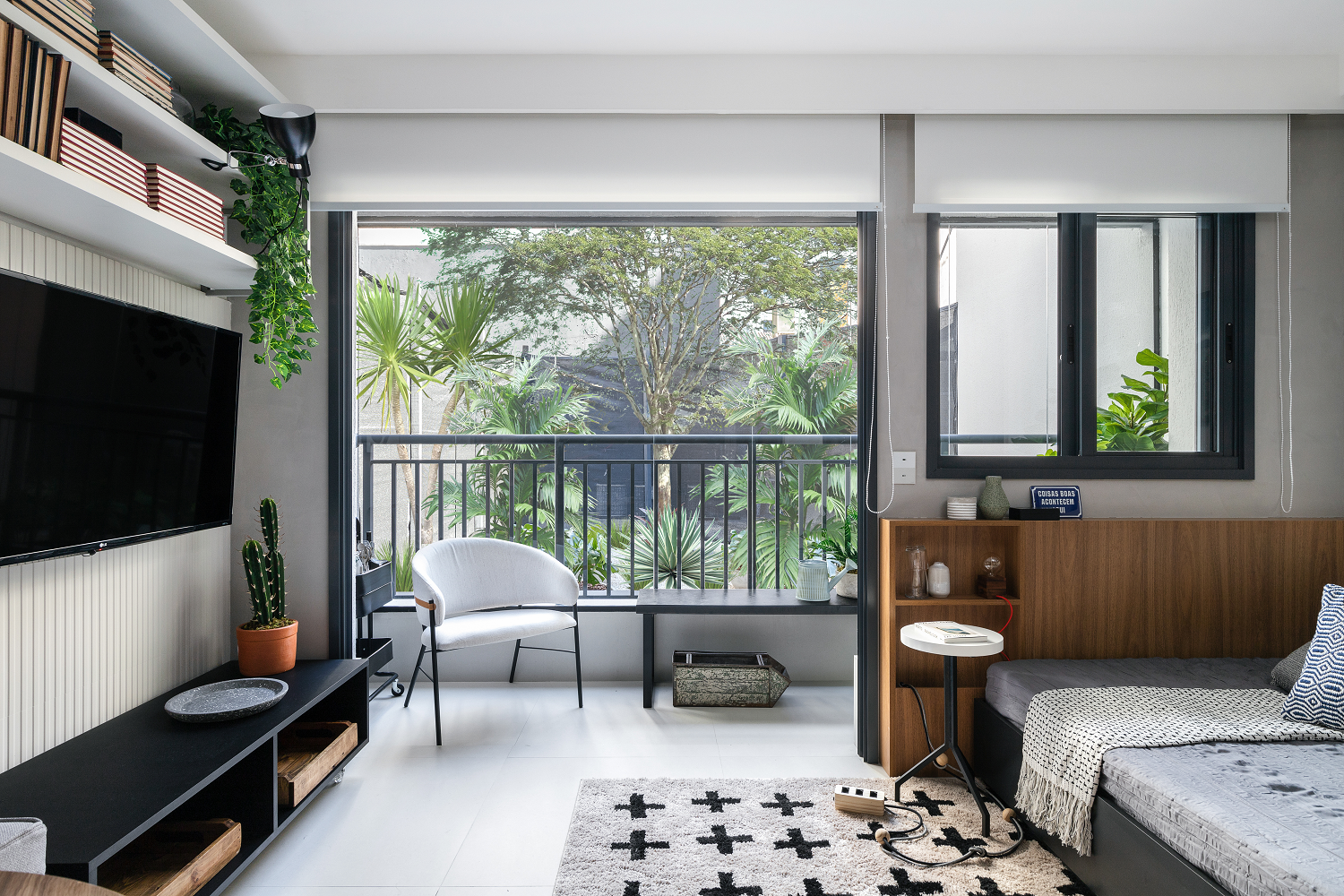
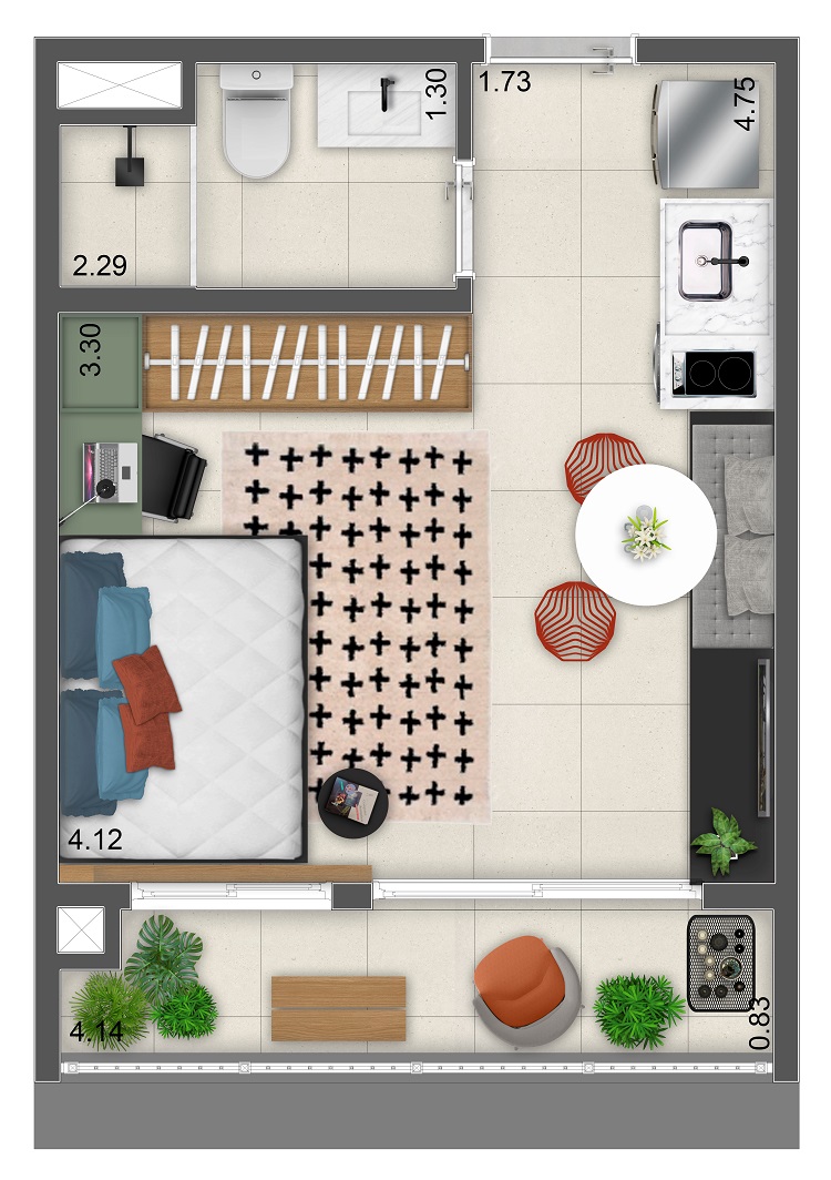
Modern life is compact. Over the 25 m² of this studio in Vila Buarque, in São Paulo, the multiple uses of each centimeter of the area have produced a small kitchen – but full of practicalities -, a dining room with a German corner and a cozy bedroom that turns into a living room when there are guests. The visual unit has a solid base that creates the sensation of a wider space. It starts with the choice of a single model of gray porcelain tile to cover the entire floor, includes the well-detailed cabinetry and goes on to the modern palette that adds green, blue, black and wood tones to the interior design mood board.
We created a wooden central volume that concentrates the cabinetry and camouflages the bathroom entrance. This room, by the way, got a narrow sculpted sink made of white granite – an elegant design that made it possible to enlarge the countertop area without restricting circulation. In the social area, loose furniture and pieces of furniture on wheels allow new configurations whenever the residents feel like changing. Note the upturned clip-on lamp: it bounces the light off of the ceiling, producing a pleasant indirect light.
The same light gray porcelain tile (Cement Block 80 x 80 cm, by Portobello) covers the entire floor of the apartment, from the entrance to the balcony. We added an extra layer of texture to the wall with the ceramic tiles Espectro Mate (30 x 90 cm), also by Portobello. Upper open shelves hold various objects and also offer support for kitchen items.
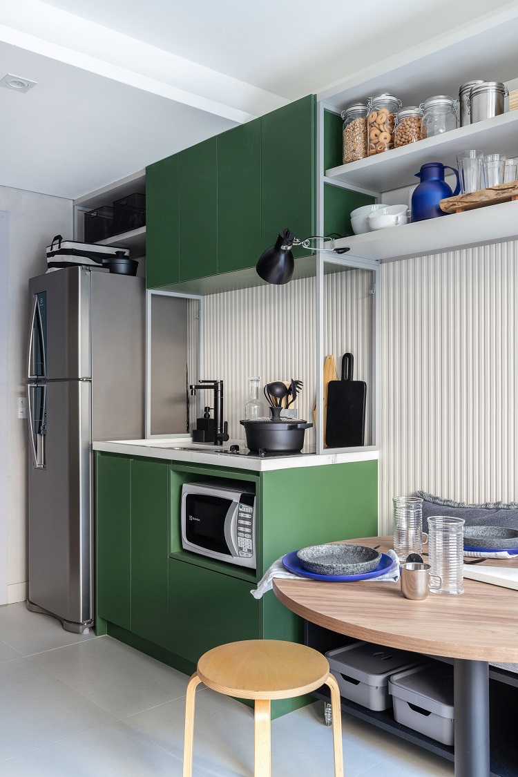
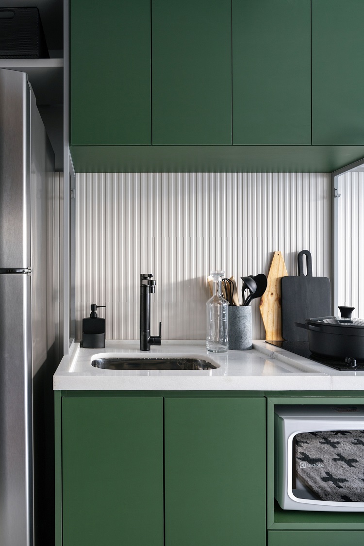
We designed cabinets with exposed metallic structures, capable of conveying a greater sense of lightness than those made entirely of wood. The kitchen’s green tone (MDF Verde Real, by Duratex) became the focal point of the interior design and makes a nice contrast with the slatted tiles on the walls (Espectro Mate 30 x 90 cm, by Portobello). Even with only 1.30 m in width, a lot can fit there: in addition to the sink with a black faucet, there is a cooktop and a microwave (yes, we chose not to have an oven). The depth is more generous: we used 65 cm so that the refrigerator fits in the niche and gets the protection of the countertop stone.
WE DISMISSED THE SOFA, BUT A BEAUTIFUL BEDSPREAD AND MANY CUSHIONS TURN THE BED INTO A WELCOMING SEAT WHEN THERE ARE GUESTS
– MAURICIO ARRUDA,
CREATIVE DIRECTOR AT TODOS
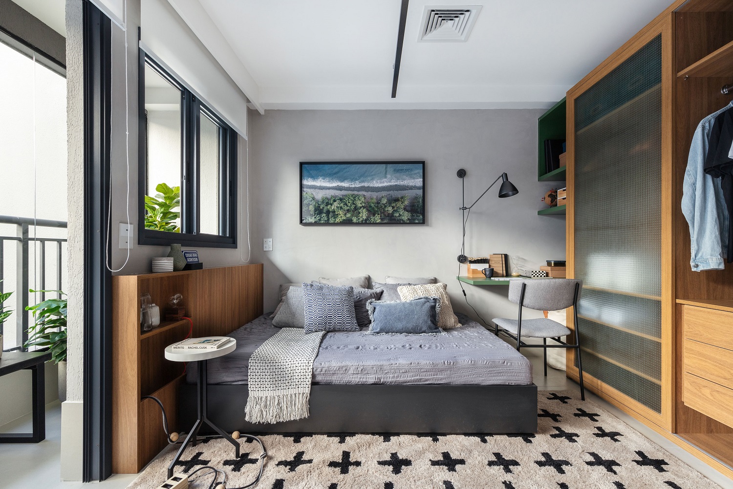
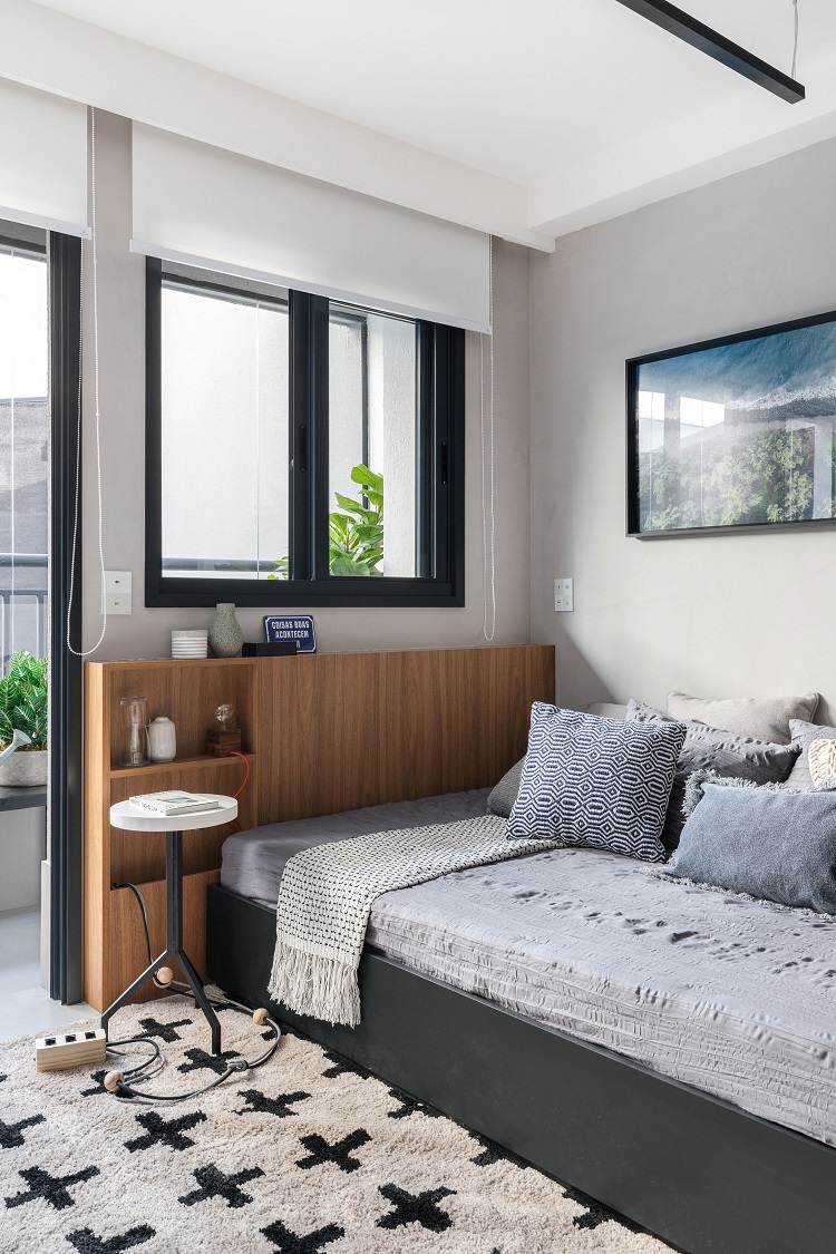
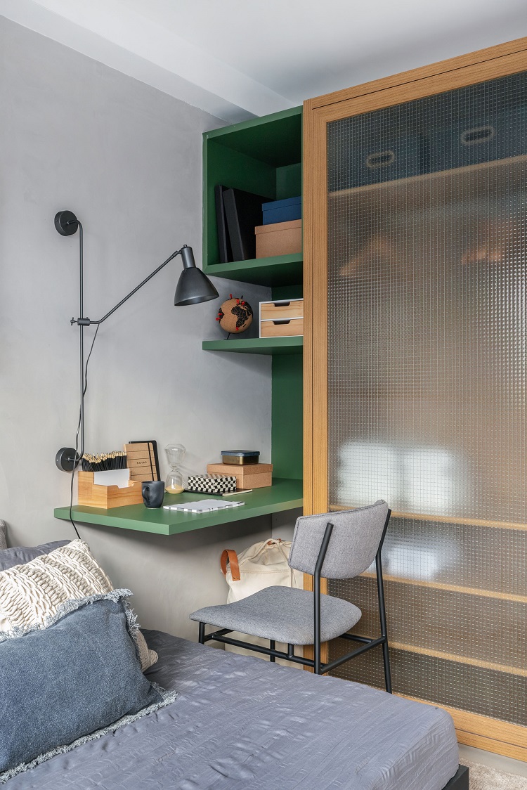
We dismissed the sofa in order to have space for a cozy bed. This same bed fulfills the role of a social seat very well with the help of pillows – they reduce the seating area and bring comfort. Another cool solution here: we designed a headboard with 12 cm depth that also turns into a side table and accompanies the blind. In the other corner of the room, there is space for a mini-office, so useful in times of hybrid work.
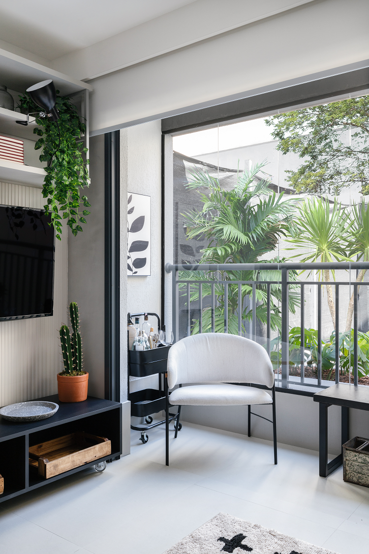
Is it worth creating an extra room in the balcony? We are in favor of three! In the corner, the metal cart is used as a bar; just ahead, the light armchair turns into a sitting and/or reading corner. On the other side, the mini-garden brings up-close that essential dose of green.
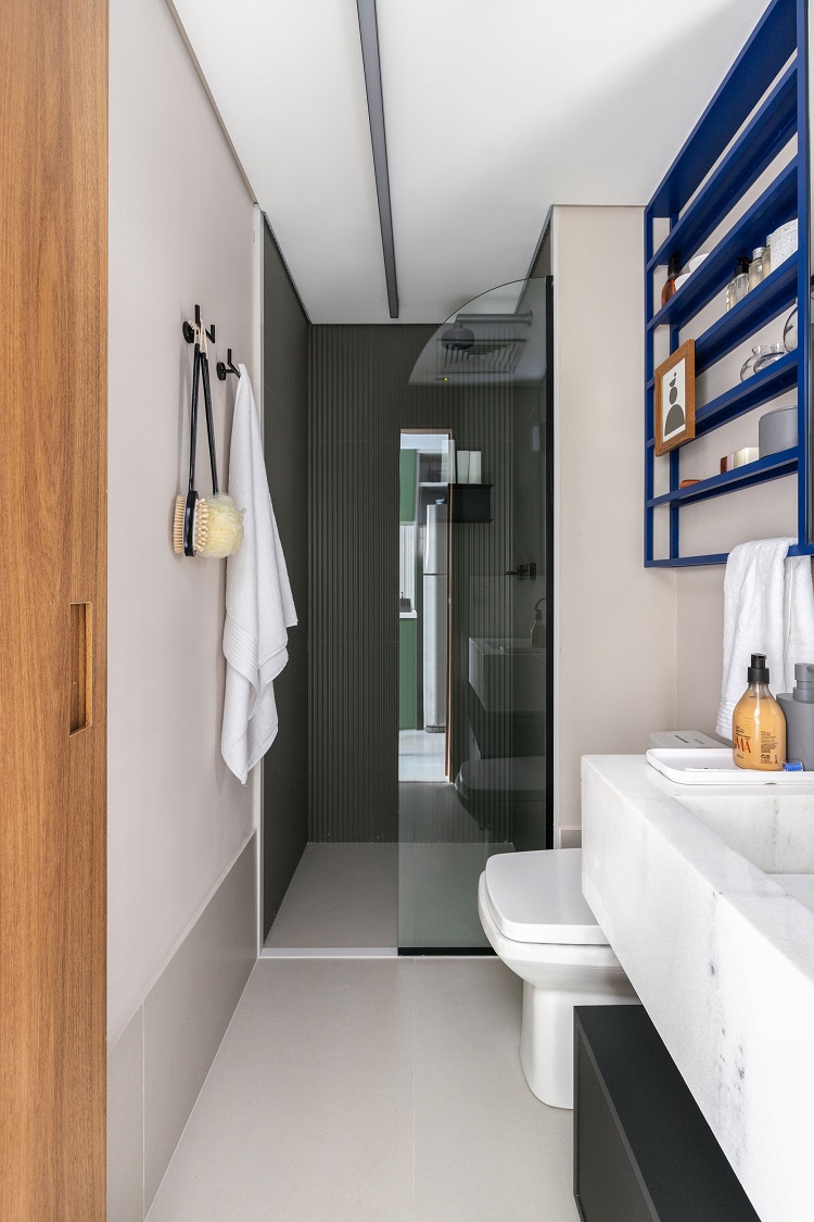
A narrow bathroom can also be stylish. A mixture of covering materials accomplishes the mission. On the floor, there are the same Cement Block (80 x 80 cm) tiles that appear throughout the apartment and which serve also as a high baseboard. Inside the shower box, the slatted ceramic tile is the model Ardesia Zigzag (30 x 90 cm). Both are from Portobello.The sink made of espírito santo white granite is narrow, but long enough to have a countertop. Other interesting details: the linear ceiling lighting and the bathroom cabinet of 10 centimeters depth (enough to store toiletries) with a mirror front. The color point contrasts with the black bathroom hardware and modernizes the space.


