IRAJÁ APARTMENT
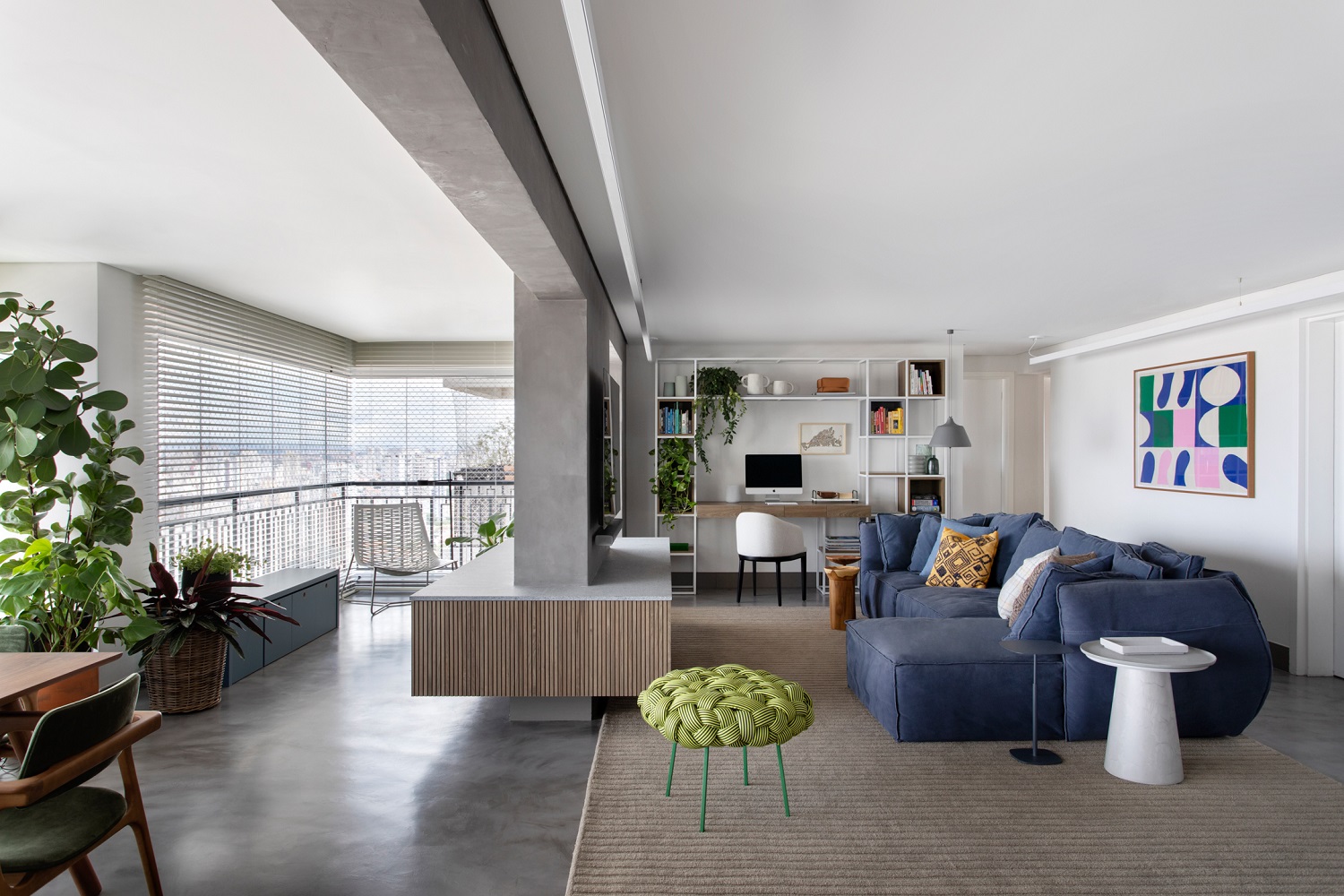
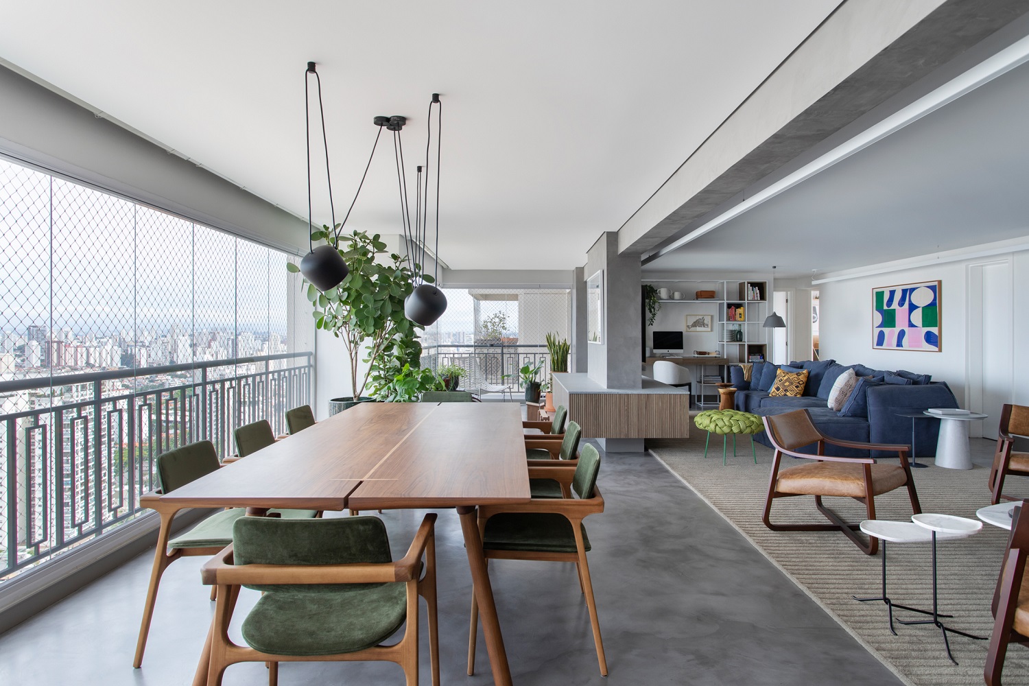
Connecting spaces – and people, as a result – has proved to be a smart choice in our projects. This 213 m² apartment in São Paulo confirms this idea. The living room and balcony spaces were unified after removing the frame that separated these environments and leveling the floor between them. Then we designed a woodworking box around the pillar, with a levigated granite top, which turned out to be a landmark in one of the most used corners by the homeowners.
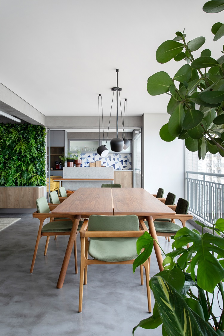
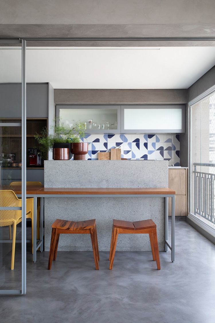
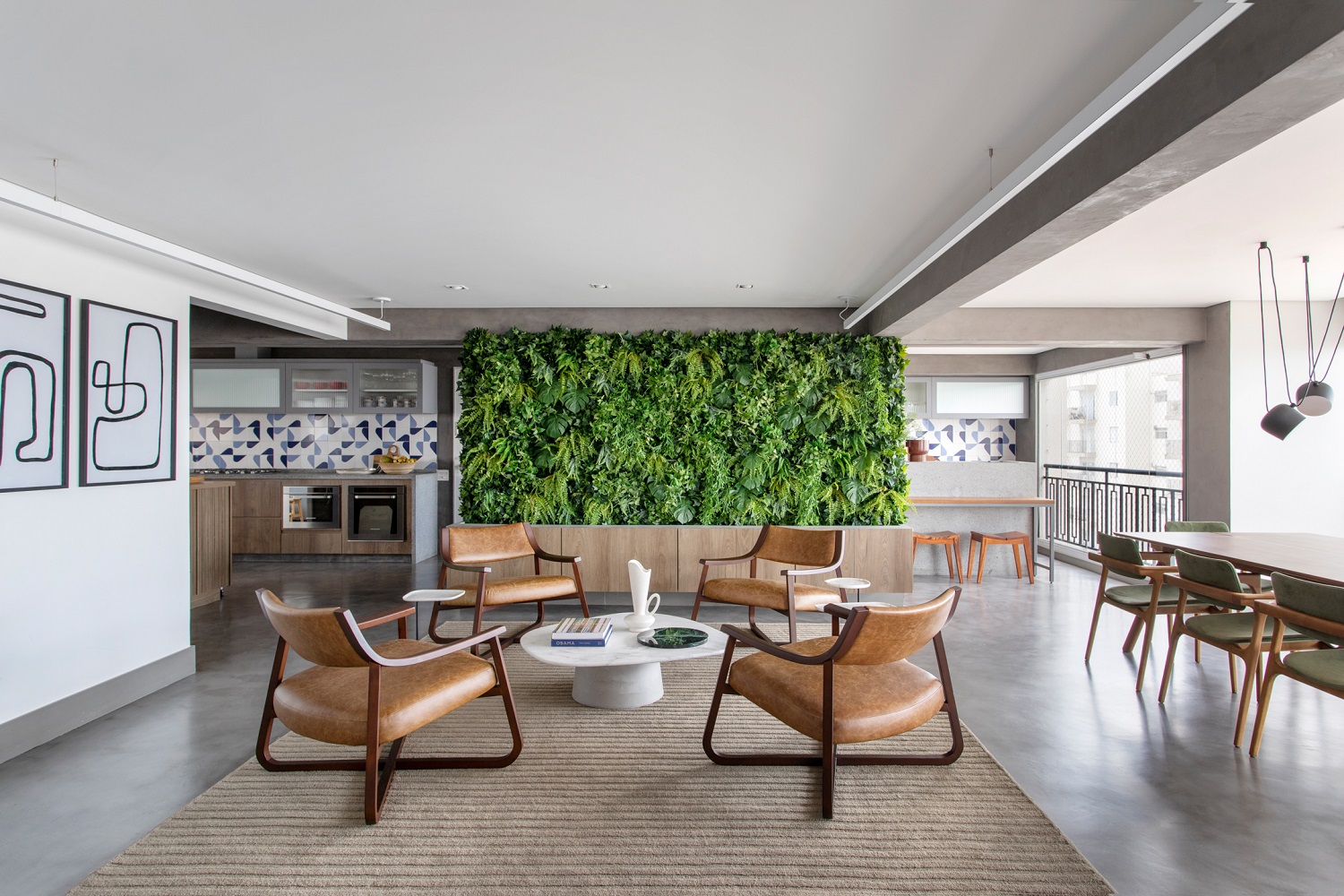
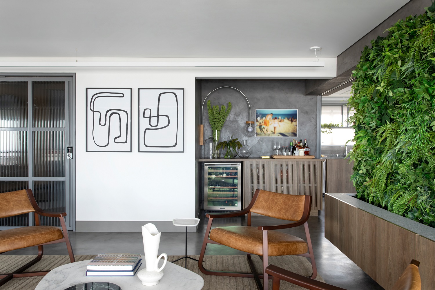
And the connections keep flowing. A large dining table welcomes people around for meals, and a small bar takes part in moments of relaxation. In the background, the barbecue area is also highlighted with a natural stone bench and decorated tile panel. The social area is even more welcoming thanks to the green wall made with preserved plants.
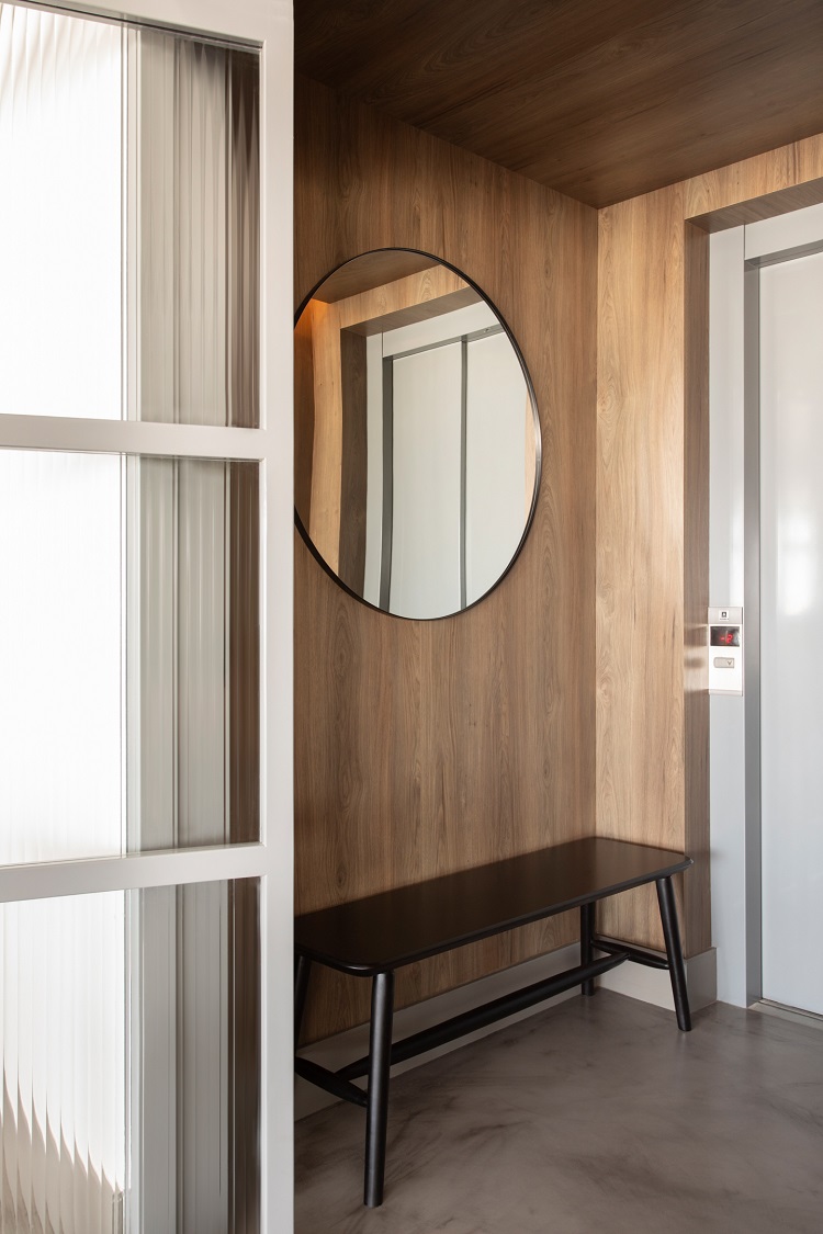
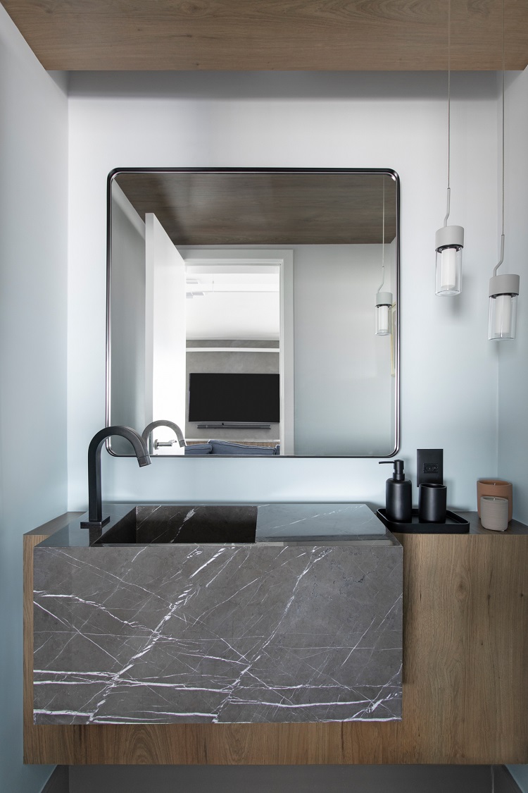
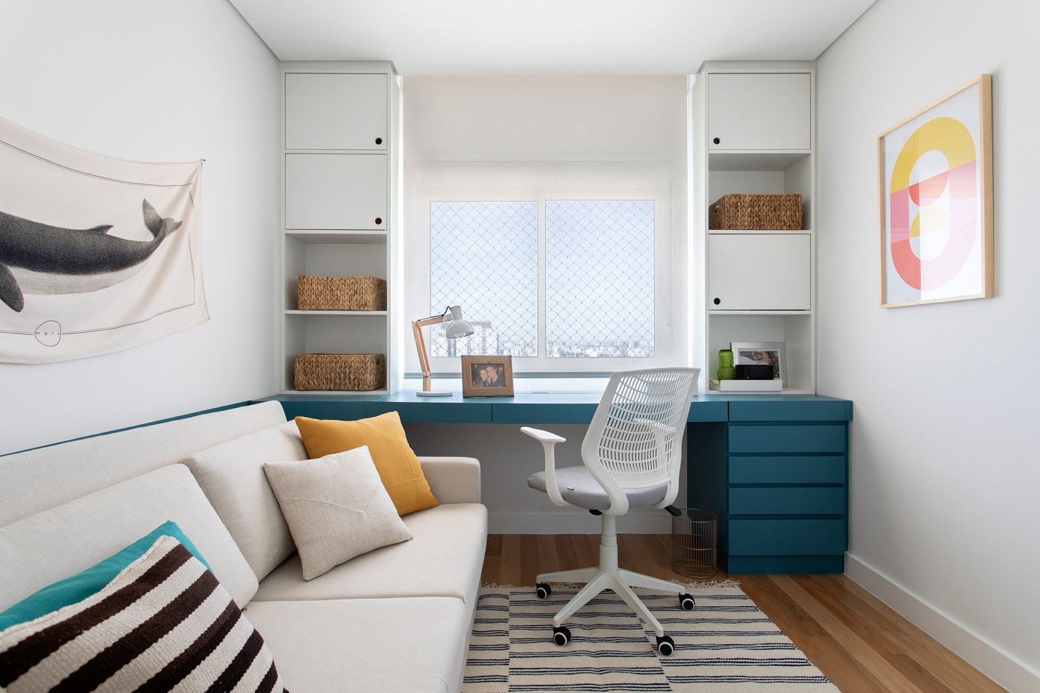
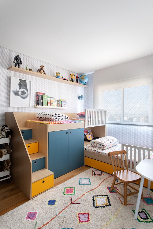
The sense of comfort advances through the intimate area with textures that encourages touch and a palette that favors natural tones. In the entrance hall and in the bathroom, the wooden ceiling creates a visual impact. The rooms receive more wood on the floor and strategic planning for the future: while small, the children of the house share a room; soon, however, it will be easy to adapt the home office to board a teenager.
This laid-back way of living, in which the whole house is connected, is more practical and up-to-date. The boundaries between spaces do exist, but have become more subtle - look at the rug, for example. It establishes the living room area, but does not create barriers in the middle of the space
– MAURICIO ARRUDA,
ASSOCIATE AT TODOS ARQUITETURA
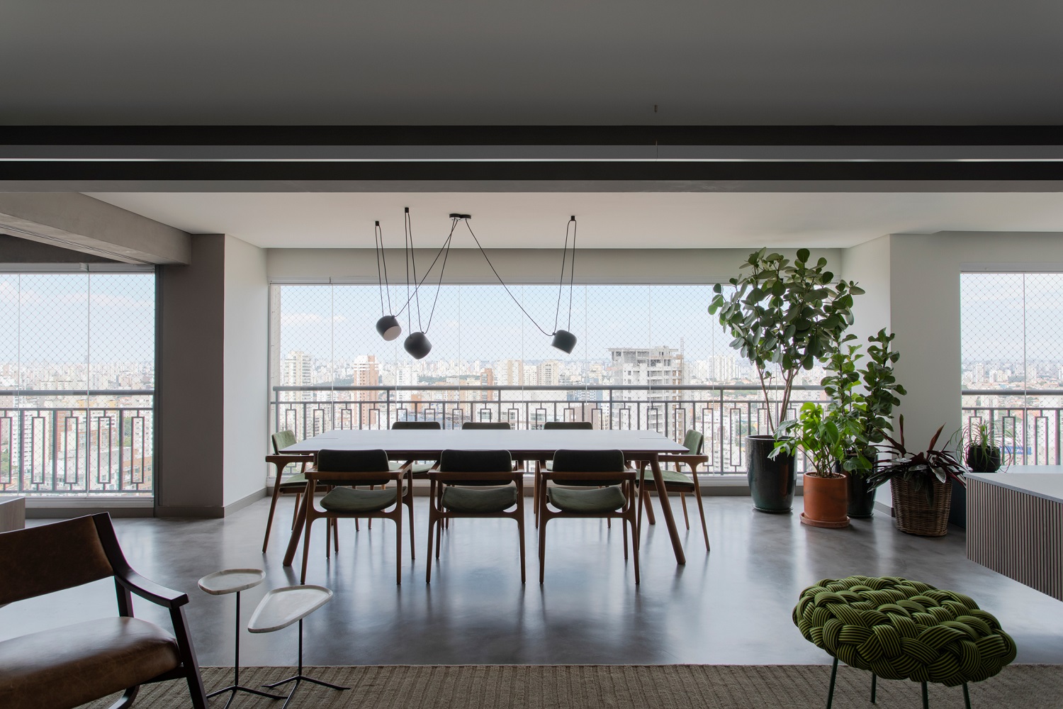
On the other side of the balcony, a dining table overlooking the São Paulo’s skyline. In the background, the barbecue has an island of gray granite, material with a great value for money. The backsplash gained color with the standard ceramic Vírgula Escuro 15 x 15 cm from Portobello. The floor is burnt cement. Dining table and chairs by Jader Almeida.
A small sitting area with low armchairs complements the social living room and takes advantage of the home bar and the beauty of the vertical garden of preserved plants. The landscaping is signed by Casa Flor Jardim.
Duratex’s Inhotim MDF makes the entrance hall and the restroom more friendly. The mirrors are Oruy’s. Gris Armani marble is the name of the stone that shapes the custom made sink.
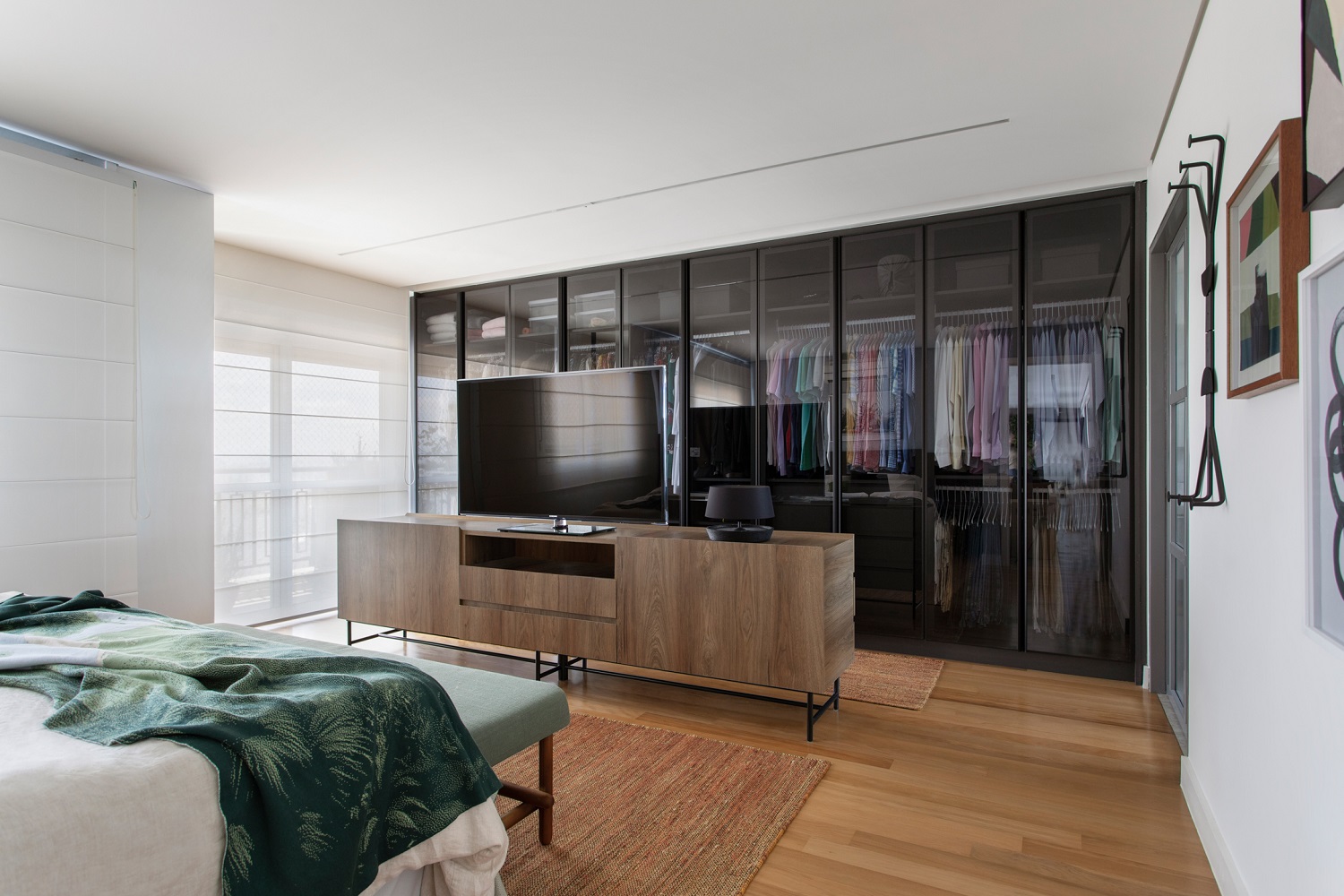
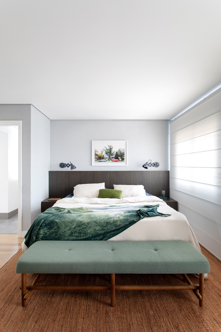
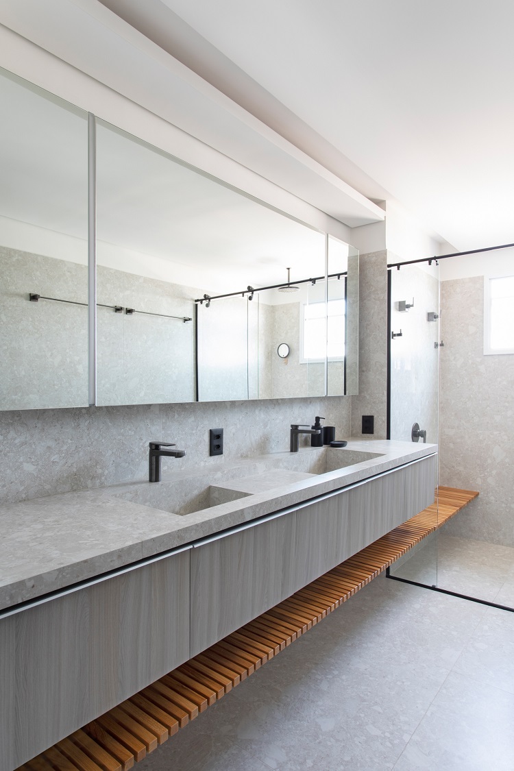
The large size of the bedroom allowed us to put together the sleeping corner with the closet and access to the bathroom. We designed a piece of furniture that has different openings on both sides as a way to section the spaces – it is what visually delimits what is a bedroom and what is a closet. In the bathroom were used the same porcelain tile as the floor to create the carved double sink. Black metals and accessories shape a modern environment.
Right now, this room has been used as a home office and also to accommodate occasional guests. In the future, when the kids grow up, the plan is to convert it into a teenager’s bedroom.
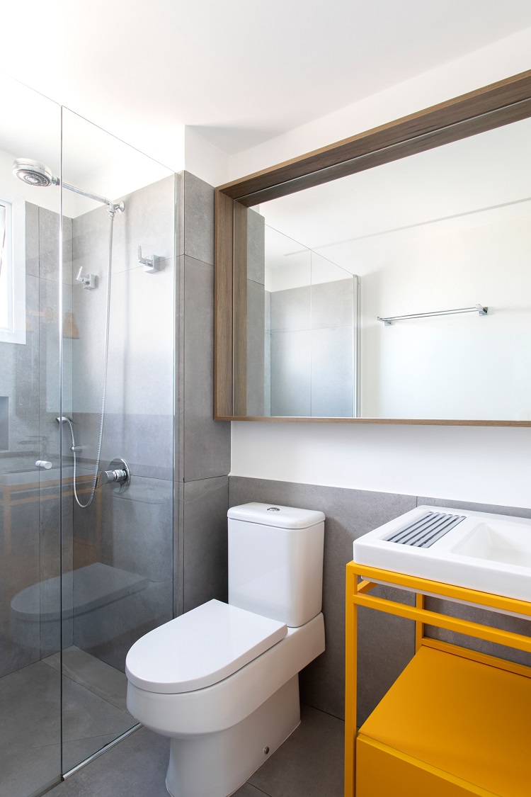
The playful atmosphere predominates in the children’s room. Toys and books at easy reach are available by various storage tricks, such as drawers in the steps and doors under the bunk. A play table also mimics the role of a mini dressing table. The bathroom preservers the same palette with strong yellow coloring and a metallic structure that supports the sink.


