FERREIRA DE ARAÚJO APARTMENT
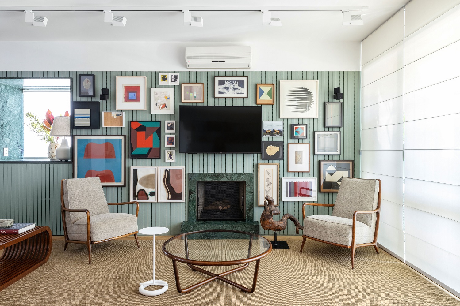
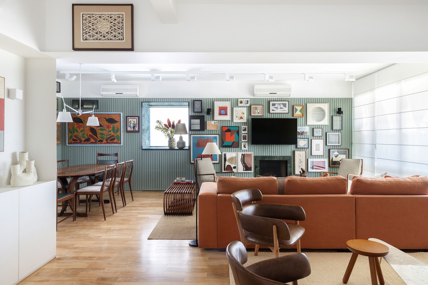
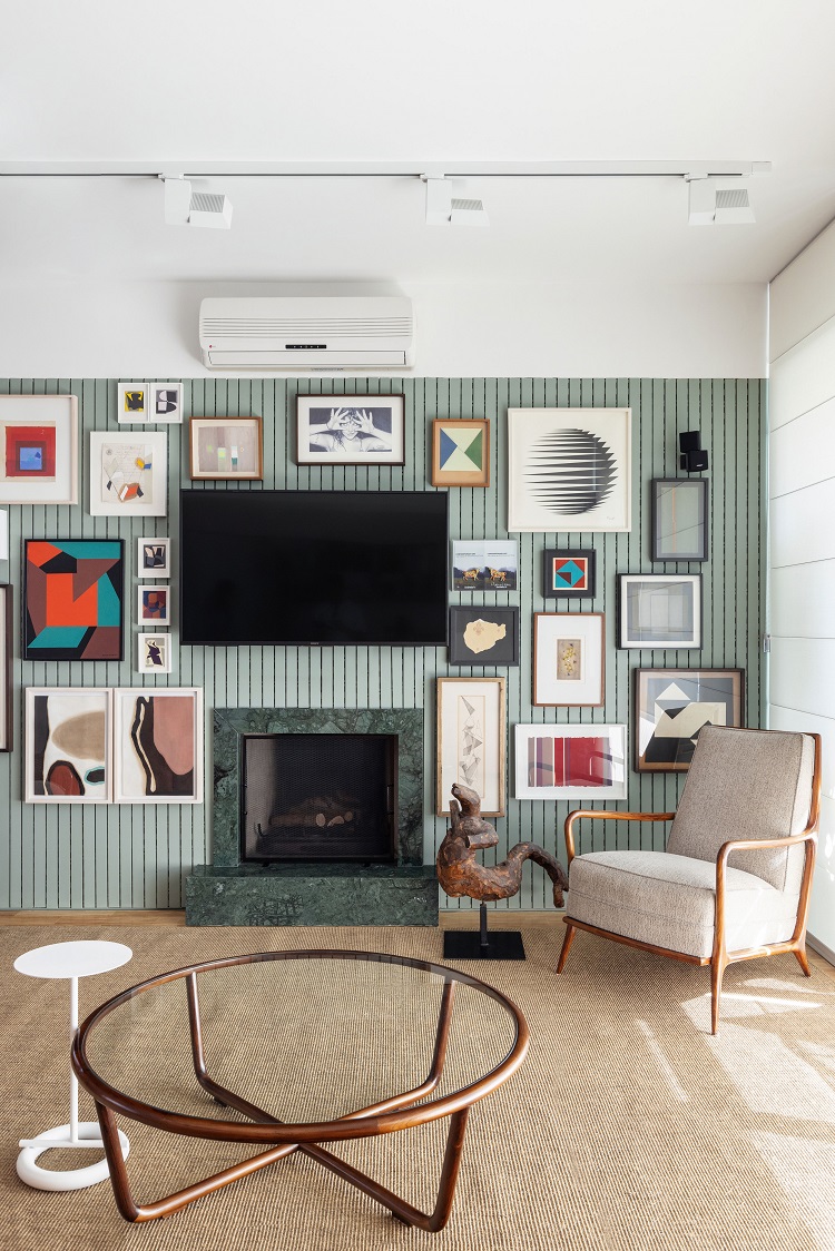
Finding a practical and beautiful way to display the art collection on the walls: that is how we started the interior design project for this 180 m² apartment located in the Pinheiros district of São Paulo. After the removal of the wall that separated the entrance hall from the rest of the living room, it was easier to distribute the three spaces of the room, which is now larger and more integrated. Then, we designed a slatted panel with built-in racks, a solution that allows the residents to change the arrangement of the artworks whenever they want, without the trouble of drilling through walls.
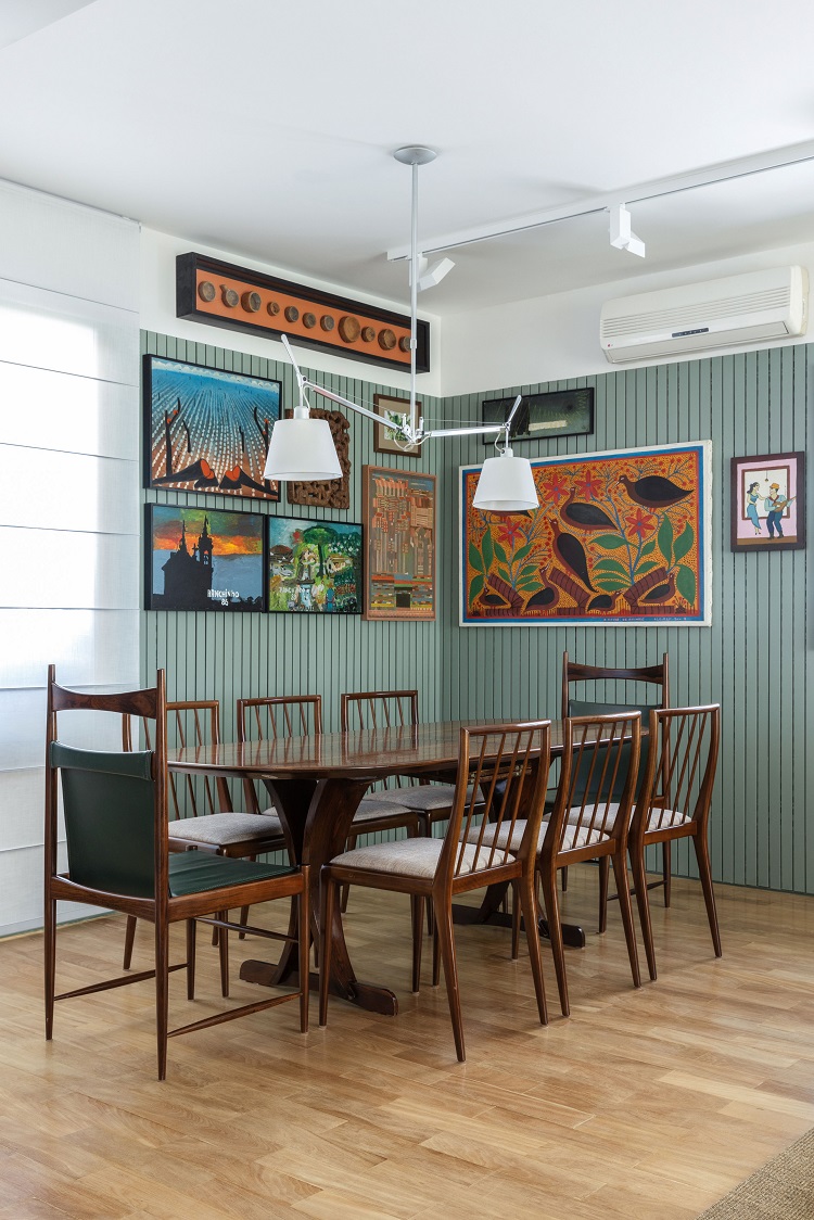
The fireplace got a frame of marble Verde Guatemala, a pattern that goes well with the tone of the panel. Hanging on the ceiling, the Wing lamps, by Lumini, can have their inclination adjusted to focus on the artworks. The selection of artworks in the dining room follows the Brazilian popular language, and coexists in balance with the Ripas chairs, by Geraldo de Barros, and the pair of Cantu chairs, by Sergio Rodrigues, both at the ends of the table. All from Dpot.
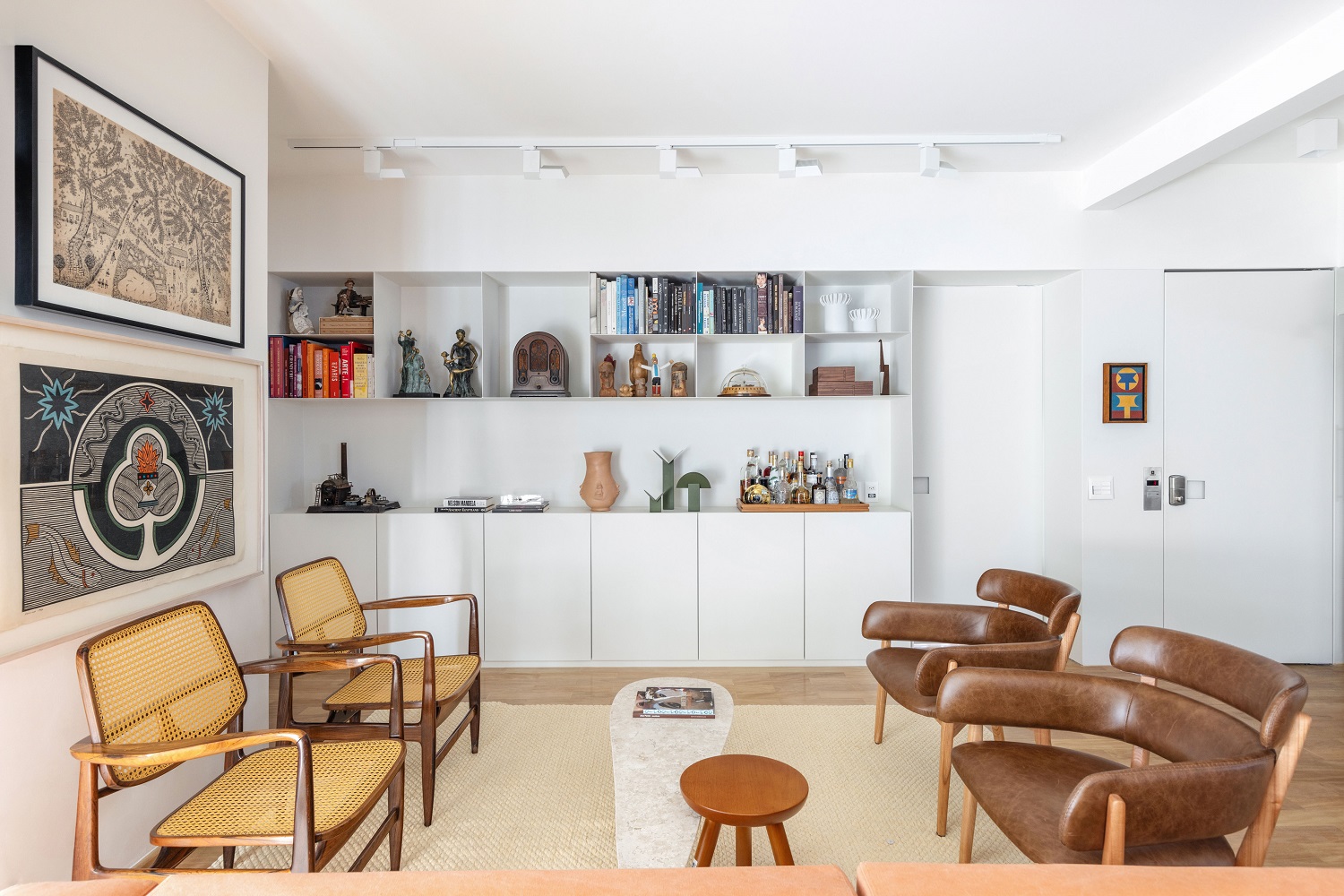
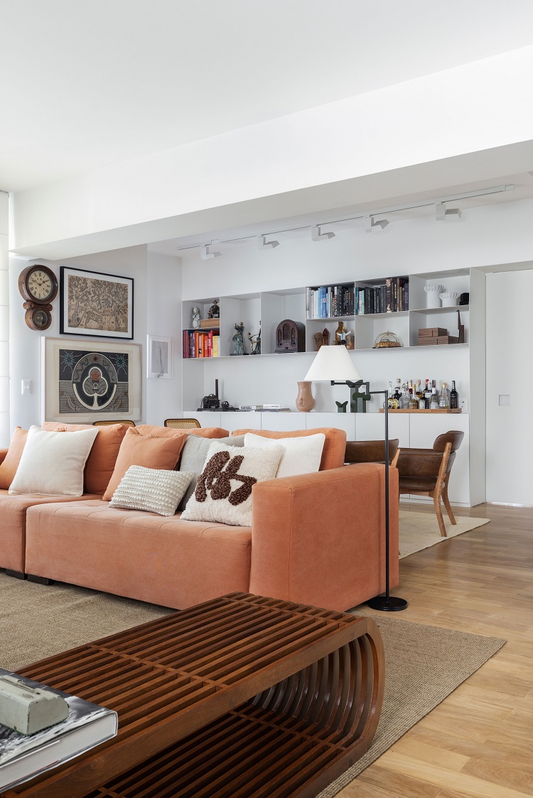
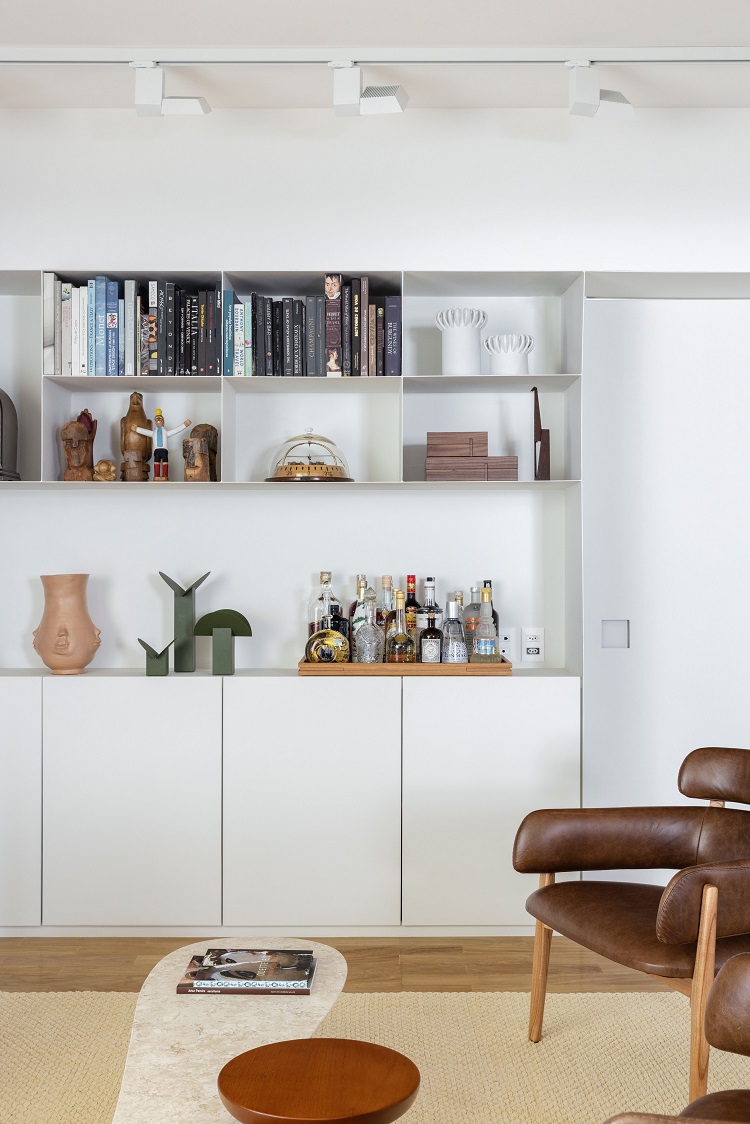
Finding space for the residents' most affective objects guided this design. In addition to the panel with built-in racks, the metal bookcase also supports sculptures, books and the bar
– CLARA NAHAS,
ARCHITECT AT TODOS
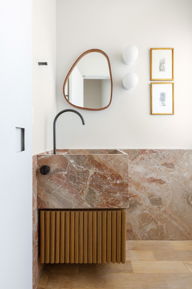
The opposite side of the panel reveals the lightness of the white metal bookcase, creating a contrast with the colored side. In the washroom, the Italian marble Breccia Oniciata covers half height of the wall and shapes the sculpted sink. The slatted cabinet is made of freijó wood.
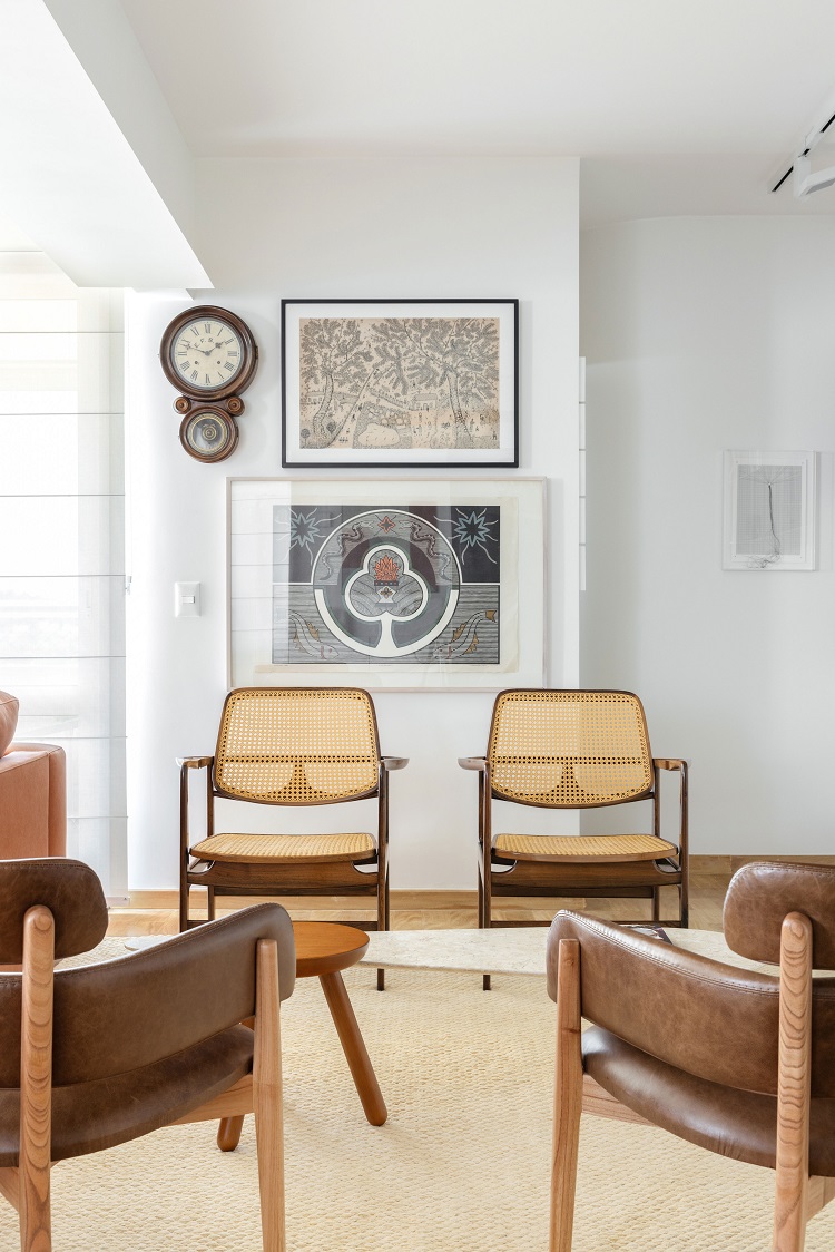
The room with the armchairs Oscar, by Sergio Rodrigues, also becomes a reading corner. Organizing the books by color made the décor lighter and more fun.
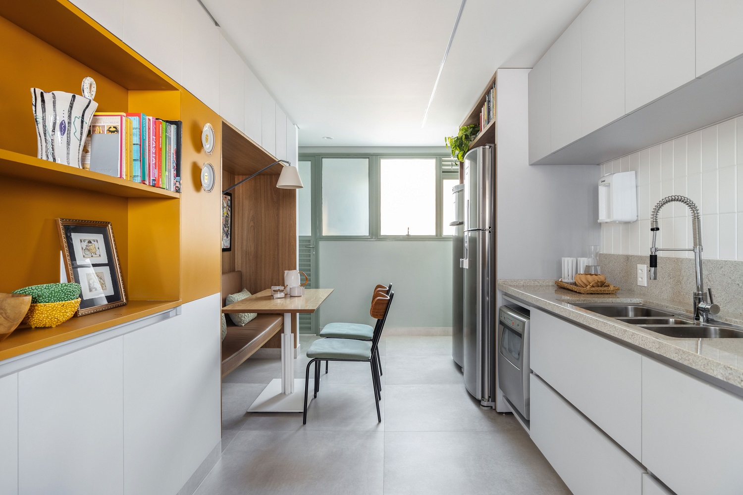
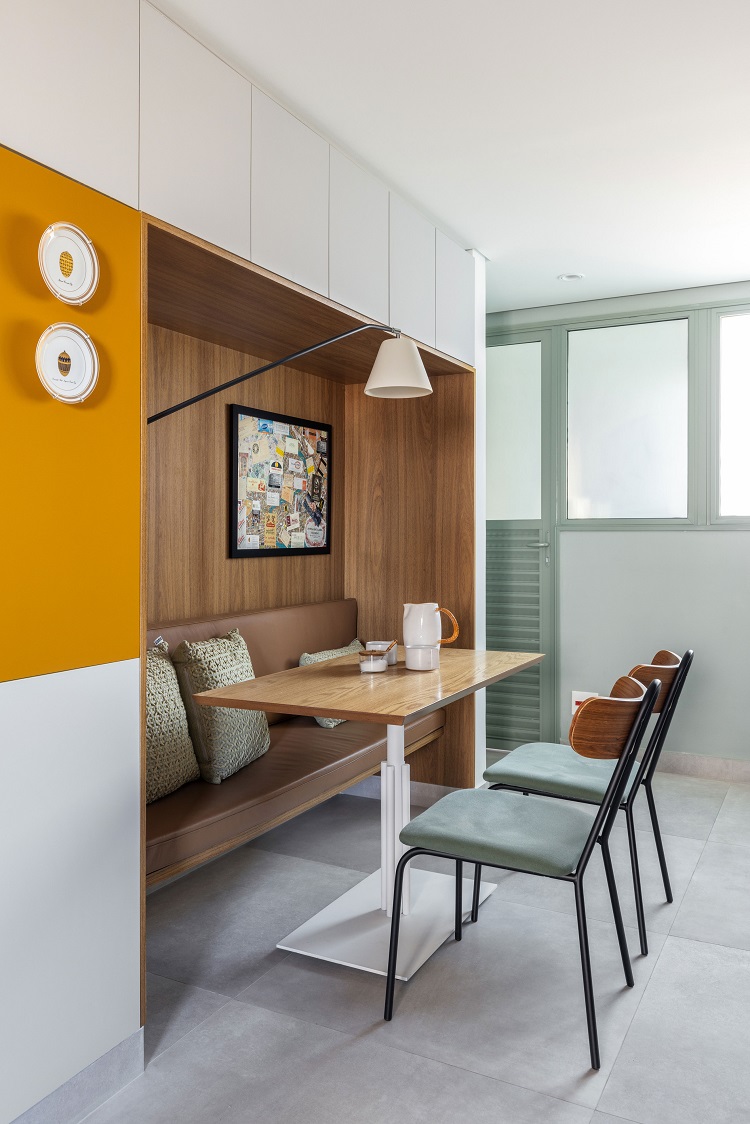
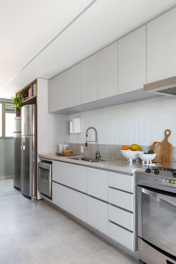
The routine of a family with two children calls for practicality. In order for not setting up the large dining table in the living room for every meal, the niche in the kitchen houses a German corner, with room for everyone. The neutral base of gray and beige gains a touch of mustard in the cabinetry.
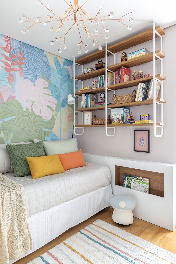
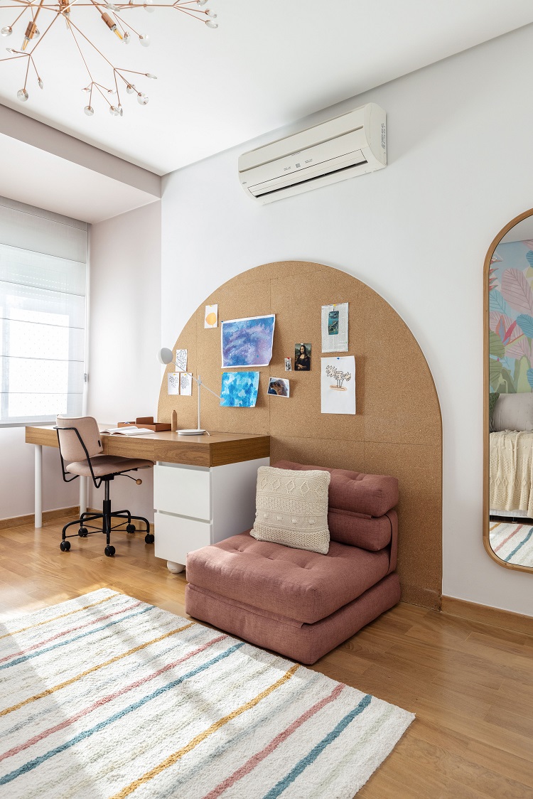
The graceful design in the girl’s room can accompany her as she grows. The study table also serves as a dresser and leaves room for creativity to run free on the cork panel. In the other corner, the suspended bookcase is above the bed and pairs with the narrow niche below it, a good bedside support that also leaves the books within reach.
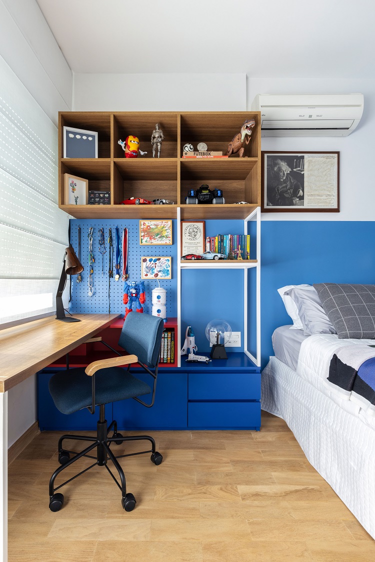
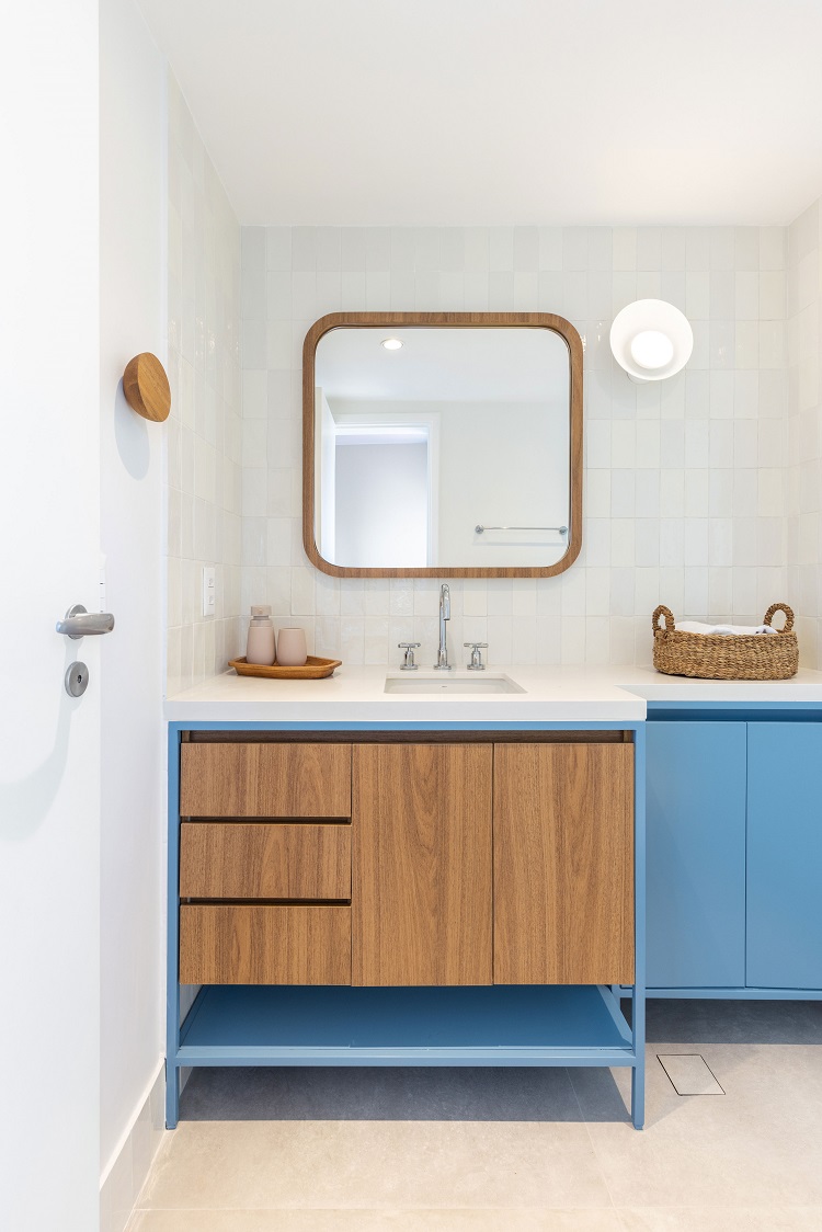
Shades of blue prevail in the boy’s en suite and color the headboard wall, the pegboard and the cabinetry; and even the bathroom, which has a cabinet with a metal structure.


