DO IT H. SCHAUMANN APARTMENT
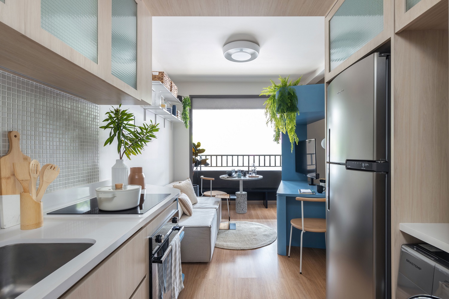
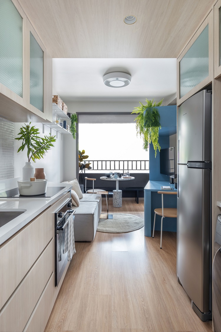
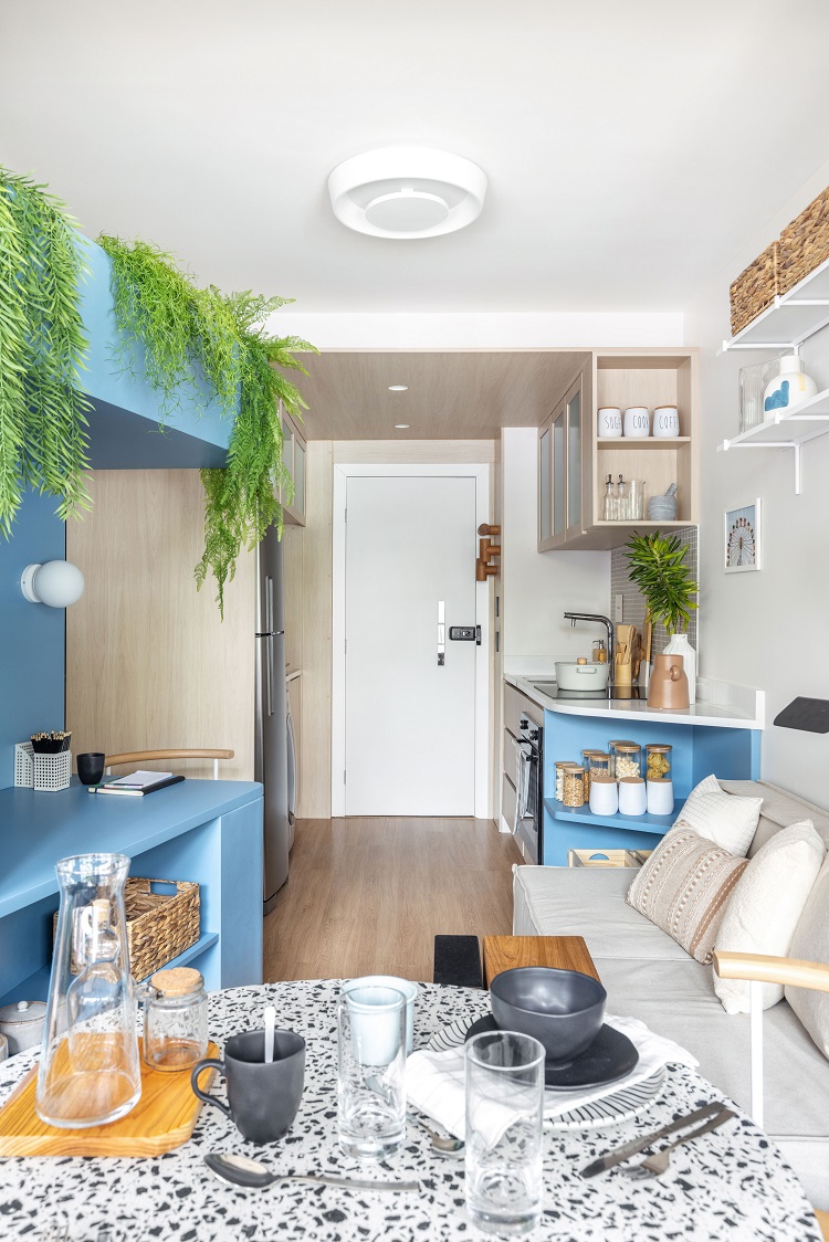
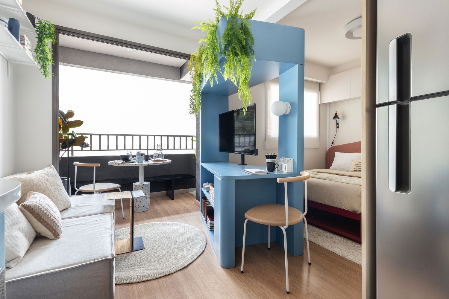
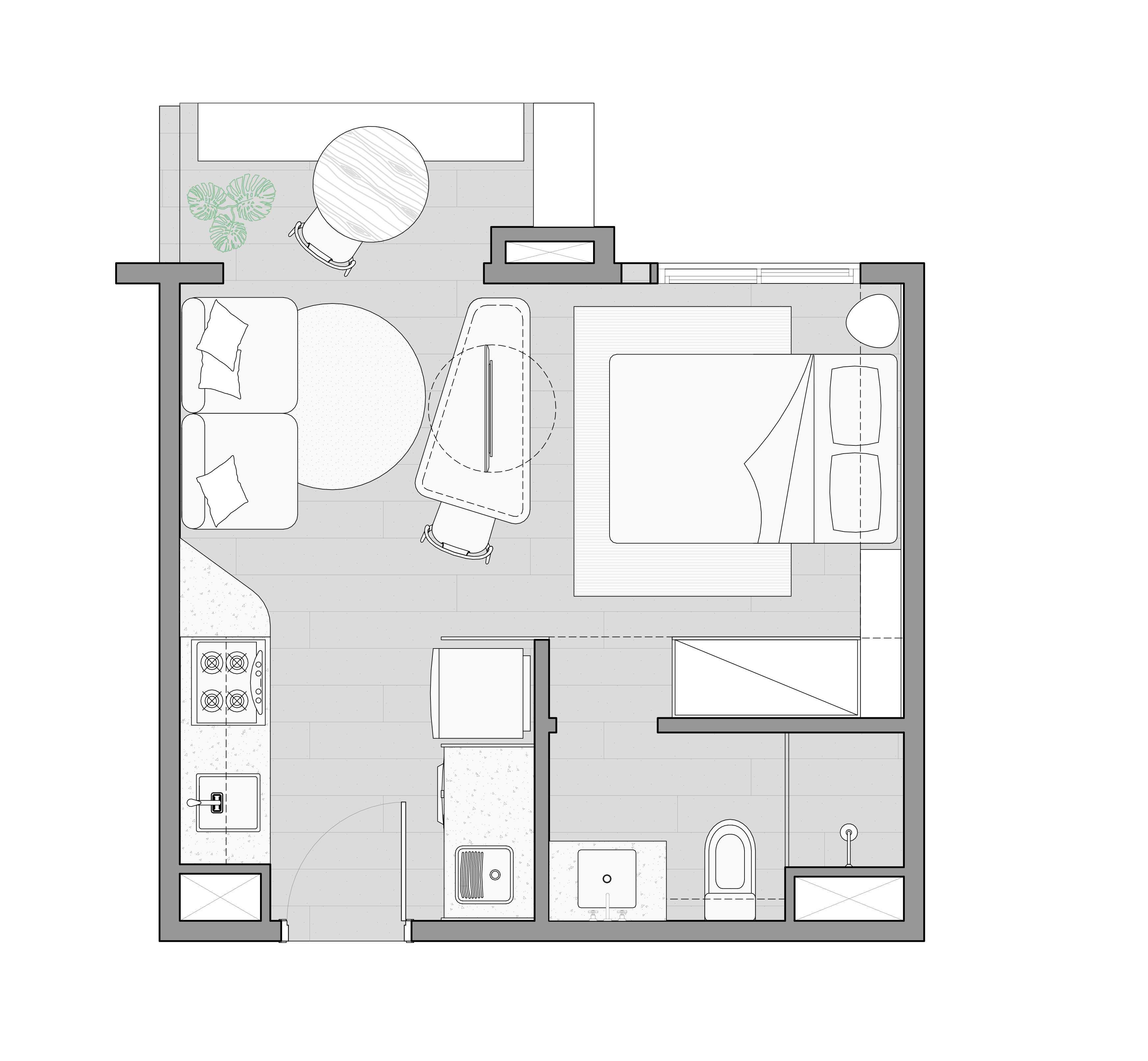
A large architectural program for a compact space: this 28 m² apartment proves that small dimensions can also mean a functional and cozy dwelling. Kitchen and laundry integrated to the living room, bedroom that looks like an en suite, dining corner in the balcony and many cabinets are part of the project we designed for this real estate development by Riva Incorporadora, the Do It H. Schaumann.
Right at the entrance, we positioned the kitchen and the laundry room facing each other, multiplying the countertop area for both rooms, which makes the routine easier. The integration of the balcony into the living room allows the dining area to be part of the social area. The same laminate wood flooring (model Oak Floorest Premiere, by Quick Step Brasil) covers the entire floor of the apartment and makes a good pair with the MDF that finishes the cabinetry of the kitchen and bathroom (model Oásis, by Duratex). Note that even the ceiling has a wooden covering – this box frames and visually unifies the spaces.
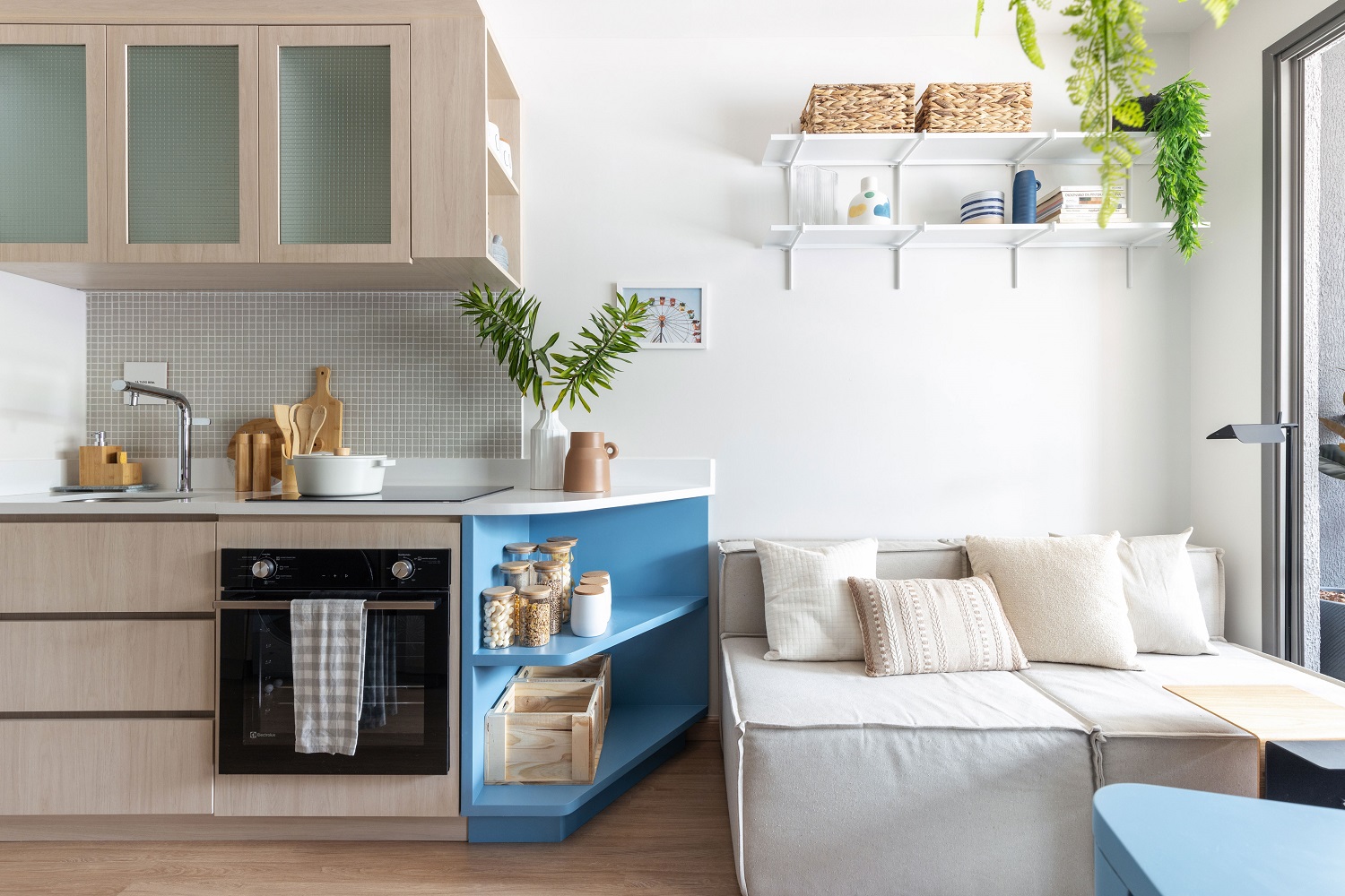
Side niches and shelves expand the storage space in the kitchen cabinetry and, sometimes, they act as a support for the living area. The quartz agglomerate countertop pairs with the ceramic tiles by Portobello (ref. Blocks 30 x 30 cm, color off white).
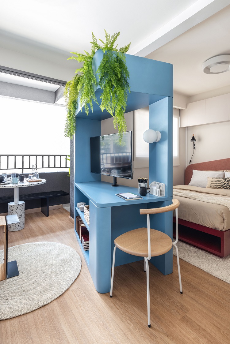
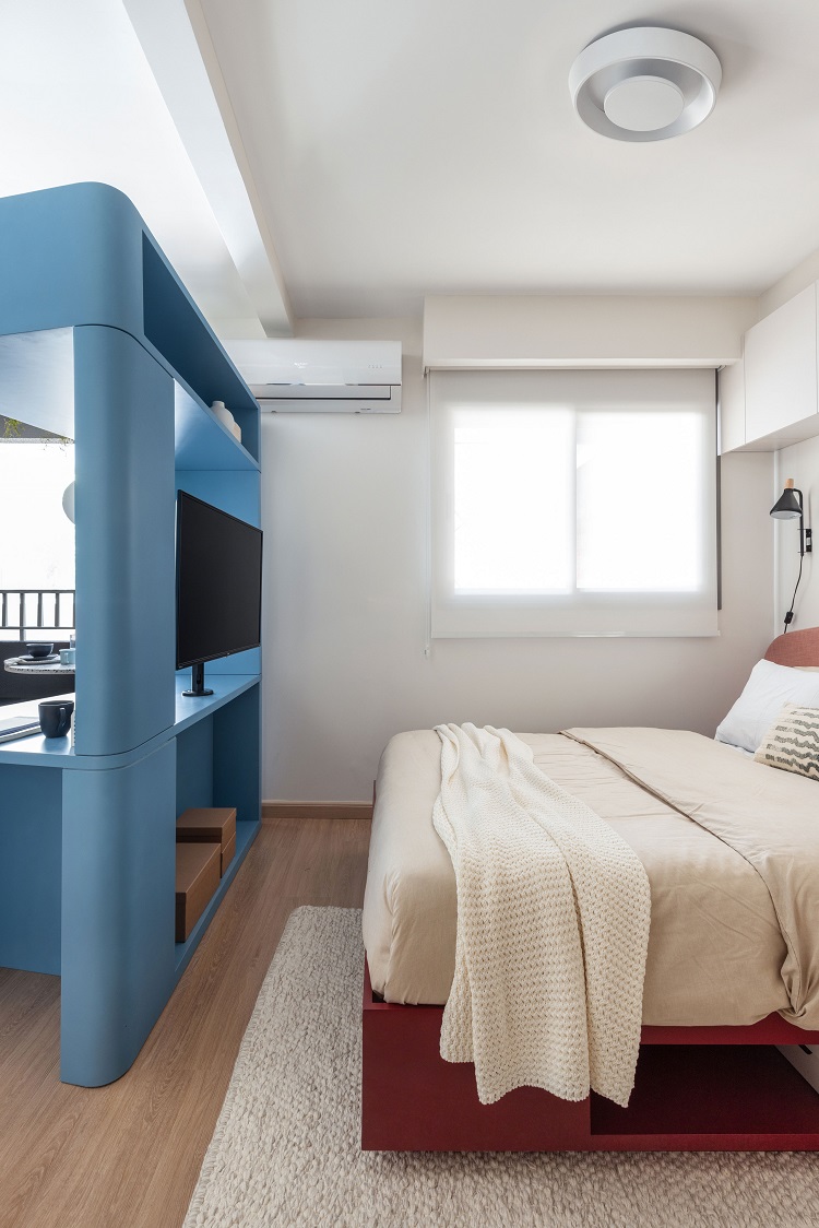
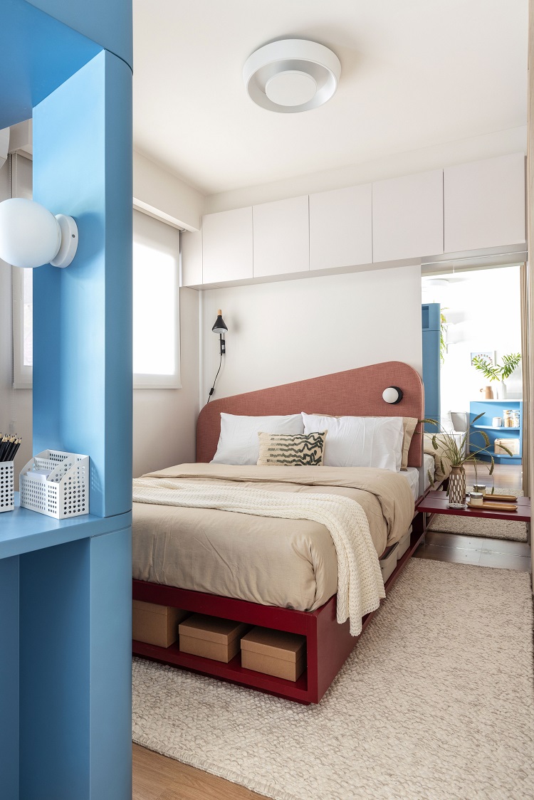
A multipurpose furniture, the triangular blue piece meets several demands at once. The bottom part stores objects on the side facing the living room and on the other side, which serves the bedroom. It also supports the TV, that rotates on its base to both rooms. At one end of the piece, the angled opening leaves room for a small office. Finally, at the top, there is also a planter.
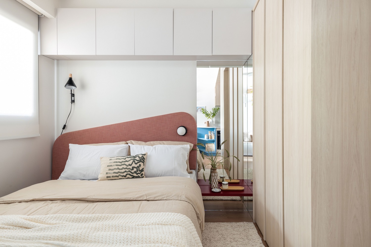
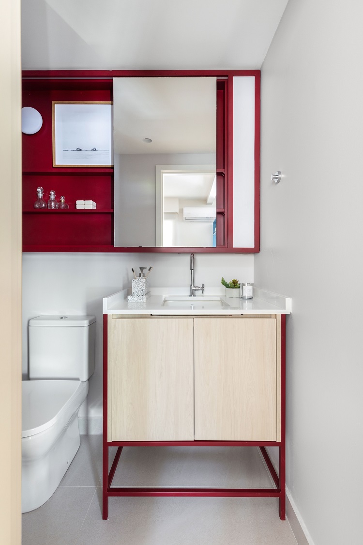
The shape of the blue cabinet guides the angle of the upholstered headboard in the bedroom, a solution that multiplies the unusual design in a subtle way. There are also two mirror panels arranged in the corner of the closet, which is complemented by the suspended cabinet above the bed. Under the custom-made bed, niches and drawers leave objects within reach without the need to lift the mattress. The shade of red (lacquer L138, by Sayerlack) also appears on the shelf next to the headboard. The repetition creates visual unity in the design: same quartz of the kitchen, same MDF finish of the cabinetry, same red lacquer of the bedroom. In the medicine cabinet designed by us, the mirror doors run on a rail and stores the bathroom products. On the right side, we included a vertical sconce; in the left corner, there is the lamp that looks like a small ball, identical to the one on the headboard of the bed.


