CITY WAY 77 M²
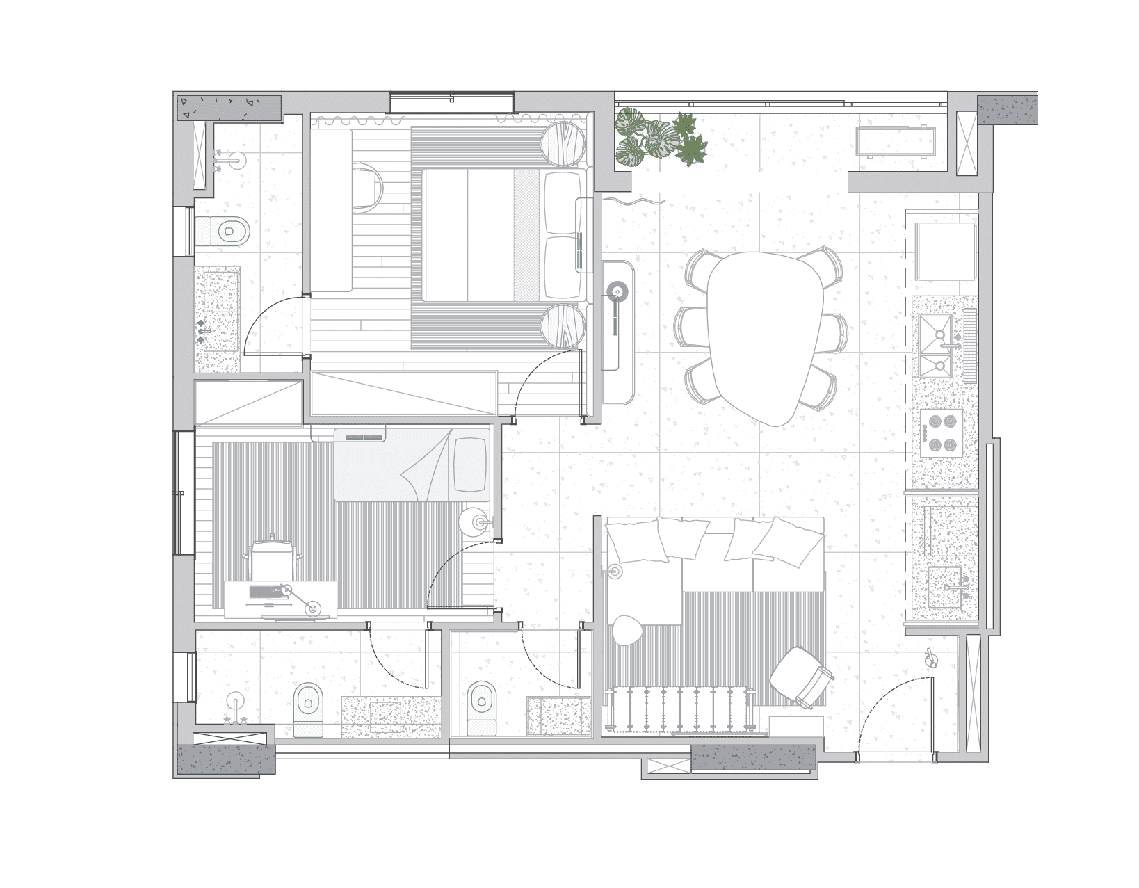
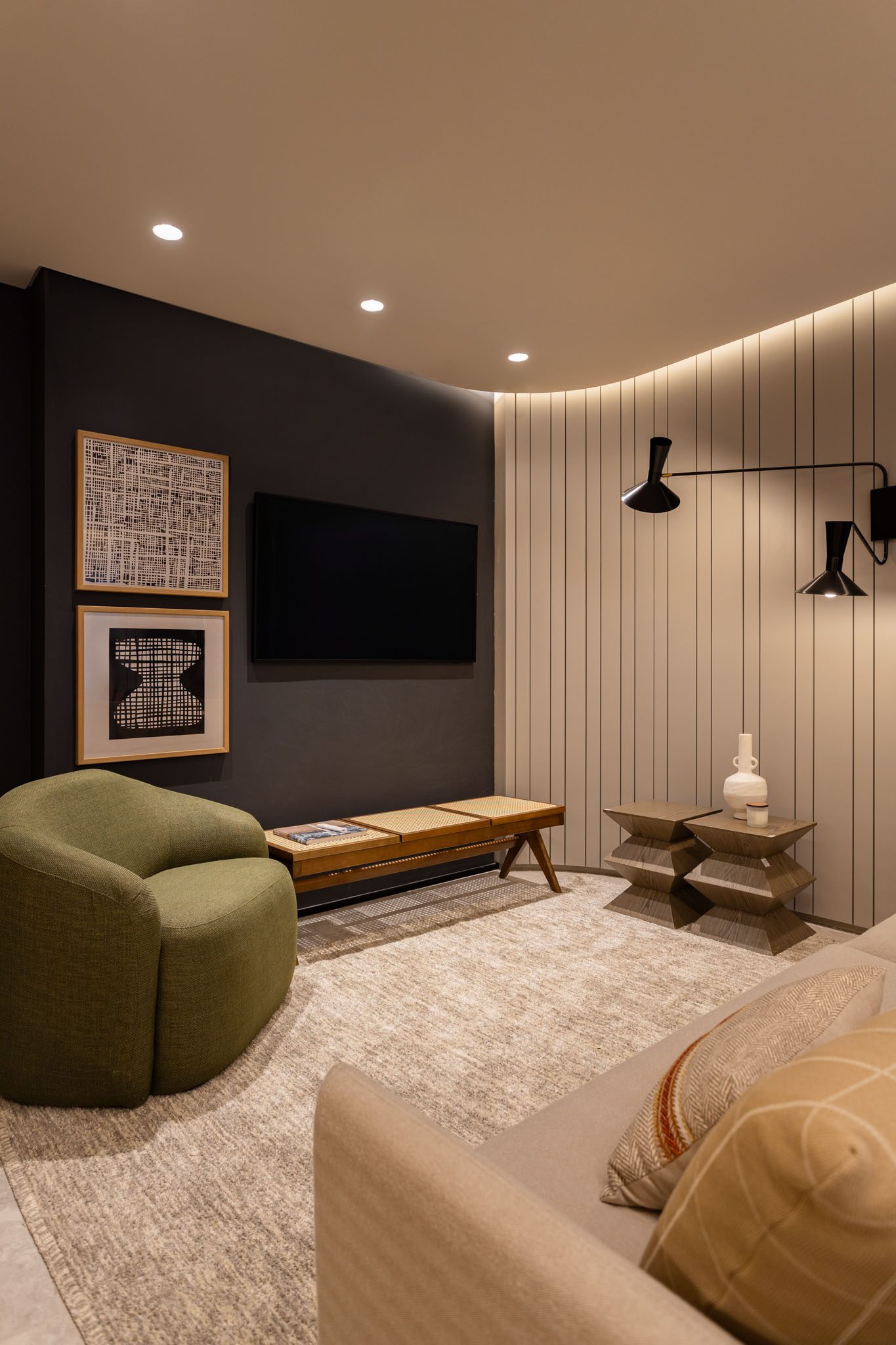
This 77 sqm decorated apartment in Goiânia, Brazil, is proof that a compact space can have a spacious and comfortable layout. Designed for the City development company, the project features a generous integrated living area with a living room, dining room, kitchen, and laundry, with a powder room completing the social area. The private area has two suites.
The interiors incorporate natural materials, textures, and organic shapes, resulting in a
combination of classic and modern styles.
Designing outside of São Paulo is a challenge that expands our cultural knowledge and expertise. In this project, we brought in local suppliers, artists, and designers to both value Goianian production and create a greater sense of identification among the public who visit the decorated space.
– FÁBIO MOTA
PARTNER AT TODOS ARQUITETURA
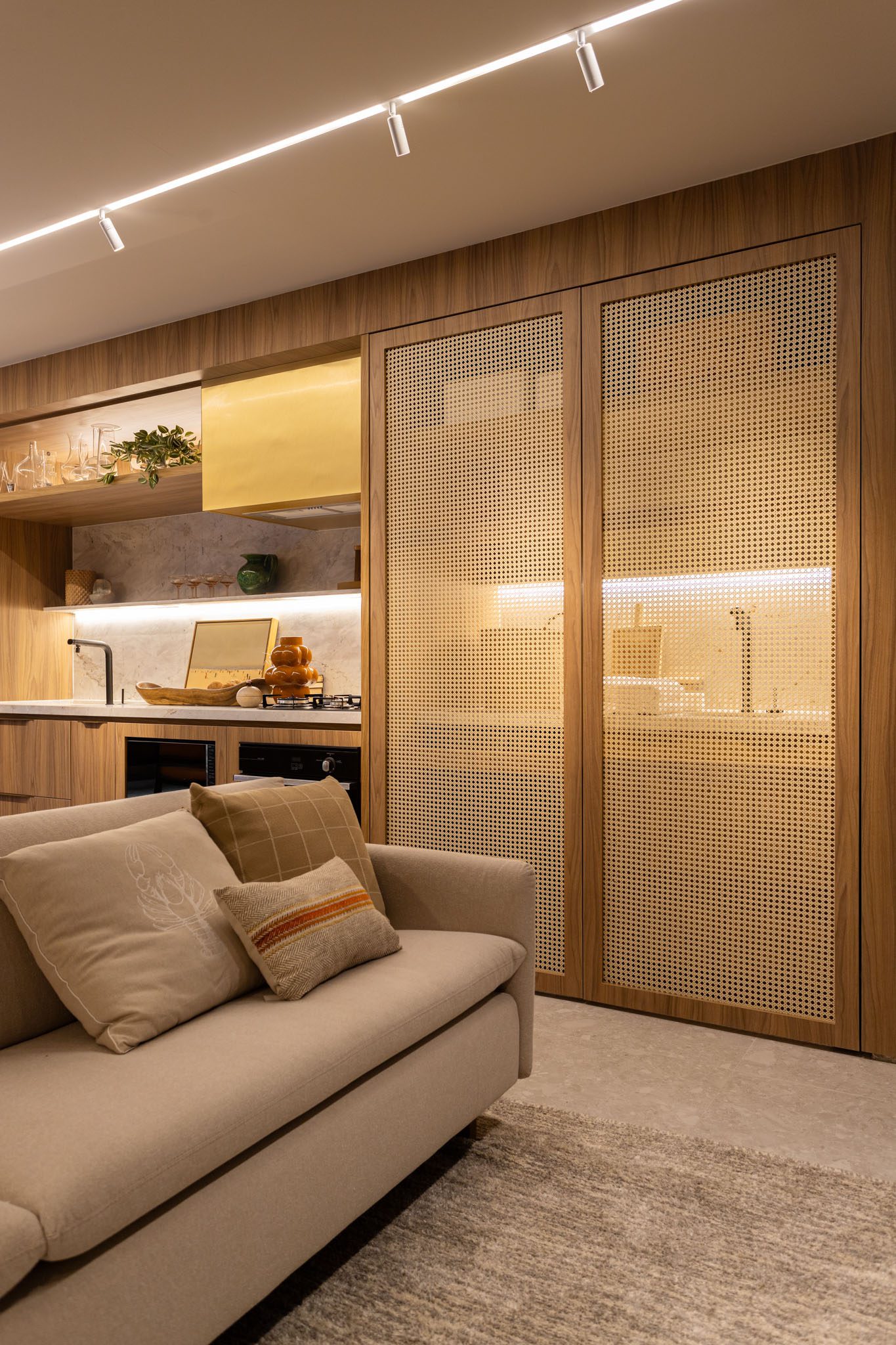
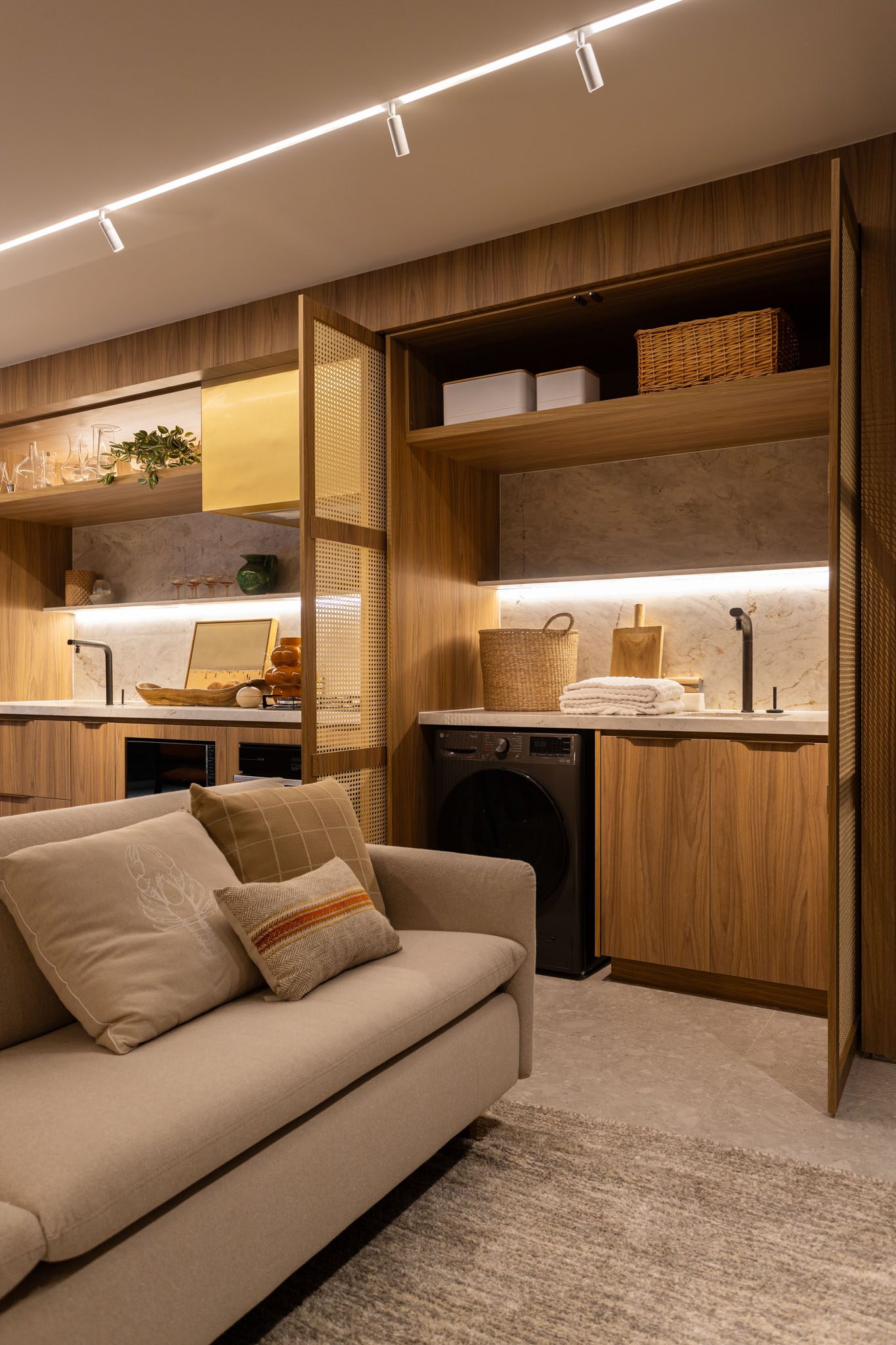
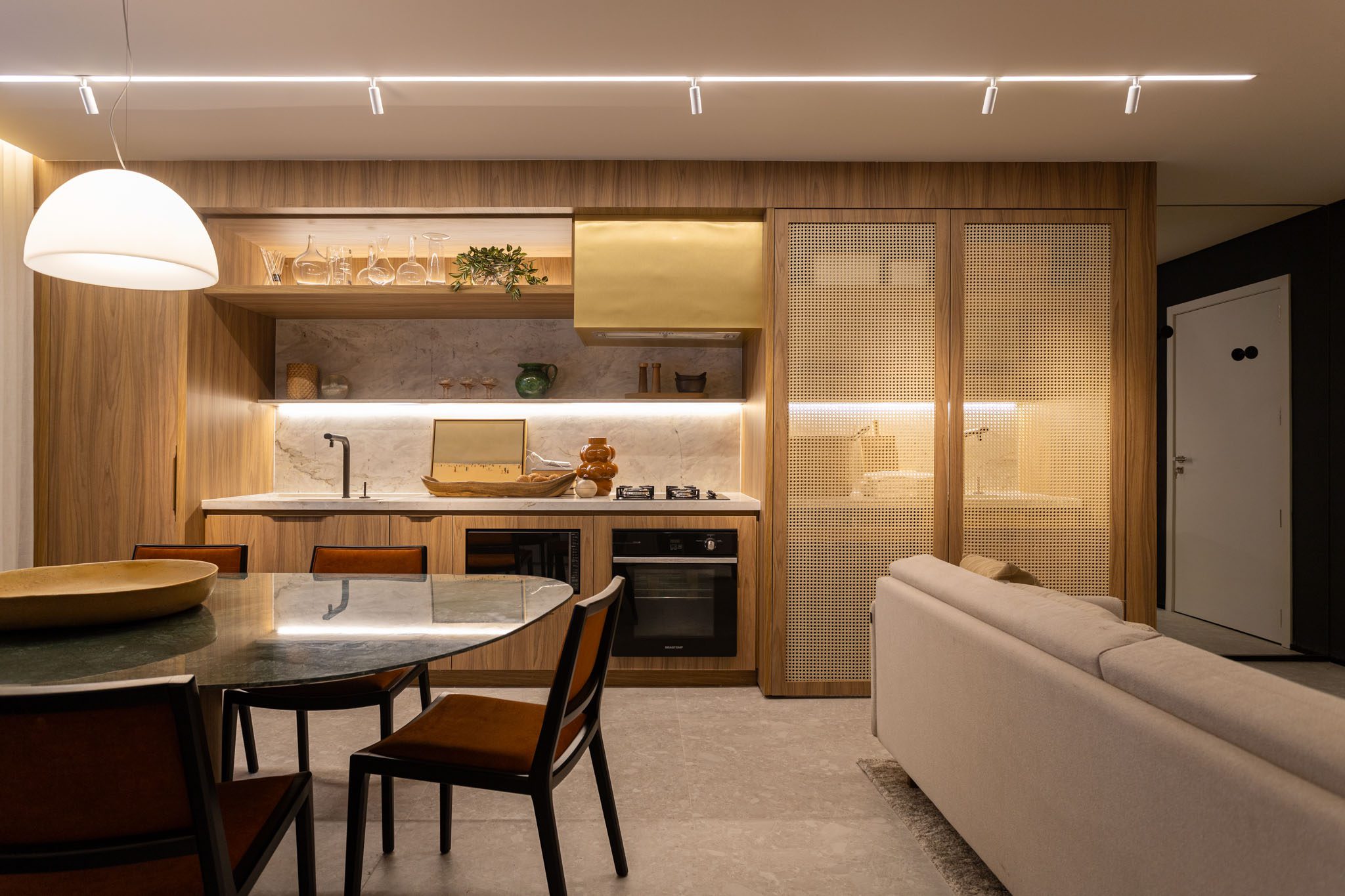
A module, clad in Guararapes’ Savana MDF, extends from one end of the living room to the other. It houses the laundry area right at the entrance of the apartment. This bold solution takes advantage of the plumbing points provided by the builder. And there’s no concern about the social aspect, thanks to the retractable straw doors. When the area is not in use, simply turn off the lights and the environment “disappears” into the cabinetry.
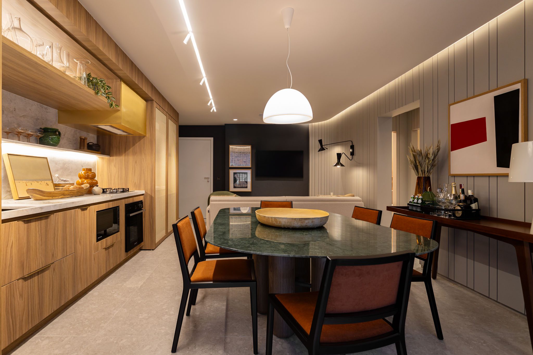
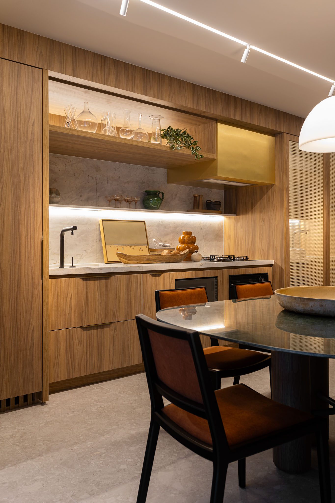
Next to it, the kitchen-corridor with a built-in refrigerator preserves the project’s classic and minimalist look. Just ahead is the dining room. The table with an amorphous Victoria Regia marble top, measuring 1.35 x 2.05 meters and designed by TODOS Arquitetura, seats six and can easily accommodate more people on busy days. Above it, a 60 cm diameter ceramic plate by artist Marcio Fleuri fills the piece of furniture and complements the room’s palette. A production that makes all the difference!
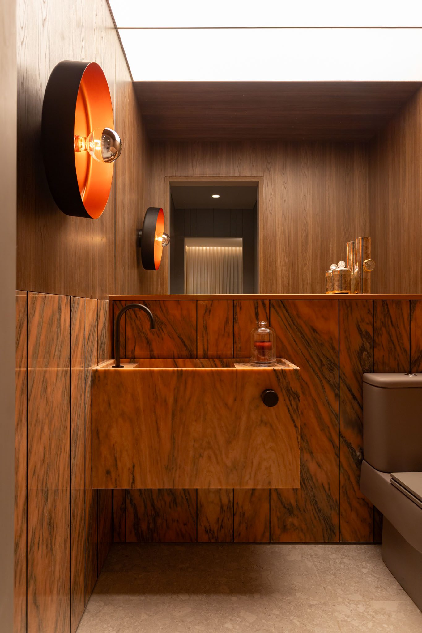
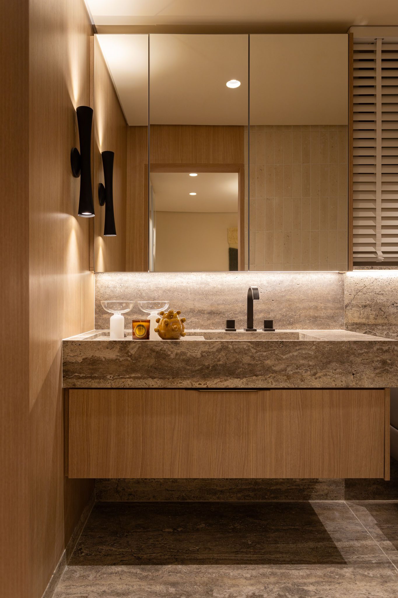
Following the project’s warm colors, the powder room features a basin and half-wall clad in Rosa Bahia marble. Above it, Duratex’s Munich oak MDF reiterates the box designs that permeate the decorated space and warms the environment with a darker wood tone.
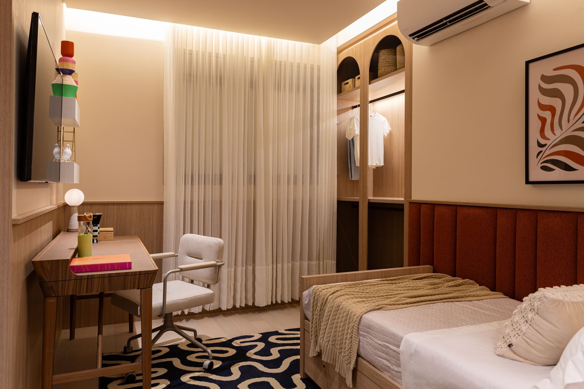
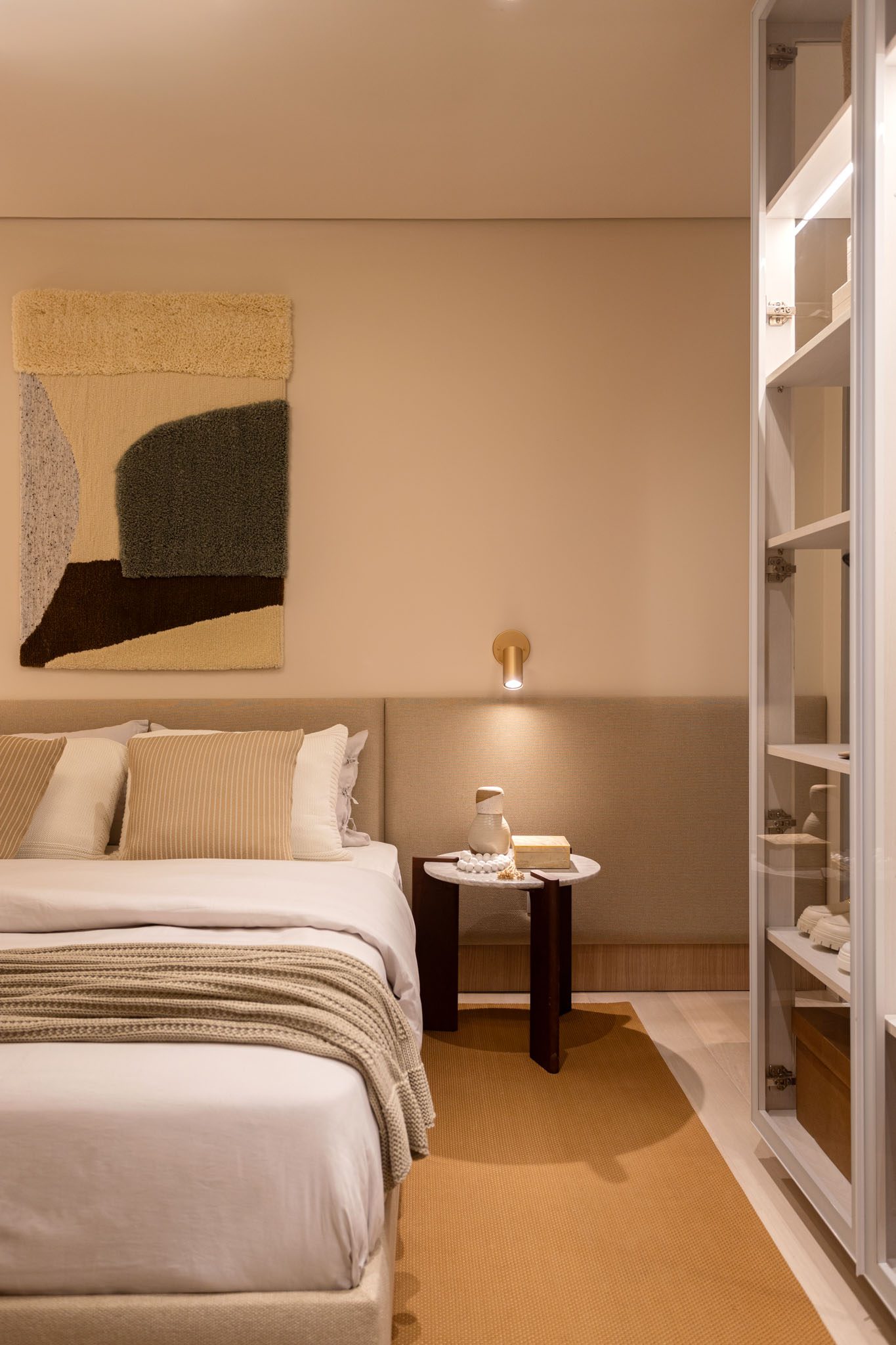
In the first suite, neutral and light tones form the basis of the decoration. Since the environment was designed for a teenager, stronger colors appear in the details, such as the terracotta headboard and the Giz rug by Muma, to bring youthfulness to the space.
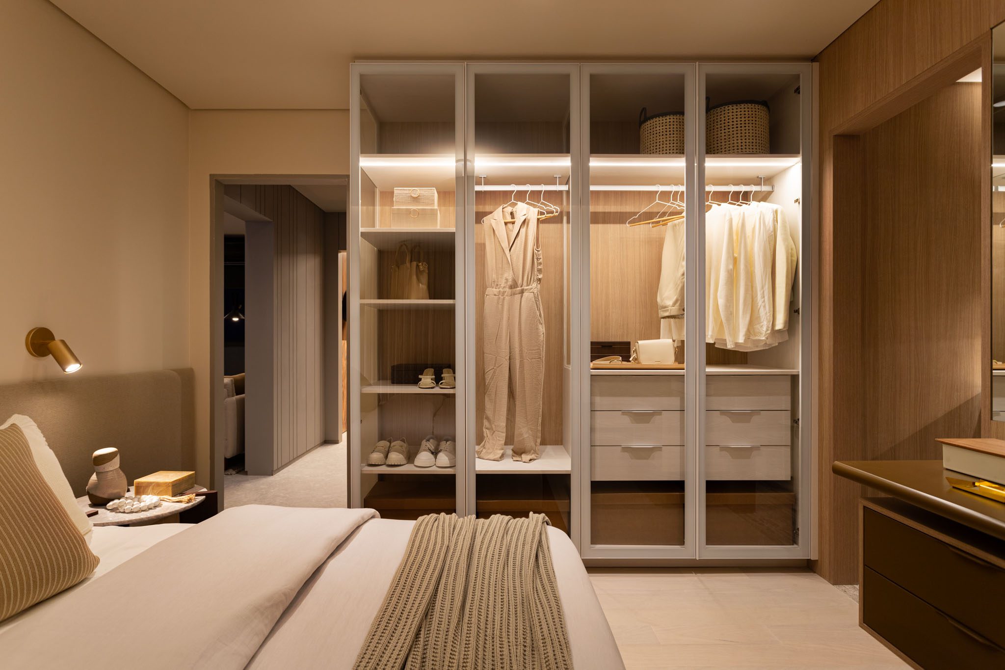
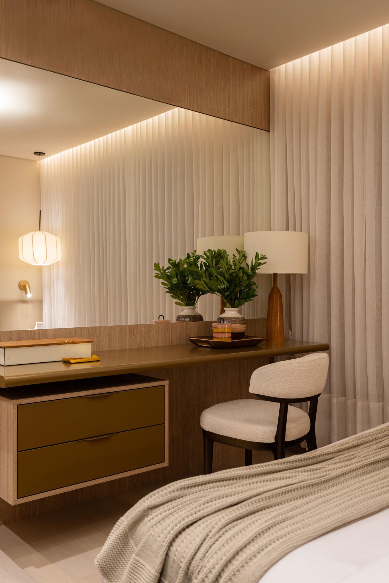
In the master suite, beige and white tones predominate, providing a sense of oasis. To create a sense of spaciousness, in addition to the glass-door cabinets, a mirror was added in front of the desk, transforming the piece of furniture into a dressing table as well. These are good solutions that ensure a
compact and complete apartment!
FLOOR PLANT
